An Analysis of Letters
So if you recall, not too long ago I analyzed whether the frequencies of letters in the English language change depending on the letter of the word. To do so, I gathered about 5,000 English words and compared the frequency distributions of the letters for the first five letters of the words. Click here to check that out if you haven’t already done so.
I’d wanted to go further into the words, but I didn’t have time/data to do so.
So that’s what I did today!
I pulled large samples of 4-, 5-, 6-, 7-, 8-, and 9-letter words from an online Scrabble dictionary*. For each sample, I went through and found the frequency distribution of the 26 letters of the alphabet for each letter place in the word (e.g., for the 4-letter words, I found the frequency distribution of the 26 letters for the first, second, third, and fourth place in the 4-letter word).
Because I think something like this is something that requires some sort of visual, I made a gif for each word size (4, 5, 6, 7, 8, 9 letters) that compares the letter frequency for each letter place in the word (in red) compared to the overall frequency of the letters in the entirety of the English language (grey). Check them all out and see if you notice a pattern as the gifs progress through the letter places in the words.
Four-letter words:
Five-letter words:

Six-letter words:

Seven-letter words:
Eight-letter words:
Nine-letter words:

Did you notice it? Regardless of word size, the letter frequencies were most different from the overall frequency in the English language near the beginning and end of the words. Near the “middle” of the words (like the fourth and fifth letters of the nine-letter words, for example), the letter frequencies best matched the overall frequency in the English language (that is, the red distribution best matched the grey distribution).
In addition to the graphical aspect, I of course worked this out with numbers. Like last time, I measured “error” as the absolute value of the total difference between the red and grey distributions for each letter of each word. This confirmed what the gifs show: the smallest error was always for the one or two letters in the “middle” of each word, regardless of size.
Pretty damn cool, huh?
FYI, the six gifs sync and “restart” at the same time every 2,520 frames, in case you’re one of those people who wonders about those types of things.
*Yes, I realize the use of a Scrabble dictionary skews the results a bit, considering that plurals are included in the dictionary as well (notice the “S” is really frequent for the last letter in all cases). But plurals are words, after all, so I figured I’d include them anyway. The pattern still exists anyway even if you omit the last letter from all gifs.
Watch this right now
This gentleman is my new favorite living human being.
Yes.
I’d add that linear algebra is an important middle step as well. A lot of stuff that I really enjoy in the field of statistics is stuff I wouldn’t understand nearly as well had I not taken linear algebra.
Ideal universe:
Basic statistics (like the stuff I’m teaching) –> Linear algebra –> more advanced statistics (FA, PCA, SEM) –> calculus (or taught concurrently with the previous) –> mathematical statistics
In my personal experience, I was able to get to SEM-level without calculus. I took calculus, but I never really used it in the context of stats.
But now that I’m taking it again, even at the basic level of 170, I’m seeing how this will apply to statistics (especially mathematical stats). And that’s super exciting.
So I don’t think this idea of “stats before calc” discounts the importance of calculus. Rather, I think it focuses on this idea of “practical versus theoretical” understanding. Statistics, especially very basic statistics, is something I think everyone should know. It’s practical, it’s applicable in every field. Calculus gives you a stronger understanding of WHY it’s so practical and applicable (at least in my opinion).
So yeah. Dr. Benjamin was also on the Colbert Report some time ago. I’ll have to find that vid.
Haha, speaking of the Report, I’m going to go watch the Maurice Sendak interviews again.
Do babies deprived of disco exhibit a failure to jive?
You know, sometimes the most “pointless” analyses turn up the coolest stuff.
Today I had…get ready for it…FREE TIME! So I decided to try analyzing a fairly large dataset using SAS (’cause SAS can handle large datasets better than R and because I need to practice my coding anyway).
I went here to get a list of the 5,000 most common words in the English language. What I wanted to do was answer the following questions:
1. What is the frequency distribution of letters looking at just the first letter of each word?
2. Does the distribution in (1) differ from the overall distribution in the whole of the English language?
3. Does either frequency distribution hold for the second letter, third letter, etc.?
LET’S DO THIS!
So the frequency distribution of characters for the first letter of words is well-established. Wiki, of course, has a whole section on it. Note that this distribution is markedly different than the distribution when you consider the frequency of character use overall.
I found practically the same thing with my sample of 5,000 words.
So this wasn’t really anything too exciting.
What I did next, though, was to look at the frequencies for the next four letters (so the second letter of a word, the third letter, the fourth, and the fifth).
Now obviously there were many words in the top 5,000 that weren’t five letters long. So with each additional letter I did lose some data. But I adjusted the comparative percentages so that any difference we saw weren’t due to the data loss.
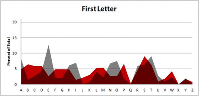
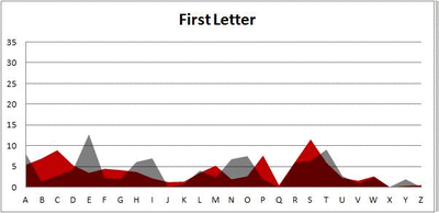
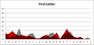
Anyway. So what I did was plot the “overall frequency” in grey—that is, the frequency of each letter in the whole of the English language—against the observed frequency in my sample of 5,000 words in red—again, for the first, second, third, fourth, and fifth letter of the word.
And what I found was actually really interesting. The further “into” a word we got, the closer the frequencies conformed to the overall frequency in the English language.
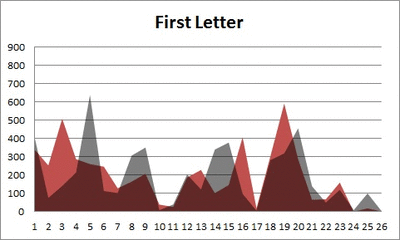
The x-axis is the letter (A=1, B=2,…Z=26). The y-axis is the number of instances out of a sample of 5,000 words. See how the red distribution gets closer in shape to the grey distribution as we move from the first to the fifth letter in the words? The “error”–the absolute value of the overall difference between the red and grey distributions–gets smaller with each further letter into the word.
I was going to go further into the words, but 1) I left my data at school and 2) I figured anyway that after five letters, I would find a substantial drop in data because there would be a much lower count of words that were 6+ letters long.
But anyway.
COOL, huh? It’s like a reverse Benford’s Law.*
*Edit: actually, now that I think about it, it’s not really a REVERSE Benford’s Law; as I found when I analyzed that pattern, it too rapidly disintegrated as we moved to the second and third digit in a given number and the frequency of the digits 0 – 9 conformed to the expected frequencies (1/10 each).
Dicking around with Data
I have my first ounce of legitimate free time today and what do I do with it?
“I GOTTA ANALYZE SOME DATA!”
Today’s feature: analyzing Nobel laureates by birth dates.
Nobel Prizes are awarded for achievement in six different categories: physics, chemistry, physiology/medicine, literature, peace, and economic sciences. Thus far, there have been 863 prizes awarded to individuals and organizations.
The Nobel website has a bunch of facts on their laureates, including a database where you can search by birthday. So because I’m me and I like to analyze the most pointless stuff possible, here’s what today’s little flirtation with association entails:
1. Does the birth month of the laureate relate in any way to the category of the award (chem, medicine, etc.)?
2. Does the zodiac sign of the laureate in any way to the category of the award?
Vroom, vroom! Let’s do it.
Pre-Analysis: Examining the data
So I should preface this. I decided, upon inspecting the observed contingency table comparing Birth Month and Award Category, to drop the Economics prize altogether. I calculated that the expected cell counts would be very small (because the Economics category is actually the newest Nobel category); such small cell counts would totally throw the chi-square test. So we’re stuck with the other five categories for our analysis.
Question 1: Relation of birth month to award category
Treating Birth Month as a categorical variable (with categories January – December) and Award Category as another categorical variable (with categories equal to the six award categories), I performed a chi-square test to examine if there is an association between the two categories.
Results: χ2 (45)= 81.334, p = 0.0007345. This suggests, using a critical value of .05, that there is a significant relationship between birth month and award category.
Examining the contingency table again (which I’d post here but it’s being a bitch and won’t format correctly, so I’m just going to list what I see):
- Those born in the summer months (June – August) and the months of late fall (October, November) tend to own the Peace and Literature prizes.
- August-, September-, and October-born have most of the Physics prizes.
- The Chemistry prizes seem pretty evenly distributed throughout the months.
- The summer-born seem to have the most awards overall.
Question 2: Relation of zodiac sign to award category.
I suspected this to have a similar p-value, just solely based on the above analysis.
Results: I get a χ2 (54) = 199.8912, p < 0.0001. So this suggests, using our same cutoff value, that there is a significant relationship between zodiac sign and award category. Which makes sense, considering what we just saw with the months. But what’s interesting is that just by looking at the size of the chi-square this relationship is actually stronger than the above one.
Looking at the contingency table for this relationship, here are a few of my observations:
- Aries, Gemini, Virgos, and Libras own the Medicine awards.
- Cancers, Sagittarians, and Aquarians own the Physics awards.
- The first five zodiac signs (Aries – Leo) seem to dominate Literature.
- Capricorns are interesting. They have the least amount of awards overall, but 30% of the awards they do have are in Peace. That’s far more (percentage-wise) than any other sign. Strange noise.
OKAY THAT’S ALL.
ZOMG
HOLY CRAP.
MIND HAS BEEN BLOWN.
PERSPECTIVE HAS BEEN CHANGED.
PANTS ARE OFF.
THAT LAST STATEMENT IS IRRELEVANT.
You guys probably all already knew this ‘cause you’re smarter than me, but I just learned that the inflection points of the normal distribution occur at the first standard deviation above and below the mean.

HOLY CRAP.
Inflection points, remember, are the points on a curve where the concavity changes (f’’(x) = 0).
I’m not quite sure why that’s a significant thing because I don’t think I’m quite at the math level I need to be to understand it, but I’m pretty sure that it’s a significant thing. Either way, VERY COOL.
I’mma go screw around with calculus now.
Freaking love calculus.
Assassinations and the Gregorian Calendar
Long-time readers of my blog may remember the post I did a long time ago in which I looked at the zodiac signs of the Presidents of the United States in conjunction with assassinations/assassination attempts.
For whatever reason, that little exploration popped back into my head the other day so I decided to do a more thorough analysis along the same lines.
I went to Wikipedia’s list of assassinated people and pulled both assassination dates and birthdates (when available) into a huge-ass dataset.
Questions of interest:
- Is there a time of the year where more assassinations have tended to occur throughout the world?
- Do assassination victims tend to be born at certain times of the year (and in certain zodiac signs, just for fun), taking into account the general overall frequencies of specific birthdays?
- (And I was going to see whether trends in assassinations differ between the continents, but I totally forgot to for this blog, haha. Maybe later.)
So! The data!
As I said, I looked at both the birthdate (when available; n = 612) and the assassination date (just month and day, not year; n = 778) for all of the victims. I didn’t think it made any sense doing any sort of paired data analysis (pairing birthdate and death date of each individual) because when you think about it, the two should be independent on one another. My being born on February 2nd shouldn’t affect the day and month on which I’d be assassinated, right?
In fact, I figured there’d be no relationship between birth date and death date at all…but I was kind of wrong.
Take a look at this plot (click to enlarge).

This shows all 1,390 points of data—the 612 birthdates and the 778 death dates—and their frequencies by month of the year. Does anybody else find the fact that the two lines are kind of a reflection of each other along a horizontal axis…strange? Especially the fall/winter months (August – March), holy crap.
Keep in mind that this is NOT paired data. Haha, I had to keep telling myself that while looking at this because I kept trying to make logical sense of it. There’s no reason (that I can think of anyway) why this pattern should be occurring, and yet there it is. Yes, I know it’s not a perfect reflection and I know that the differences in instances given the sample size are pretty small and the differences are exaggerated by the Y-axis range (my fault), but still. You have to admit that’s freaky.
Anyway.
Months in which assassinations were most common: June, February, and October.
Months in which most eventual assassination victims were born: March, January, May, and September. Nothing too remarkable; the general frequency of people born in these months versus the number of assassination victims born in these months doesn’t seem markedly different to me.
Most commonly assassinated zodiac signs: Virgo, Aries, Aquarius, and Gemini (which, if you believe in the zodiac affecting personality, could just mean that people of these signs are more apt to take positions that leave them more vulnerable to assassination attempts).
Vroom!
40 Years of Boxplots? Are you serious?
It’s a paper by Hadley Wickham and Lisa Stryjewski detailing John Tukey’s 1970 introduction of the boxplot as well as changes, improvements, and adaptations to the visualization.
I’m not going to summarize it here ‘cause I think you need the visuals and I already post enough crap here without explicit permission and therefore won’t be reposting any from the article, but seriously, read it. It’s fascinating.
Adventures in R: Creating a Pseudo-CDF Plot for Binary Data
(Alternate title: “Ha, I’m Dumb”)
(Alternate alternate title: “Skip This if Statistics Bore You”)
You may recall a few days ago during one of my Blog Stats blogs I mentioned the problem of creating a cumulative distribution function-type plot for binary data, which would show the cumulative number of times one of the two binary variables occurred over some duration of another variable.
Um, let’s go to the actual example, ‘cause that description sucked.
Let’s say I have two variables called Blogs and Images for a set of data for which N = 2193. The variable Blogs gives the blog number for each post, so it runs from 1 to 2193. The variable Images is a binary variable and is coded 0 if the blog in question contains no image(s) and 1 if the blog contains 1 or more images.
Simple enough, right?
So what I was trying to do was create an easy-to-interpret visual that would show the increase in the cumulative number of blogs containing images over time, where time was measured by the Blogs variable.
Not being ultra well-versed in the world of visually representing binary data, this was the best I could come up with in the heat of the analysis:

If you take a look at the y-axis, it becomes clear that due to the coding, the Images variable could only either equal 0 or 1. When it equaled 1, this plot drew a vertical black line at the spot on the x-axis that matched the corresponding Blogs variable. It’s not the worst graph (and if you scan it at the grocery store, you’ll probably end up with a bag of Fritos or something), but it’s not the easiest-to-interpret graph on the planet either, now is it?
What I was really looking for was some sort of cumulative distribution function (CDF) plot, but for binary data. I like how Wiki puts it: “Intuitively, [the CDF] is the “area so far” function of the probability distribution.” As you move right on the x-axis, the CDF curve lines up with the probability (given on the y-axis) that the variable, at that point on the x-axis, is less than or equal to the value indicated by the curve. Assuming your y-axis is set for probability (mine isn’t, but it’s still easy to interpret). This is all well and good for well-behaving ratio data, but what happens if I want to do such a plot for a dichotomously-coded variable?
There were two ways to go about this:
1) Be a spazz and write some R code to get it done, or
2) Be an anti-spazz and look up if anybody’s written some R code to get it done.
I originally wanted to do A, which I did, but B was actually a lot harder than it should have been.
Let’s look at A first. I wanted to plot the number of surveys containing images against time, measured by the Blogs variable. Since I coded blogs containing images as 1 and blogs not containing images as 0, all I needed to get R to do was spit out a list of the cumulative sum of the Images variable at each instance of the Blogs variable (so a total of 2193 sums). Then plot it.
R and I have a…history when it comes to me attempting to write “for” loops. But it finally worked this time. I’ll just give you that little segment, ‘cause the rest of the code’s for the plotting parameters and too long/bothersome to throw on here.
for (m in (1:length(ximage))){
newimage=ximage[1:m]
xnew=sum(newimage)
t=cbind(m,xnew)
points(t,type="h",pch="1")
}
ximage is the name of the vector containing the coded Images variable. So what this little “for” loop does is create a new variable (newimage) for every vector length between 1 and 2193 instances of the Images variable. Another new variable (xnew) calculated the sum of 1s in each newimage. t combines the Blogs number (1 through 2193) with the matching xnew. Finally, the points of t are plotted (on a pre-created blank plot).
So. Wanna see?

Woo!
So I actually figured this out on Wednesday, but I didn’t blog about it because I wanted to see if I could find a function that already does what I wanted. Why did it take an extra three days to find it? Because I couldn’t for the life of me figure out what that type of plot was called. It’s not a true CDF because it’s not a continuous variable we’re dealing with. But after obsessively searching (this is the reason for the alternate title—I should have known what this type of plot was called), I finally found a (very, very simple) function that makes what this is: a cumulative frequency graph (I know, I know, duh, right?).
So here’s the miniscule little bit of code needed to do what I did:
cumfreq=cumsum(ximage)
plot(cumfreq, type="h")
The built-in function (it was even in the damn base package. SHAME, Claudia, SHAME!!) cumsum gives a vector of the sum at each instance of ximage; plotting that makes the exact same graph as my code (except I manually fancied up my axes in my code).

Cool, eh?
Maybe I’ll post my full code once I make it uncustomized to this particular problem.
The United States of Craigslist (Part II)
Ahoy, readers!
As I was falling asleep last night I thought up another (dinky) analysis I could run on the Craigslist data.
Question of interest: what state(s) had the highest proportion of Craigslist personal ads compared to their total population? Easy little analysis, I know, but it’s a fun thing to look at.
So here we go!

This map shows a gradient from white to deep purple. States that are whiter have a lower proportion of Craigslist ads with respect to the total state population. States that are a deeper purple, therefore, have a HIGHER proportion of Craigslist ads with respect to the total state population.
The three states with the lowest proportion of Craigslist ads:
Mississippi (0.019%)
West Virginia (0.021%)
Iowa (0.023%)
The three states with the highest proportion of Craigslist ads:
Washington, D.C. (1.055%)
Nevada (0.18%)
Hawaii (0.167%)
And yes, I realize Alaska and Hawaii aren’t on this map (and weren’t on the original US of Craigslist post either). Sorry about that. I’d remedy that, but it’s late and I want to go read some fanfic before I go to sleep. Hawaii’s the same color as Nevada; Alaska’s the same color as Illinois.
United States of Craigslist
Sweet Jesus crackers, it’s data time!
Over the past month I’ve been collecting data off of Craigslist; specifically, data from the Craigslist personals. This is mainly because statistics is my crack I like to flex my analytical muscles as often as possible and I’ve been in a data drought for far too long.
Anyway, enough blabbering. ONWARDS!
Data: Craigslist Personals from all 415 individual Craigslist listings* within the United States, divided into the four main categories:
WFW: women seeking women
WFM: women seeking men
MFW: men seeking women
MFM: men seeking men
The data were collected over a 13-day span (March 1 through March 13). I recorded the number of personals under each listing that were posted within the last 15 days of whatever day in the 13-day span on which I was doing the collecting. So keep in mind there might have been some post-Valentine’s Day angst-driven posts for some of the listings.
Results of interest:
1. (via extrapolation) Approximately how many Craigslist personal ads (in the United States) are posted yearly?
2. (via correlation) How highly correlated are the number of ads per state and the population of the state? In other words, do more populous states have more personal ads?
3. (via graphs) Where in the United States do homosexual personal ads (WFW, MFM) outnumber heterosexual personal ads (WFM, MFW), and vice-versa?
4. (via way-too-meticulous-digging-through-individual-listings) Are there any individual listings that can be considered “unnecessary” due to lack of posts? Are there any individual listings that should be further divided due to way too many posts?
Cool? Cool.
Let’s do this!
1. Approximately how many Craigslist personal ads in the United States are posted yearly?
Within 15 days, there were a total of 297,141 personals posted. That’s almost .01% of the US population.
Assuming there’s a fairly uniform number of personals being posted year-round, that would be a total of 7,230,431 ads per year (about 2.3% of the US population). That’s a lot of Criagslistin’.
2. Do more populous states tend to have more personal ads?
This’ll probably end up as a “duh,” but it’s worth checking out. Maybe EVERYONE in Wyoming is posting because they can’t find one another, while everyone in Cali is shying away from personals because they’re so sick of being around people.
Food for thought.
Anyway.
Here’s a quick little graph just to give you the idea of the range we’re talking about here.

State with the fewest number of ads: North Dakota (201 ads in 15 days)
State with the most number of ads: California (46,016 ads in 15 days)
To check if there’s a correlation between state population and number of ads, I ranked the states by the number of ads and also by the population, then ran a Spearman rank correlation on the two rankings (non-parametric statistics FTW).
rsp = .837
That’s a pretty high correlation, I don’t care who you are. So yes, the higher a state’s population, the more ads they are likely to have on Craigslist. Durh.
3. Where in the United States do homosexual personal ads (WFW, MFM) outnumber heterosexual personal ads (WFM, MFW), and vice-versa?
This was an interesting one that didn’t quite turn out as I expected. For one, there were more ads in the MFM section than any of the other three sections for pretty much every single listing. This brought the total of the homosexual ads well above the total of heterosexual ads for most listings. That alone was surprising to me.

What’s even more surprising, though, is the pattern of homosexual- and heterosexual-dominated ads by state. Here’s a map that breaks the states down by the ratio of homosexual ads to heterosexual ads.

In order to make keying this thing easier, I centered the ratios at zero, where zero indicates a ratio of 1:1, negative values indicate a ratio of more than one heterosexual posting for every homosexual posting, and positive values indicate a ratio of more than one homosexual posting for every heterosexual posting. I color-coded the map by creating six intervals on either side of zero, with each interval increasingly more imbalanced (fewer/more homosexual postings per heterosexual posting). Therefore, the more intense the colors get, the more imbalanced that state is in terms of the ratio of homosexual to heterosexual postings. I’m dumb and lost the original ratios, but they ranged from .292:1 (.292 homosexual posts for every heterosexual post; South Dakota) to 3:1 (3 homosexual posts for every heterosexual post; Washington, D.C.). States that have more homosexual ads are a deeper red; states that have more heterosexual ads are a deeper blue. States that have a near 1:1 ratio are white.
Can any of you dudes see any sort of demographic that this pattern follows? I was thinking that maybe the ratios followed the red/blue states, but that doesn’t appear to be the case. I also thought that maybe it would vary by general geographic region, but that doesn’t appear to be the case either (except for the Northwest, which is pretty “neutral” overall). Interesting stuff.
4. Are there any individual listings that can be considered “unnecessary” due to lack of posts? Are there any individual listings that should be further divided due to way too many posts?
This wasn’t as tedious as I thought it’d be…just basically involved going back through the data for the individual listings to see if there were any that had HUGE amounts of ads or any that had virtually none.
Some points of interest:
The average number of ads posted per listing was exactly 716.
Pierre, SD had only three ads posted.
New York City had 23,122.
WFW had the fewest ads overall (7,923 for the whole country), while MFM had the most (191,753).
Cool stuff, eh?
*when I say “listing” I mean things like “Pullman/Moscow” under Washington’s state or “Rockford” under Illinois…all the individual cities/towns/regions. When I say “personal” or “personal ad” I mean things like “Good Man Wanted” under Tippecanoe’s WFW section or “SEXCAPADES” under Boulder’s MFM.
Fisher’s LSD: My Anti-Drug
As much as I blather on about loving statistics, I realized that I’ve never really explained what I like about it. So I figured I’d give it a shot.
Surprisingly (considering how obsessively in love I am with stats now), I was hesitant to take the University of Idaho’s intro statistics course that was required for my psych major. But I had to, so I did, and though I had no issues with the class or concepts and did well, I still wasn’t all that enthusiastic about the material in the end. Mean, median, mode, z-tests, and chi-squares. Who cares, right?
I wanted to go to grad school for psychology at that time, and I’d heard from my advisor and several other people that psychology graduate programs really liked students who knew their statistics. So grudgingly I made up my mind to complete at minimum a statistics certificate (like 15 credits of stats courses), or at best get a full minor (which was only two or three more stats/math courses, I can’t remember now).
To help facilitate my weak stats understanding (and to have the class on my transcript), I took PSYC 456: Tests and Measurements in my third semester.
And that’s when things changed.
This class introduced me to the useful aspects of statistics in an applied setting—inter-item correlations and their ability to reveal good and poor test items, predicting student’s final exam grades by their previous assignment and test scores, assessing personality and determining correlations between proposed traits…holy freaking crap.
And it went from there. The next semester I took STAT 401 and STAT 422, the latter full of grad students whose mental asses I kicked on every exam. You all know me and know how insane I get about things once I decide I like them. I had gotten that way about statistics.
Every stats class after this made me love the subject more. Why? I guess because I love how statistical procedures are able to extract meaning from gallons of data that, at first glance, may just appear to be a jumble of meaningless numbers without any pattern. Human beings love to measure things. Statistics allow us to measure with meaning. Take factor analysis. This procedure allows you to take a set of multivariate data (data in which each subject has measurements on multiple components) and “reduce” it down to a smaller number of “factors,” or components responsible for the most variation amongst the subject’s measurements.
Despite the negative reputation statisticians and their methods have gotten thanks to crappy researchers and phrases like “there are three kinds of lies: lies, damned lies, and statistics,” statistics are incredibly useful, incredibly revealing, and interesting as hell. To me, it’s really exciting to be able to describe data in totally new ways by bringing the meaning of huge datasets to the surface for everyone to see and understand what the data are actually saying. Not to mention the power of statistical visualizations—when done appropriately, graphs and figures can speak volumes. Hundreds or even thousands of subjects and numbers can be meaningfully reduced to a couple lines and colors and yet make an incredible statement. THAT’s powerful.
It’s also fun, especially if you don’t quite know what the data will reveal. And regression’s like the psychic component of the math world. How cool?
I love stats. Love, love, love.
Do all path diagrams want to grow up to be models?
HI!
Remember this?

This is probably the strangest result I found while writing my thesis. I’ll explain what it’s showing ‘cause it certainly isn’t obvious from this graph (especially if you don’t know structural equation modeling, aka SEM) and then tell you why I’d like to study something like this in depth.
SEM 101!
SEM is basically the process by which researchers attempt to construct models of the relationships amongst variables that best fit a given data set. For example, if the data I’m interested in are a bunch of variables related to the Big Five personality factors and I as a researcher have evidence to support a specific structure of relationships amongst these variables and factors, I can construct a structural equation model that numerically represents how I think the variables are related. I can then test my model against the actual relationships amongst the variables in the actual data.
Fit indices, the whole topic of my thesis, are calculations which allow researchers to quantify the degree to which their hypothesized model accurately represents the real structure of the relationships amongst the variables in the data. Most fit indices range from 0 to 1, though the meaning of scores of 0 and 1 differ depending on the index. Model fit can be affected by a bunch of stuff, but most obviously (and importantly) it is affected by inaccuracies in the hypothesized model.
For example, say I had a model in which I had variable A, variable B, and variable C all related to factor X but all uncorrelated with one another (good luck with that setup, but it’s good for this example). I fit this to data which, indeed, has A, B, and C all related to X but also has B and C covarying via their errors. The fact that my model is missing this covariation would factor into the calculation of the fit index, lowering its value.

Got it?
Okay.
Without going into the gory details of how these simulations were constructed and what model misspecification we added so that the fit index would have a discrepancy to work with (that is, the proposed model in the simulations purposefully didn’t match the underlying structure of the data and thus would have a fit index indicating a certain degree of misspecification), I’ll tell you what we did for this plot. I’ll tell you as I describe the plot, actually, ‘cause I think that’d be easiest.
Recall from like 20 sentences ago: SEM is about creating an accurate representation of the real relationships that exist amongst a set of variables. This representation of the true relationships amongst the data (called the “true model”) takes the form of a researcher’s proposed model (called the “hypothesized model”). I’ve labeled the pic above appropriately.
For the plot at the beginning of this blog, there were actually 18 simulated models—each with two factors and 24 indicator variables. The only differences between each of these models was how many indicator variables loaded onto the two factors. For example, one model looked like this (click to make these pics bigger, BTW):

(Three indicator variables loading onto Factor 1, 21 indicator variables loading onto Factor 2)
And another model looked like this:

(An equal number of indicator variables (12) loading onto both Factor 1 and Factor 2).
For each model, all the errors of the indicators were uncorrelated except for V1 and V2 (indicated by the crappily-drawn red arrows). You don’t really need to know what that means to get the rest of this blog; basically all you need to know is that each of the models had one extra “path” (or relationship between variables) in addition to the relationship between the two factors and the 24 indicator-to-factor relationships. So for each model, there totaled a number of 26 pathways or relationships between variables.
Now remember, I said these were simulated models. These models are actually what the data I created are arising from. Hence, they can be considered in the context of SEM as “true models” (see above).
Okay, so we’ve got a bunch of true models. How in the heck do we assess the performance of fit indices?
Easy! By creating a “hypothesized model” that (purposefully, in this case) omits a pathway that’s actually present in the data arising from the true model. In this simulation, that meant that for each true model, there would be a hypothesized model created that would fit every path correctly BUT would omit the correlation between the errors for V1 and V2 (the red-arrow-represented relationship between V1 and V2 would not exist in the hypothesized model).
See what I’m getting at? I’m purposefully creating a hypothesized model that doesn’t fit the true model exactly so that I can analyze what fit indices appropriately reflect the discrepancy. Indices that freak out and say “OH YOUR MODEL SUCKS, IT’S TOTALLY NOT AN ACCURATE REPRESENTATION OF THE UNDERLYING DATA STRUCTURE AT ALL” would be too sensitive, as a model that accurately represents 25 out of 26 possible pathways is a pretty damn good one (and is almost unheard of in psychology-related data). However, an index that says, “Hey, you’re a pretty badass researcher, ‘cause your model fits PERFECTLY!” isnt’ right either; you’re missing a whole pathway, how can the fit be perfect?
ANYWAY.
Wow, that was like 20 paragraphs longer than I was expecting.
[INTERMISSON TIME! Go grab some popcorn or something. I’m watching Chicago Hope at the moment, actually. Love that show. Thank you, Hulu. INTERMISSION OVER!]
Back to the plot.
So now you know what the models were in this case, I can tell you that the x-axis of this plot represents the 18 different models I had created. You’ll note the axis label states “# of Indicators per Factor with Misspecification.” This means that for the tick labeled “3,” the correlated errors of V1 and V2 in the true model occurred under the factor with three variables (with the other factor, Factor 2, having the remaining 21 indicator variables loading onto it). The hypothesized model, then, which omits this relationship, looks like this:

On the opposite side of the plot then, the tick labeled “21” is opposite—the error covariance occurs between variables that load onto the factor with the 21 indicator variables loading onto it.
Make sense?
Probably not ‘cause I’m writing this at like 5 AM and sleep is for wusses and thus I haven’t been partaking in much of it, but I SHALL CARRY ON FOR THE GOOD OF THE NATION!
Remember, for each of the 18 true models, I fit a hypothesized model that matched the true model perfectly, except it OMITTED the error covariance occurring between two indicator variables.
Now let’s look at the y-axis, shall we? You’ll see it’s label reads “SRMR,” which stands for the Standardized Root Mean Square Residual fit index. This index, as can be seen by the y-axis values, ranges from 0 to 1. The closer the index gets to 1, the better the hypothesized model is said to fit the true model, or the true underlying structure of the data.
Okay, and NOW let’s look at the colored lines. The different colors represent the different strengths of correlation between the two factors in the model. But that’s probably the least important thing right now. So I guess just ignore them, haha, sorry.
Alrighty. Now that you (hopefully kind of sort of) mucked through my crappy, haphazard, rushed explanation of what this graph is showing, take a look at it, particularly at how the lines change as you move left to right on the x-axis.
Do you all see how weird of a pattern that is? This plot is basically showing me that the fit index SRMR is sensitive to misspecification in the form of an omitted pathway (relationship between variables), but that this sensitivity jumps all over the damn place depending on the size of the factor on which it occurs. Notice how all the lines take a dive toward a y-axis value of zero (poor fit) when there 7 indicators belonging to the factor containing the misspecification (and 17 indicators belonging to the factor without the misspecification). Isn’t that WEIRD? Why in the hell does that particular shaped model have such a poor fit according to this index? Why does fit magically improve once this 7:17 ratio is surpassed and more indicator variables per the factor with the error are included?* By the way, that’s this model:

Freaking SRMR, man. And the worst part of all this is the fact that this is NOT such an aberrant result. ALL of the fit indices I looked at (I looked at seven of them), at least once, performed really, really poorly/counter-intuitively.
This is why this stuff needs studying, yo. Also why new and better indices need to be developed.
Haha, okay, I’m done. Sorry for that.
*Actually this sort of makes sense—the more indicator variables there are loading onto the factor with the error, the more “diluted” that error becomes and it’s harder for fit indices to pick it up. However, there’s not really an explanation as to why the fit takes a dive UP TO the 7:17 ratio.
Best. Present. Ever.
Today was a fairly crappy Christmas for both my mom and myself (due to the wonderful, wonderful circumstances this year has brought both of us).
But my mom is an awesome human being (have I mentioned this yet? I need to mention it more) and surprised me with the book I was raving about a few months ago.
Observe this bad boy:

1,800 glorious pages of statistical tests, examples, and explanations. 43 individual statistical tests.

What am I going to do with this glorious wealth of knowledge?
LOVE IT, OF COURSE!
I also think I’m going to use this as the basis for a new blog starting January 1st. I think I’m going to call it StatsWeekly, and in it I’m going to, once a week, go over one of the tests in the Big Bad Stats Book of Awesomeness. I’ll find an appropriate data set, analyze it using the weekly featured tests, and discuss the interpretation and its implications.
How’s that sound? I’ll try to keep it away from this blog, ‘cause I know you’re all probably sick of my gushing over stats.
Yay! And Merry Christmas, ladies and gents!
Statistics in the Nude
HAHA, you wish, right?
Today (or yesterday, or some time recently) CNN.com put up a link to the 100 most popular boy and girl baby names of 2011. Said link is here.
My personal opinions:
- Hate the name Aiden
- Dig the name Sophia
- Annabelle’s my kitty’s name!
- Xavier? Really?
- What’s with the excessive overuse of “y” as a replacement vowel for…well, pretty much every other vowel?
- Half of these names I would never expect to be in the 100 most popular for this year.
Anyway.
Me being me, I decided to run a few quick little stats to see what’s what with these names. Consider this a delightful little romp through basic descriptive and inferencial stats.
- Test 1: Is there a difference between the mean number of syllables in the 100 most popular names for boys vs. the 100 most popular names for girls? (2-sample t-test)
- Test 2: Is there a difference between the mean syllable of emphasis in the 100 most popular names for boys vs. the 100 most popular names for girls? (2-sample t-test)
- Test 3: Do either the number of syllables or the mean syllable of emphasis statistically predict the rank of the names for either boys or girls? (Regressions! Regressions!)
Since these are small baby analyses I won’t go through the analyses in depth; I’ll just give you the results.
Test 1
I wanted to determine with this test if the top 100 male and 100 female names had a statistically different number of syllables. No names in either list had more than 4 syllables.
Mean number of syllables for male names: 2.45
Mean number of syllables for female names: 2.09
Results of the t-test: t(187.956) = 3.80, p < 0.001 (0.0001967)
This means that there is a statistically significant difference in the number of syllables in the 100 most popular male names and the 100 most popular female names (with male names having, on average, more syllables).
Test 2
I wanted to see if there was any difference between the two lists of names in terms of where the emphasis was placed in the name. Did one list contain more names where the emphasis was on the first syllable (e.g., “E-than,” “KA-thy”, “CA-ro-line”), or more names where the emphasis was later in the name (e.g. “a-LEX-a,” “nath-AN-iel,” “el-ISE”)? This was simplified somewhat by my coding; I just had “1,” “2,” “3,” and “4” as the codes for the emphasis falling on the first, second, third, or fourth syllable, respectively.
Mean syllable of emphasis for male names: 1.09
Mean syllable of emphasis for female names: 1.29
Results of the t-test: t(167.09) = 3.04, p = 0.0027
This means that there is a statistically significant difference between the location of the syllable of emphasis in the 100 post popular male names and the 100 most popular female names (with the emphasis being placed earlier in the name for males than females).
Test 3
I didn’t save the printout results of the regressions because afterward I realized how bad it was to attempt an inferential statistic with such a pittance of a data set, but I figured I’d let you know what I got anyway: performing a Poisson regression (y variable is a count variable, bitches!) revealed that neither the number of syllables nor the location of the emphasis in the name were statistically significant predictors of the rank of the names.
Ta-da!
Partying with Primes: Part I
HI PEOPLE!
So I was doing my usual surfing the internets via StumbleUpon and came across an R-Bloggers post about using R to determine the primality of any given number. The code for doing so is somewhat long and I’d like to take more time to study it and see if I could come up with my own code for determining primality, but today I was too excited to do so and instead wanted to focus on actually using the code instead.
Perhaps those readers who dig math have heard of the Ulam spiral, a method of visualizing the prime numbers in relation to the non-primes (I’m having flashback’s to NaNoWriMo 2009’s topic and therefore keep having to backspace to not capitalize “prime” and “non-prime,” haha). Developed by Stanislaw Ulam in 1963, the spiral shows a pattern indicating that certain quadratic polynomials tend to generate prime numbers. Check out the Wiki, it’s a super fascinating thing.
Anyway, ever since I’d heard of the Ulam spiral, I’ve always thought of other possible patterns or trends that may exist with respect to the primes. Could other possible patterns arise if we just “arrange” numbers in other ways? Ulam used a spiral. What other “shapes” might produce patterns?
Thus begins Part I of my mission to make pretty number patterns and see what happens! (Though I must admit that Part I is rather boring, as it just consists of me using the code on R-Bloggers).
Anyway, let’s organize this noise:
Part I: write a new function that applies R-Bloggers IsPrime() function to any given vector of numbers, say one that contains the numbers 1 through 100 (just as a start, obviously, we can extend this to much larger vectors because math rules and R is like a mental sex toy). Make sure this new function is able to output a binary response—a 0 for any non-prime and a 1 for any prime. This will allow for easy visualization once we get to that point.
Part II: Brainstorm possible pattern ideas for numbers. Figure out how in the hell to program R to output a number spiral, among other fun shapes. Use excel cells as a means by which to make the actual visualizations.
Part III: Try not to lose sanity while attempting to bend R’s base graphics to your will in order to plot said patterns without having to resort to Excel.
Part IV: Now that the work is done, actually take a step back and see if anything came of these fun experiments.
Part V: RED BULL!
Today was Part I, so I really don’t have anything special to show you guys. But next time will be fun, I promise!
30-Day Meme – Day 28: Say something to your 15 year old self.
Dear 15-Year-Old Claudia: your high school math teacher will be a jackass, but for the love of god, TAKE ALL THE MATH YOU CAN. You’ll love yourself later for it. Don’t be like the stupid 23-year-old version of yourself who quit after Algebra II (a class she totally rocked with a C-!). Tough it out, suffer through algebra, make it through trig, and ROCK OUT CALCULUS, YOU CAN SO TOTALLY DO CALCULUS. Then take all the math you can in college. You may not see it now (in fact you don’t, you see yourself right now as an artist with no need for college…this view won’t change until you’re like 19, by the way), but math and statistics are in your future. Remember back in elementary school when it was just you and two other super nerdy guys crammed in the janitor’s closet for the “advanced math” section? Remember that? Yeah, you know you can rock math. You just need to do it, yo. PRESS ON, WAYWARD HIGH SCHOOL FRESHMAN! You may feel directionless now, but that will so totally change.
See you in a few years!
Pretty R
I love R. This is an established fact in the universe. The only thing I love more than R is revising code I’ve written for it.
For my thesis, I had to make a metric ton of plots. For each scenario I ran, I ran it for seven different fit indices. I included plots for four of these indices for every scenario. With a total of 26 scenarios, that’s a grand total of 104 plots (and one of the reasons why my thesis was 217 pages long).
Normally, once I write code for something and know it works, I like to take the time to clean up the code so that it’s short, as self-explanatory as possible, and given notations in places where it’s not self-explanatory. In the case of my thesis, however, my goal was not “make pretty code” but rather “crap out as many of these plots as fast as possible.” Thus, rather than taking the time to write code that would basically automate the plot-making process and only force me to change one or two lines for each different plot and scenario, I basically made new code for each and every single plot.
In hindsight, I realize that probably cost me way more time than just sitting down and making a “template plot” code would have. In fact, I now know that it would have taken less time, as I have made it my project over the past few days to actually go back and create such code for a template plot that I could easily extend to all plots and all scenarios.
Side note: I’m going to be sharing code here, so if you have absolutely no interest in this at all, I suggest you stop reading now and skip down to today’s meme to conclude today’s blog.
This code is old code for a plot of the comparative fit index’s (CFI’s) behavior for a 1-factor model with eight indicators for an increasingly large omitted error correlation (for six different loading sizes; those are the colored lines). As you can see in the file, there are quite a few (okay, a lot) of lines “commented out,” as indicated by the pound signs in front of the lines of code. This is because for each chunk of code, I had to write a specific line for each of the different plots. Each of these customizing lines took quite awhile to get correct, as many of them refer to plotting the “λ = some number” labels at the correct coordinates as well as making sure the axis labels are accurate.
This other code, on the other hand, is one in which I need to change only the data file and the name of the y-axis. It’s a lot cleaner in the sense that there’s not a lot of messy commented out lines, lines are annotated regarding what they do, and—best of all—this took me maybe five hours to create but would make creating 104 plots so easy. Some of the aspects of “automating” plot-making were somewhat difficult to figure out, like making it so that the y-axis would be appropriately segmented labeled in all cases, and thus the code is still kind of messy in some places, but it’s a lot better than it was. Plus, now that I know that this shortened code works, I can go back in and make it even more simplified and streamlined.
Side-by-side comparison, old vs. new, respectively:

Yeah, I know it’s not perfect, but it’s pretty freaking good considering I have to change like two lines of the code to get it to do a plot for another fit index. Huzzah!
30-Day Meme – Day 17: An art piece (painting, drawing, sculpture, etc.) that is your favorite.
As much as I love Dali’s Persistence of Memory, I have to say that one of my favorite paintings is Piet Mondrian’s Composition with Red, Blue, and Yellow.

It’s ridiculously simple, but that’s what I like about it. There’s quite a lot of art I don’t “get” and I think Mondrian’s work may fall into that category. However, there’s something implicitly appealing about this to me. I love stuff that just uses primary colors and I really like squares/straight lines/structure. So I guess this is just a pretty culmination of all that.
Blameworthiness and the Anonymous Judge: An Analysis of FML Categories
Introduction
The website Fmylife was created on January 13, 2008 and serves as a blog for people to post anecdotes relating to unfortunate goings on (either by their doing or others’) in their lives. The stories that are published allow readers of the blog to essentially assess the placement of blame for each anecdote. As Wiki so succinctly puts it, “anybody who visits the site can decide if the writer of each anecdote’s life indeed “sucks” [‘fuck your life’ or ‘FYL’] or if he or she “deserved” what happened [‘you deserved it’ or ‘YDI’].”
The FML posts belong to one of seven categories: Love, Money, Kids, Work, Health, Miscellaneous, and Intimacy.
Party on.
Anyway, me being me, I wanted to see if people rating the FMLs rated them differently (FYL vs. YDI) depending on the category of the FML. That is, I wanted to see whether people assigned blame (quantified by the number of YDIs voted) to the anecdote poster differently depending on what category the FML belonged to.
Hypotheses:
a) People would assign blame to the poster more readily when the anecdote belonged to more “personal” or “individual” category (Money and Health, maybe Miscellaneous).
b) People would be more willing to say FYL to the poster if the anecdote is from a category that involved other individuals (Love or Kids or Work).
Methods/Procedure
Utilizing the “random FML” button, I acquired a random sample of 30 FMLs per each category, save the Intimacy category (‘cause FMLs from that category are not included in the random search). I noted the number of FYLs and the number of YDIs for each anecdote and then computed a paired t-test comparison of mean differences for each category.
H0: µFYL = µYDI for all categories. This means that there is no significant difference between the mean number of FYLs and the mean number of YDIs, regardless of the category.
Ha: µFYL < µYDI for Money and Health categories (meaning most people would assign blame to the poster) and µFYL > µYDI for Love, Kids, and Work categories (meaning most people would NOT assign blame to the poster).
Analyses were done in R. All t-tests were performed under the assumption of unequal variances, as was indicated by the Levene Tests for each group (performed using the lawstat package in R).
Results
Love: t(29) = 5.04, p < 0.0001*
Money: t(29) = 1.76, p = 0.09
Kids: t(29) = 4.24, p = 0.0002*
Work: t(29) = 3.85, p = 0.0005*
Health: t(29) = 1.601, p = 0.06
Miscellaneous: t(29) = 0.922, p = 0.3641
*significant at the 0.05 level
Conclusion/Discussion
So what does this mean?
While the results were statistically insignificant for one “individual-based” groups Money and Health (and Miscellaneous, but I didn’t have any specific hypotheses regarding that category), my second hypothesis received statistical support!
That is, at the 0.05 level of significance, significantly fewer readers place blame on the individual FML poster in the categories of Love, Kids, and Work—categories that were deemed by me to be those that involved the actions of others more than just the action of the individual poster.
So I guess we can very loosely conclude based on my oh-so-scientific way of categorizing the categories (haha) that people who vote on Fmylife tend to assign blame more readily to the individual poster when said poster’s anecdote belongs to a category that includes more individual-based actions than when the anecdote belongs to a category that includes the actions of others.
YAY STATS!
30-Day Meme – Day 5: Your favorite quote.
I’m not much of a quote person, but I still really like the quote I used in my senior yearbook: “become who you are,” as said by Friedrich Nietzsche. It’s such a simple quote and kind of sums up what I think life is all about.
Haha, I don’t have much more to say about today’s meme entry.
Pi vs. e
So a couple days ago I blogged about why I hadn’t ever analyzed e the same way I had analyzed pi awhile back.And today I said to myself, “hey you idiot, what’s your malfunction? Just break up the million digits into chunks, summarize the numbers within, and then combine all the info in an R-friendly table?”
Yeah, what a genius, eh? Proof that any moron can get a Master’s degree.
(Haha, holy hell, I have a Master’s degree. I think that’s the first time I’ve ever written that.)
Anyway.
So I found a list of the first 1 million digits of e here, broke the list into 10 sections of 100,000 digits, summarized the frequencies, made a fancy-shmancy table, plugged it into R, and did an analysis like the one I did to pi. Specifically, I wanted to see exactly how uniform the distribution of digits were in a number with a non-repeating decimal.
Rather than just showing you the results from e (and to have an excuse to screw around with R graphics), I drudged up the data from my pi analysis so I can present to you a few side-by-side comparisons.
Off we go! And as always, pictures are clickable for fullsize.
Here is a table of the digit frequencies, or how often each number (0 through 9) occurred within the first million digits of the two irrational numbers. Since the distribution of these digits is presumably uniform, the expected frequency for each digit is 100,000. As you can see, there’s a slight deviation from this because my sample size is comparatively very tiny.

Cool, huh? And here are comparative pie charts, which aren’t useful at all because the differences in frequencies—both within and across the two irrationals—are so small compared to the number of digits overall. But they were fun to make and they’re pretty, so you get them anyway.


Here’s a better graphic to show a comparison of the frequencies. Number of instances on the y-axis, digits on the x-axis. The red lines/points represent frequencies for e, the blue lines/points represent frequencies for pi. Look at 6. Isn’t that weird how it’s the most frequent digit in e but the least frequent in pi? And check out 3. There was only one more instance of a 3 in the first million digits of pi than there was in the first million digits of e.

How cool, eh?
MATHEMATICS!
As Time Marches On, We Sit and Dream
Oh my goodness.
Oh my statistical gods in heaven goodness.
I. Must. Have. This.
Short. Sentences. Mean. I’m. Serious.

This is a photo of the Handbook of Parametric and Nonparametric Statistical Procedures, hereby known as Claudia’s Stats Bible. 1,926 pages of univariate, bivariate, and multivariate statistical tests, both those parametric and those nonparametric.
In other words, it’s 1,926 pages of what is practically porn to me.
As soon as I get my first check from Western, this book shall be mine.
Be prepared for further gushing at a later date.
Hats off
You’d think someone like me would be totally into infographics, right?
Well, I have a few issues with them.
I had this huge long blog written too on the misleading nature of infographics when they’re done wrong, but Vaio’s graphics card decided to have a meltdown and caused Vaio to do a hard restart in the middle of a sentence. And of course I hadn’t saved, ‘cause that would have just made sense.
So in lieu of the frustrations of retyping everything I’d just ranted about, I present to you several links to blogs that basically say the same thing that I was going to say.
An exceedingly interesting blog (both this post specifically and in general)
Haha, I had internet access in Victoria tonight, can you tell?
Also, room service = awesome.
Artz n’ Letterz
So this is something I noticed a long time ago, but going through my playlists in iTunes this afternoon made the observation come to the forefront of my mind: when I sort my “Top Favorites” playlist by artist, I notice that a large amount of the songs (68%) are by artists whose names begin with a letter from the first half of the alphabet (A – M). When I sort my entire music library in this manner, I find the same proportion (okay, 67%…it’s pretty damn close). And you know what’s more interesting? If I sort by the TITLE of the song, I get the same proportion again! OOH, OOH, and sorting my freaking book list gives the same 67% as the music.
I find this quite fascinating. Has anyone else ever noticed this type of pattern in any of their things? It’s interesting to me that this 2:1 ratio keeps coming up. This requires exploration.
Hypothesis: this 2:1 ratio occurs because the first half of the alphabet contain more letters that appear more often as the first letters in English words.
Method: utilizing letterfrequency.org, I found the list of the frequencies of the most common letters appearing as the 1st letter in English words*. I used this list as a ranking and, using a point-biserial correlation, correlated this ranking with a dichotomized list of the letters, in which letters in the first half of the alphabet were assigned a value of “0” and those in the second half of the alphabet were assigned a value of “1.”
Results: here are the two values being correlated alongside their respective letters:

Where the “X” column is ranking by the frequency of appearance as the first letter of a word and the “Y” column is a dichotomized ranking by alphabetical order. Point-biserial correlation necessary because one of the variables is dichotomous. So what were the results of the correlation? rpb = .20, p = .163.
Conclusion: well, the correlation isn’t statistically significant (p < .05) by a long shot, but I’ll interpret it anyway. A positive correlation in this case means that letters with the larger dichotomy value (in this case, those coded “1”) tend to also be those same letters with a “worse” (or higher-value) coding when ranked by frequency as the first letter in English words. So in plain English: there is a positive correlation between letters appearing in the second half of the alphabet and their infrequency as their appearance as the first letter in English words. In other words, letters appearing in the first half of the alphabet are more likely to appear as the first letter in English words. Not statistically more likely, but more likely.
Meh. Would have been cooler if the correlation were significant, but what are you going to do? Data are data.
*Q, V, X, and Z were not listed in the ranking, but given the letters, I assume that they were so infrequent as first letters that they were all at the “bottom.” Therefore, that is where I put them.
I love how Windows gets overly defensive when you try and move the location of the calculator
If you ever get the chance to watch Food, Inc., do it. Though it’ll probably make you not want to eat anything ever again. I watched it this afternoon and was subsequently terrified of my pasta. I’m assuming Canadian farming and food industry policies aren’t much different than the ones in the US.
Also, as I was searching related YouTube clips, I came across this one:
Interesting content, eh?
That’s not what caught my attention, though. It was the particular quote at 1:20—“…so Keys did what any dedicated researcher would do: he threw out the data that didn’t fit and published his results.”
Yes, I know the narrator of the documentary says that with a kind of tongue-in-cheek intention, but it bothers me that atrocious “data cleaning” techniques like the one utilized by Keys have become so exposed in the media that this type of behavior is what is now expected when dealing with obtaining and reporting results in scientific literature. “Don’t trust that statistic, it’s probably made up.”
Lies, damn lies, and statistics, right?
Wrong! Statistics isn’t a deceitful, evil field. People who misuse stats give the profession its horrible reputation, not the methods themselves.
Maybe that’s what I’ll study for my philosophy MA…ethics in statistical research and reporting.
How awesome would that be?
In This Blog: My Data Look like a Napkin Swan

Seriously, standardized root mean square residual? Seriously?
This pattern makes absolutely no sense. It’s pretty, but it makes absolutely no sense.
I feel like this plot should be on Maury or something. “When Bad Patterns Happen to Good Data.”
I’d totally watch that.
Rock, Paper, Hammer
So I finally finished the practice AP stats exam that I told you all about a week or so ago. I was going to do the whole thing, but the long answer section is, well, long (it would take a couple hours). So I just did the multiple choice section.
Because I only did the multiple choice, I can’t actually calculate what my final score would be. However, based on my multiple choice score, my probability of getting a 5 is about .80, while my probability of getting a 4 is about .19.
So it’s reassuring to know that the last four or so years I’ve spent studying statistics hasn’t left me in the mar of numerical ignorance.
Now I want to do factor analyses.
Data, data everywhere and not a model to fit
Things a normal person does to relax:
– sleeps
– hangs out with friends
– copious amounts of alcohol
– screws around
Things Claudia does to relax:
– ignores sleep
– locks herself in her apartment
– copious amounts of Red Bull
– fits a structural equation model to her music data
Yeah.
I’ve spent a cumulative 60+ hours solely on my thesis writing this week, and considering all the other crap I had to finish, what with the semester ending and all, that’s a pretty large amount of time.
Despite that, it’s pretty sad that I spent my first few hours of free time this week fitting an SEM to my music.
BUT IT HAPPENED, so here it is.
With “number of stars” the variable I was most interested in, I wanted to fit what I considered to be a reasonable model that showed the relationships between the number of stars a song eventually received from me (I rarely if ever change the number after I’ve assigned the stars) and other variables, such as play count and date acquired. Note: structural equation modeling is like doing a bunch of regressions at once, allowing you to fit more complicated models and to see where misfit most likely occurs.
Cool? Cool.
Onward.

This is the initial model I proposed. The one-way arrows indicate causal relationships (e.g., there is a causal relationship in my proposed model between the genre of a song and the number of stars it has), the double-headed arrow indicates a general correlation without direction. Oh, and “genre” was coded with numbers 1 through 11, with lower numbers indicating my least favorite genres and higher numbers indicating my favorite genres. Important for later.
Using robust maximum likelihood estimation (because of severe nonnormality), I tested this model in terms of its ability to describe the covariance structure evident in the sample (which, in this case, is the 365 songs I downloaded last year).
So here’s what we got!
Satorra-Bentler scaled χ2(7) = 9.68, p = 0.207
Robust CFI: .992
Robust RMSEA: .032
Average absolute standardized residual: 0.0190
All these stats indicate a pretty awesome fit of the model to the data. This is shocking, considering ridiculous non-normality in the data itself and the fact that this is the first model I tried.
Here are the standardized pathway values (analogous to regression coefficients, so if you know what those mean, you can interpret these), with the significant values marked with asterisks:

So what’s this all mean? Well, in general, the relationships I’ve suggested with this model are, according to the stats, a good representation of the actual relationships existing among the variables in real life. Specifically:
– There is a significant positive relationship between genre and play count, which makes sense. Songs from my more preferred genres are played more often.
– There is a strong positive relationship between play count and stars, which also obviously makes a lot of sense.
– The significant negative relationship between date added and play count makes sense as well; the more recently downloaded songs (those with high “date added” numbers) have been played less frequently than older songs.
– There is no significant correlation between genre and song length, which surprises me.
– Genre, length, and play count all have significant, direct effects on how many stars I give a song.
– Another interesting finding is the positive relationship between stars and skips, which suggests that the higher number of stars a song has, the more often it is skipped. Perhaps this is just due to the sheer number of times I play the higher-starred songs. Who knows?
Yay! Fun times indeed.

