Pretty R
I love R. This is an established fact in the universe. The only thing I love more than R is revising code I’ve written for it.
For my thesis, I had to make a metric ton of plots. For each scenario I ran, I ran it for seven different fit indices. I included plots for four of these indices for every scenario. With a total of 26 scenarios, that’s a grand total of 104 plots (and one of the reasons why my thesis was 217 pages long).
Normally, once I write code for something and know it works, I like to take the time to clean up the code so that it’s short, as self-explanatory as possible, and given notations in places where it’s not self-explanatory. In the case of my thesis, however, my goal was not “make pretty code” but rather “crap out as many of these plots as fast as possible.” Thus, rather than taking the time to write code that would basically automate the plot-making process and only force me to change one or two lines for each different plot and scenario, I basically made new code for each and every single plot.
In hindsight, I realize that probably cost me way more time than just sitting down and making a “template plot” code would have. In fact, I now know that it would have taken less time, as I have made it my project over the past few days to actually go back and create such code for a template plot that I could easily extend to all plots and all scenarios.
Side note: I’m going to be sharing code here, so if you have absolutely no interest in this at all, I suggest you stop reading now and skip down to today’s meme to conclude today’s blog.
This code is old code for a plot of the comparative fit index’s (CFI’s) behavior for a 1-factor model with eight indicators for an increasingly large omitted error correlation (for six different loading sizes; those are the colored lines). As you can see in the file, there are quite a few (okay, a lot) of lines “commented out,” as indicated by the pound signs in front of the lines of code. This is because for each chunk of code, I had to write a specific line for each of the different plots. Each of these customizing lines took quite awhile to get correct, as many of them refer to plotting the “λ = some number” labels at the correct coordinates as well as making sure the axis labels are accurate.
This other code, on the other hand, is one in which I need to change only the data file and the name of the y-axis. It’s a lot cleaner in the sense that there’s not a lot of messy commented out lines, lines are annotated regarding what they do, and—best of all—this took me maybe five hours to create but would make creating 104 plots so easy. Some of the aspects of “automating” plot-making were somewhat difficult to figure out, like making it so that the y-axis would be appropriately segmented labeled in all cases, and thus the code is still kind of messy in some places, but it’s a lot better than it was. Plus, now that I know that this shortened code works, I can go back in and make it even more simplified and streamlined.
Side-by-side comparison, old vs. new, respectively:

Yeah, I know it’s not perfect, but it’s pretty freaking good considering I have to change like two lines of the code to get it to do a plot for another fit index. Huzzah!
30-Day Meme – Day 17: An art piece (painting, drawing, sculpture, etc.) that is your favorite.
As much as I love Dali’s Persistence of Memory, I have to say that one of my favorite paintings is Piet Mondrian’s Composition with Red, Blue, and Yellow.

It’s ridiculously simple, but that’s what I like about it. There’s quite a lot of art I don’t “get” and I think Mondrian’s work may fall into that category. However, there’s something implicitly appealing about this to me. I love stuff that just uses primary colors and I really like squares/straight lines/structure. So I guess this is just a pretty culmination of all that.
Benford’s Law: The Project
Exploratory Data Analysis Project 3: Make a Pretty Graph in R (NOT as easy as it sounds)
Seriously, the code to make the graphs is longer than the code to extract the individual lists of digits from the random number vector.
Anyway.
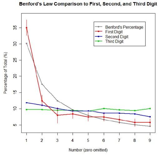
The goal was to show a simple yet informative demonstration of Benford’s Law. This law states that with most types of data, the leading digit is a 1 almost one-third of the time, with that probability decreasing as the digit (from 1 to 9) increases. That is, rather than the probability of being a leading digit being equal for each number 1 through 9 the probabilities range from about 30% (for a 1) to about a 4% (for a 9).
For the first graph, I wanted to show how quickly the law breaks down after the leading digit (that is, I wanted to see if the second and third digit distributions were more uniform). I took a set of 10,000 randomly generated numbers, took the first three digits of each number, and created a data set out of them. I then calculated the proportion of 1’s, 2’s, 3’s…9’s in each digit place and plotted them against Benford’s proposed proportions. Because it took me literally two hours to plot those stupid errors of estimate lines correctly (the vertical red ones), I just did them for the leading digit.
For the second graph, I took a data table from Wikipedia that listed the size of over 1,000 lakes in Minnesota (hooray for Wiki and their large data sets). I split the data so that I had only the first number of the size of the lakes, then calculated the proportion of each number. I left out the zeros for consistency’s sake. I did the same with the first 10,000 digits of pi, leaving out the zeros and counting each number as a single datum. I wanted to see, from the second graph, how Benford’s law applied to “real life” data and to a supposedly uniformly-distributed set of data (pi!).

Yes, this stuff is absolutely riveting to me. I had SO MUCH FUN doing this.

