RGuides Redux
So remember in August like two years ago when I put all my R stuff on a Google Sites page?
Turns out you can only view a Google Sites page if you have a Google account and are signed into it.
Which pretty much sucks.
So GoDaddy it is, then.
(In case anyone cares.)
R Guides
Heyyyyyyyyyyyyyyyyyyyyy wassup?
So in an effort to try to accumulate all the stuff I’ve written on how to use R, I’ve compiled it all and put it (or links to it) on a Google Sites page. I’m like 99% sure none of you care, but in case anyone stumbles upon this blog who DOES care about R, here are my reference guides and such.
More will be added soon!
Eulering
Heyyyyyyyyy, what’s up, fools?
So remember Project Euler, that site that has hundreds of programming challenge problems? Well, I haven’t had much time for it lately (blame school), but today I decided to log back in and see if there was a problem I could try. And I found one!
This is the problem:
Passcode derivation (Problem 79): A common security method used for online banking is to ask the user for three random characters from a passcode. For example, if the passcode was 531278, they may ask for the 2nd, 3rd, and 5th characters; the expected reply would be: 317.
The text file, keylog.txt, contains fifty successful login attempts.
Given that the three characters are always asked for in order, analyse the file so as to determine the shortest possible secret passcode of unknown length.
This is one that I was able to solve by hand pretty easily, but since it’s a coding challenge site, I figured I ought to give it a shot using R. It took me a bit to get my code just right (there was one particular thing I was trying to do and I couldn’t figure out how to do it in R, so I had to modify things a bit), but I finally got it right!
Anyway, I’m not going to share my code here (it’s discouraged to share solutions outside the problem forums, each of which can only be accessed once you’ve input the correct answer for a given problem), but I thought that this was a super interesting and fun question to try. It’s easy to do by hand, but in my opinion a bit harder to do with code.
If you like this type of stuff, try it out!
Also, happy birthday, mom!
R Stuff!!!!!1!!!!11one11!
HI GUYS!
I have something cool today. (Well, not really. It’s cool to me, at least, but that means absolutely nothing as far as it’s actual coolness goes. And it’s R code, so who knows if that is really anything interesting to any of you out there. It’s not even the code itself; I’m just showing the results. Whatevs, just read. Or don’t!).
Now that I’ve parentheticalled you all to death, here’s the story:
One of the ladies in the office next to ours is a second year Master’s and is working on her thesis. She has a lot of huge matrices of data and is doing a lot of the matrix construction in R. I don’t know her research very well or why she had to remedy this particular problem, but today she came to me with this question: she has a matrix that looks like this (this is just an example of the first few rows):

The columns p1 through p6 contain probabilities based on some distribution (I can’t remember which one, it was a weird one), the column u contains probabilities from a uniform distribution between 0 and 1, and the y column contains values based on properties of the other columns. For example, if the u probability is greater than p2 but smaller than p1 for a specific row, that row’s y value is 2. If the u probability for another row is greater than p4 but smaller than p5, that row’s y value is a 4. Things like that. The problem, though, is that because of the distribution from which the p1-p6 values are drawn, there are a lot more 1’s and 2’s in the resulting y column than there are 3’s, 4’s, 5’s, etc. So she wanted to know if there was an easy way to “even out” the distribution of the y numbers so that their frequencies are approximately equal (that is, there are about as many 1’s as 2’s, 2’s as 3’s, 3’s as 4’s, etc.) while still being initially based on the p1-p6 values.
Because of a few other stipulations, it took me awhile to work it out, but I finally got some code that did it! To test it, I wrote some other code that generated a matrix similar to hers:

Here are the frequencies of the numbers in the y column prior to applying my fixing code:

And after:
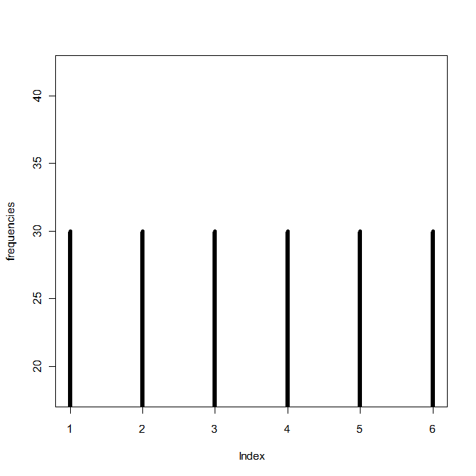
Yay! I hope it’s what she wanted.
More R stuff
HOLY CRAP I love teaching people R. My office mate Charles is wanting to learn so he’s been reading some books and picking up the basics, but he’s told me that a lot of the books he’s looked at are reasonable for the first few chapters and then start getting too hard too fast or explain things really counter-intuitively.
So today I spent ten minutes or so teaching him how to write functions in R and he said that the way I showed it to him was way easier to understand than how the books explained it.
So now I want to write a (new) R booklet thingy. I still have that one I wrote a few years ago, but that was before I knew loops/functions/shortcut-type stuff.
WOO, R!
This blog sponsored by…
I’m going to shamelessly plug some products/brands in this blog. Because I want to.
Actually, this was brought on by buying like seven pairs of headphones at the Moscow Walmart because they don’t have these headphones in Canada and they’re my absolute favorite.
So let’s start with those!
Claudia-Endorsed Product #1: Koss Headphones
Everyone knows (or at least you do now!) that I listen to music when I walk. I wear on-ear headphones because the little in-ear buds hurt after about 10 minutes and I can never get them placed in my ears so that they stay put when I’m moving around. I have a really good and expensive pair of on-ear Bose headphones back at home—they’re soft and noise reducing and have great sound—but I don’t usually like to wear them during my walks because I’m super rough on headphones and don’t want to break those.
Instead, I wear these:

Not only do these headphones only cost $4.88 at Walmart, but they have really, really good sound. They don’t sound like $5 headphones. They sound more like the Bose ones. Sure, they’re not nearly as durable and thus break more frequently (though I guess “frequently” is a relative term; I go through about 3 or 4 of these a year because I’m rough on headphones), but they’re cheap to replace. If you like on-ear headphones and don’t want to spend like $50+ on a good set, I’d recommend these, since the sound is still really, really good despite the low price. You can also order them from the Koss website.
Claudia-Endorsed Product #2: Saucony Kinvara Shoes
You knew my shoes had to be on here. I love my Kinvaras. Not only are they very comfortable (at least for my feet), but they are very, very durable little shoes. Note that I don’t run in them, I just walk, but I’d suspect that they’d endure running pretty well, too.
Here is my current Kinvara 5 pair next to my original Kinvara 3 pair. They both look holey and ratty as hell, right? That’s because I have at least 750 miles on the newer ones and 1,500 miles on the older ones.
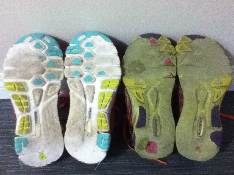
The older ones are still technically wearable, too. I bet I could go another 400 at least before the soles actually start wearing all the way through, haha. If you walk a lot or just want a pair of shoes that will last you a long time, try these out.
Claudia-Endorsed Product #3: L.L. Bean backpacks
I think I’ve gone through a total of four of these backpacks, and I’ve been using them ever since I was in first grade. Not only are they durable (I think I might be even harder on my backpacks than I am on my headphones), but they can hold a LOT of stuff and they’re pretty waterproof, too. Plus, you can get one in lime green. What’s not to like?
I had like five other things in mind, but I got distracted by R and now I can’t remember any of them.
OOH! R!
Claudia-Endorsed Product #4: R
I don’t know if this even counts as a product, but whatevs. R is a great statistical software package because a) it’s free, and b) it’s like SAS’s little brother who wants to be just like big brother SAS, but cheaper, because c) it’s free. So if you’re ever in need of some statistical analysis software and aren’t afraid of a little coding, go here and download R.
Idea
I have a good idea for a project! So remember that Project Euler website I mentioned a month (or so) ago? If you don’t, it’s a website that contains several hundred programming problems geared to people using a number of different programming languages, such as C, C++, Python, Mathematica, etc.
I was thinking today that while R is a language used by a small number of members of Project Euler, a lot of the problems seem much more difficult to do in R than in the more “general” programming languages like C++ and Java and the like. Which is fine, of course, if you’re up for a “non-R” type of challenge.
However, I was thinking it would be cool to design a set of problems specifically for R—like present an R user some problem that must be solved with multiple embedded loops…or show them some graph or picture and ask them to duplicate it as best they can…or ask them to write their own code that does the same thing as one of the built-in R functions.
Stuff like that. I’ve seen lots of R books, but none quite with that design.
I know that my office mate has been wanting to learn R but says that he learns a lot better when presented with a general problem—one that might be above his actual level of knowledge with R—and then allowed to just screw around and kind of self-teach as he figures it out.
Miiiiiiiight have to make this my first project of 2015.
Woo!
Ha
Idea: someone should make a pirate-themed R how-to book and call it R Matey. There would be a little cartoon parrot throughout giving little hints and tricks.
*squawk* “Close your brackets! Close your brackets!” *squawk*
Sleep deprivation is fun.
Conduct of Code
OH MY GOD this looks like fun.
From the site (and in case you don’t want to click the link for whatever reason): “Project Euler is a series of challenging mathematical/computer programming problems that will require more than just mathematical insights to solve. Although mathematics will help you arrive at elegant and efficient methods, the use of a computer and programming skills will be required to solve most problems. The motivation for starting Project Euler, and its continuation, is to provide a platform for the inquiring mind to delve into unfamiliar areas and learn new concepts in a fun and recreational context.”
The problems look fairly challenging (at least, challenging in R, which of course is my programming language of choice, I mean c’mon), but at least it will give me a good excuse to practice!
Edit: hahaha, I’ve done like five of them already. But the rest look super hard!
An Exploration of Crossword Puzzles (or, “How to Give Yourself Carpal Tunnel Syndrome in One Hour”)
Intro
Today I’m going to talk about a data analysis that I’ve wanted to do for at least three years now but have just finally gotten around to implementing it.
EXCITED?!
(Don’t be, it’s pretty boring.)
Everybody knows what a crossword puzzle looks like, right? It’s a square grid of cells, and for each cell, it’s either blank, indicating that there will be a letter placed there at some point, or solid black, indicating no letter placement.
Riveting stuff so far!!!!!
Anyway, a few years back I got the idea that it would be interesting to examine a bunch of crossword puzzles and see what cells were more prone to be blacked out and what cells were more prone to being “letter” cells. So that’s what I finally got around to doing today!
Data and Data Collection
Due to not having a physical book of crossword puzzles at hand, I picked my sample of crosswords from Boatload Puzzles. Each puzzle I chose was 13 x 13 cells, and I decided on a sample size of n = 50 puzzles.
For each crossword puzzle, I created a 13 x 13 matrix of numbers. For any given cell, it was given the number 1 if it was a cell in which you could write a letter and the number 2* if it was a blacked out cell. I made an Excel sheet that matched the size/dimensions of the crossword puzzle and entered my data that way. I utilized the super-handy program Peek Through, which allowed me to actually overlay the Excel spreadsheet and see through it so I could type the numbers accurately. Screenshot:
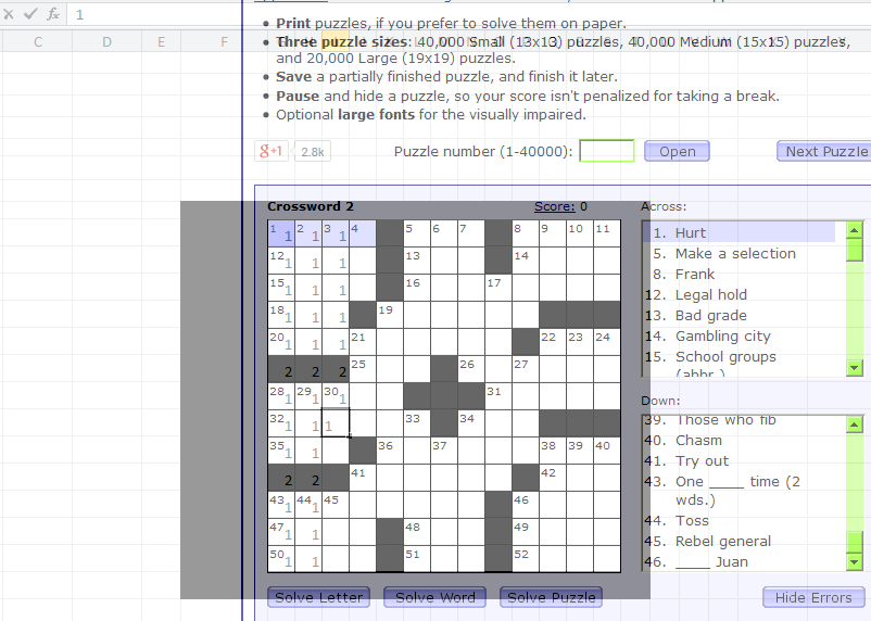
Again, I did this for 50 crossword puzzles total, making a master 650 x 13 matrix of data. Considering I collected all the data in about an hour, my wrists were not happy.
Method and Analysis
To analyze the data, what I wanted to do was to create a single 13 x 13 matrix that would contain the “counts” for each cell. For example, for the first cell in the first column, this new matrix would display how many crosswords out of the 50 sampled for which this first cell was a cell in which you could write a letter. I recoded the data so that letter cells continued to be labeled with a 1, but blacked-out cells were labeled with a zero.
I wrote the following code in R to take my data, run it through a few loops, extract the individual cell counts across all 50 matrices, and store them as sums in the final 13 x 13 matrix.
x=read.table('clipboard', header = F)

#converts 2's into 0's for black spaces; leaves 1's alone
for (y in 1:650) {
  for (z in 1:13){
    if (x[y,z] == 2) {
       x[y,z] = 0
 }}}

attach(x)  #new x with recoded 0's and 1's

n = (as.matrix(dim(x))[1,])/13  #gives number of puzzles in dataset
bigx = matrix(rep(NaN, 169), nrow = 13, ncol = 13) #big matrix for sums

hold=rep(NaN, n) #create blank "hold" vector

for (r in 1:13) {
  for (k in 1:13) {
    hold = rep(NaN, n) #clear "hold" from previous loop
      for (i in 0:n) {
        if (i < n) {
        hold[i+1] = x[(i*13)+r,k] #every first entry in first row
    }}
    bigx[r,k] = sum(hold) #fill (r,k)th cell with # of white spaces
  }}
Then I made a picture!
library(gplots)
ax = c(1:13)
ay = c(13:1)
par(pty = "s")
image(x = 1:13, y = 1:13, z = bigx, col = colorpanel((50-25), "black", "white"),
 axes = FALSE, frame.plot = TRUE,
 main = "Letter vs. Non-Letter Cells in 50 13x13 Crossword Puzzles",
 xlab = "Column", ylab = "Row")
axis(1, 1:13, labels = ax, las = 1)
axis(2, 1:13, labels = ay, las = 2)
box()

#optional gridlines
divs = seq(.5,13.5,by=1)
abline(h=divs)
abline(v=divs)
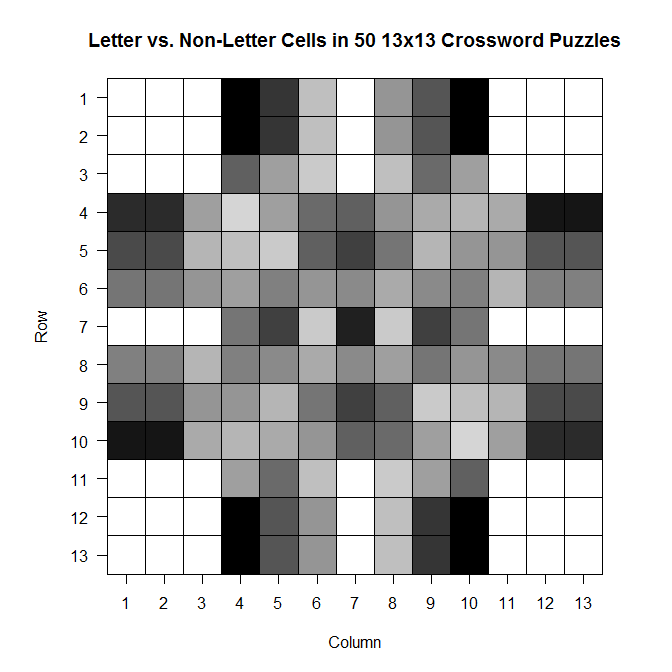
The darker a cell is, the more frequently it is a blacked out cell across those 50 sample crosswords; the lighter a cell is, the more frequently it is a cell in which you write a letter.
And while it’s not super appropriate here (since we’ve got discrete values, not continuous ones), the filled contour version is, in my opinion, much prettier:
library(gplots)
filled.contour(bigx, frame.plot = FALSE, plot.axes = {},
col = colorpanel((max(bigx)-min(bigx))*2, "black", "white"))
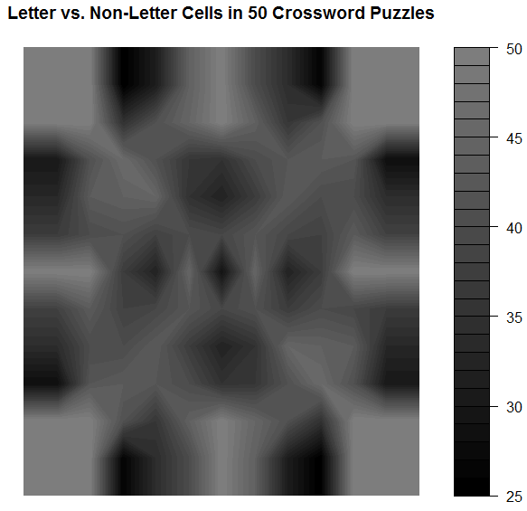
Note that the key goes from 25 to 50–those numbers represent the number of crosswords out of 50 for which a given cell was a cell that could be filled with a letter.
Comments
It’s so symmetric!! Actually, when I was testing the code to see if it was actually doing what I wanted it to be doing, I did so using a sample of only 10 crosswords. The symmetry was much less prominent then, which leads me to wonder that if I increased n, would we eventually get to the point where the plot would look perfectly symmetric?
Also: I think it would be interesting to do this for crosswords of different difficulty (all the ones on Boatload Puzzles were about the same difficulty, or at least weren’t labeled as different difficulties) or for crosswords from different sources. Maybe puzzles from the NYT have a different average layout than the puzzles from the Argonaut.
WOO!
*I chose 1 and 2 for convenience; I was doing most of this on my laptop and didn’t want to reach across from 1 to 0 when entering the data. As you see in the code, I just made it so the 2’s were changed to 0’s.
Plotting
Aalskdfsdlhfgdsgh, this is super cool.
Today in probability we were talking about the binary expansion of decimal fractions—in particular, those in the interval [0,1).
Q: WTF is the binary expansion of a decimal fraction?
A: If you know about binary in general, you know that to convert a decimal number like 350 to binary, you have to convert it to 0’s and 1’s based on a base-2 system (20, 21, 22, 23, 24, …). So 350 = 28 + (0*27) + 26 + (0*25) + 24 + 23 + 22 + 21 + (0*20) = 101011110 (1’s for all the “used” 2k’s and 0’s for all the “unused” 2k’s).
It’s the same thing for fractions, except now the 2k’s are 2-k‘s: 1/21, 1/22, 1/23, …).
So let’s take 5/8 as an example fraction we wish to convert to binary. 5/8 = 1/21 + (0*1/22) + 1/23, so in binary, 5/8 = 101. Easy!*
So we used this idea of binary expansion to talk about the Strong Law of Large Numbers for the continuous case (rather than the discrete case, which we’d talked about last week), but then we did the following:

where x = 0.x1 x2 x3 x4… is the unique binary expansion of x containing an infinite number of zeros.
Dr. Chen asked us to, as an exercise, plot γ1(x), γ2(x), and γ3(x) for all x in [0,1). That is, plot what the first, second, and third binary values look like (using the indicator function above) for all decimal fractions in [0,1).
We could do this by hand (it wasn’t something we had to turn in), but I’m obsessive and weird, so I decided to write some R code to do it for me (and to confirm what I got by hand)!
Code:
x = seq(0, 1, by = .0001)
x = sort(x)
n = length(x)
y = matrix(NaN, n)
z = matrix(NaN, n)
bi = matrix(NaN, n, nrow=n, ncol=3)

for (i in 1:n) {
   pos1 = trunc(x[i]*2)
   if (pos1 == 0) {
      bi[i,1] = 1
      y[i] = x[i]*2
      }
   else if (pos1 == 1) {
      bi[i,1] = -1
      y[i] = -1*(1-(x[i]*2))
      }
   pos2 = trunc(y[i]*2)
   if (pos2 == 0) {
      bi[i,2] = 1
      z[i] = y[i]*2
      }
   else if (pos2 == 1) {
      bi[i,2] = -1
      z[i] = -1*(1-(y[i]*2))
      }
   pos3 = trunc(z[i]*2)
   if (pos3 == 0) {
      bi[i,3] = 1
      }
   else if (pos3 == 1) {
      bi[i,3] = -1
      }
   }

bin = cbind(x,bi)
bin = as.matrix(bin)
plot(bin[,1],bin[,2],  type = 'p', col = 'black', lwd = 7,
     ylim = c(-1, 1), xlim = c(0, 1), xlab = "Value",
     ylab = "Indicator Value",
     main = "Indicator Value vs. Value on [0,1) Interval")
lines(bin[,1],bin[,3], type='p', lwd = 4, col='green')
lines(bin[,1],bin[,4], type='p', lwd = .25, col='red')
Results:

(black is 1/2, green is 1/4, red is 1/8)
I tried to make the plot readable so that you could see the overlaps. Not sure if it works.
Makes sense, though. Until you get to ½, you can’t have a 1 in that first expansion place, since 1 represents the value 1/21. Once you get past ½, you need that 1 in the first expansion place. Same things with 1/22 and 1/23.
SUPER COOL!
(I love R.)
*Note that this binary expression is not unique. All the work we did in class was done under the assumption that we were using the expressions that had an infinite number of zeroes rather than an infinite number of ones.
WISSJDFSLHGHDKSHR
I’m so totally in flail mode right now. Happy flail mode.
I have a grad student working for me (because there’s like 150 students in my section). That’s beyond creepy to me.
AND, while I was making the syllabus this afternoon, I realized that the grad student working for me is also the TA for the SAS programming class I’m taking. I have that class later in the day on Tuesday/Thursday after I lecture. That’s hilarious.
Edit: dude. I just realized…I GET TO TEACH THEM R.
Edit 2: my TA is the Joe Vandal twin that got jellyfish-mauled in Hawaii when we all went down there for the game.
[insert more flailing]
Adventures in R: Decisions, Decisions, Decisions!
Hokay. So. Here’s the earth. Here’s what’s going down at work:
My boss put me in charge of writing up all these instructions for the ten or so AT programs that are used at Pima Community College. These programs make text/images/etc. on the computer accessible for students who need something to help them learn, be that need from a physical disability (low-vision, blindness, etc.), a learning disability, or some other such thing. These programs can do a lot of things: read text aloud on the computer, enhance displayed text so that it’s easier to read (magnification, color change, background color change, etc.), highlight individual words as their read…things like that.
Cool, huh?
It turns out, though, that of the twelve or so general features we utilize from these programs, each of the programs is able to different things. For example, a person using FS Reader will only able to change voice speed and magnify the screen, whereas a person using Kurzweil 1000 will pretty much be able to alter the visual and spoken text any way they wish.
The problem with this program diversity is that it makes it fairly difficult to help students choose which program is best for them—especially considering you have to keep track of ten different programs, some of which change with each software update.
So one of my tasks at work has been to make some sort of visualization that shows which programs have which features.
Which has turned out to be a more arduous task than first thought. Mainly because it’s difficult to include both the “reading features” (those related to the text-to-speech) and the “visualization features” (those related to how the text can be manipulated on screen).
The most “uncomplicated” visual I could do for the reading features was this pyramid thingy (even a regular flowchart looked horrible).

You don’t want to see the pictures for the visualization features. They’re horrible. There are twelve main features and no two programs have the same features. As you can probably guess, the pyramid looks like somebody vomited words everywhere and the flowchart looks…well, even worse.
My boss finally told me not to worry about a visualization for the features just yet, but I wanted to see if there was a way that I (with my lack of programming skills in everything but R) could make some sort of automatic “decision maker” that would spit out the appropriate program(s) if a user input what features they required.
So what did I, with my lack of programming skills in everything but R, use to do this?
R!
It took like four days, too. Either I’m a moron and over-thought this waaaay too much or it really is this complicated to implement in R.
Either way, here we go:
I wanted to make it so that someone wanting to figure out what AT program they needed could just input a binary YES/NO for each of the four reading options, copy this info in to R, and automatically get an output telling them what they could use. So I made this little Excel thing (click to enlarge, as always).

Next, I had to figure out a way to program my R function so that it would spit out the appropriate program for the given input (e.g., if I needed all four reading features, it would only show me Adobe Reader, EasyReader, Kurzweil and MAGic). This part wasn’t that big of a deal. But when I wanted to also make it possible for the function to spit out the appropriate program for ALL levels of customization (like if I wanted just voice speed to be editable, the function would give me ALL programs as options, not just FS Reader), things got a bit more difficult.
So I finally just made a code that included what to output for all possible combinations of the four reading features.
tellme <- function(x,print=TRUE)
{ A=sum(x[,1])==1
B=sum(x[,2])==1
C=sum(x[,3])==1
D=sum(x[,4])==1
E=(sum(x[,1])==1)&&(sum(x[,2])==1)
F=(sum(x[,1])==1)&&(sum(x[,3])==1)
G=(sum(x[,1])==1)&&(sum(x[,4])==1)
H=(sum(x[,2])==1)&&(sum(x[,3])==1)
I=(sum(x[,2])==1)&&(sum(x[,4])==1)
J=(sum(x[,1])==1)&&(sum(x[,2])==1)&&(sum(x[,3])==1)
K=(sum(x[,1])==1)&&(sum(x[,2])==1)&&(sum(x[,4])==1)
L=(sum(x[,1])==1)&&(sum(x[,3])==1)&&(sum(x[,4])==1)
M=(sum(x[,2])==1)&&(sum(x[,3])==1)&&(sum(x[,4])==1)
N=(sum(x[,1])==1)&&(sum(x[,2])==1)&&(sum(x[,3])==1)
&&(sum(x[,4])==1)
O=(sum(x[,3])==1)&&(sum(x[,4])==1)
if (A==TRUE)
{FSReader="YES"}
 else if (A==FALSE)
{FSReader="NO"}
if (A==TRUE|B==TRUE|E==TRUE)
{NaturalReader="YES"}
else if (C==TRUE|D==TRUE|F==TRUE|G==TRUE|H==TRUE|
I==TRUE|J==TRUE|K==TRUE|L==TRUE|M==TRUE|N==TRUE)
 {NaturalReader="NO"}
if (A==TRUE|B==TRUE|C==TRUE|E==TRUE|F==TRUE|H==TRUE)
{WYNN="YES"}
else if (D==TRUE|G==TRUE|I==TRUE|J==TRUE|K==TRUE|L==TRUE|
M==TRUE|N==TRUE)
{WYNN="NO"}
if (A==TRUE|B==TRUE|C==TRUE|D==TRUE|E==TRUE|F==TRUE|
G==TRUE|H==TRUE|I==TRUE|J==TRUE|K==TRUE|L==TRUE|
M==TRUE|N==TRUE)
{AdobeReader="YES"
 EasyReader="YES"
Kurzweil1000="YES"
MAGic="YES"}
else if (C==TRUE|D==TRUE|F==TRUE|G==TRUE|H==TRUE|I==TRUE|
J==TRUE|K==TRUE|L==TRUE|M==TRUE|N==TRUE)
{AdobeReader="NO"
EasyReader="NO"
Kurzweil1000="NO"
MAGic="NO"}
result <- rbind(FSReader, NaturalReader, WYNN, AdobeReader,
EasyReader, Kurzweil1000, MAGic)
return(result)
}
It’s still way too complicated for my taste; I was going to do it with the visualization features, but there are eight of those features and considering I had to do 16 different combinations just for the four reading features, I figured I’d hold off on the visualization features until I get a more streamlined code going for this project.
But check this noise:
Let’s say I was a student who needed to figure out what program(s) I could use based on my needs. I go to this little Excel check box thingy I made and select Voice Speed, Voice Profile, and Volume Control as the three things I need to be able to change.
I copy this info onto the clipboard and run the code in R. This is what it tells me:
FSReader      "NO"
NaturalReader "NO"
WYNN          "YES"
AdobeReader   "YES"
EasyReader    "YES"
Kurzweil1000  "YES"
MAGic         "YES"
Cool, huh?
What if I only needed to be able to change the Voice Profile?
FSReader      "NO"
NaturalReader "YES"
WYNN          "YES"
AdobeReader   "YES"
EasyReader    "YES"
Kurzweil1000  "YES"
MAGic         "YES"
Yay!
Next mission: to make it better!
Benford’s Law? More like Benford’s LOL
Okay, today’s going to be a quick little blog ‘cause I’m busy trying to organize/transfer/protect from any possible massive hard drive failures my music library. It’s stressing me out.
While I was working on the “References” section of a textbook today at work, I noticed a pattern that I’ve come in contact with several times: there appeared to be a lot more “entries” that started with a letter from the first half of the alphabet (A – M) rather than the latter half (N – Z). I’ve done at least one other analysis regarding this topic, but I decided to do another slightly different one to see if it applied in this case.
QUESTION OF INTEREST
So what is Benford’s Law? For those of you who don’t want to click the link (lazy fools!), Benford’s Law states that with most types of data, the leading digit is a 1 almost one-third of the time, with that probability decreasing as the digit (from 1 to 9) increases. That is, rather than the probability of being a leading digit being equal for each number 1 through 9, the probabilities range from about 30% (for a 1) to about a 4% (for a 9).
What I want to see is this: is there a “Benford’s Law” type phenomenon for the letters of the alphabet? That is, do letters in the first half of the alphabet appear as the first letter of words more often than letters in the latter half of the alphabet?
HYPOTHESIS
In a given set of random words, a greater number of words will start with a letter between A and M than with a letter between N and Z.
METHOD
Using this awesome little utility, I generated (approximately) 5,000 words each from The Bible, Great Expectations, and The Hitchhiker’s Guide to the Galaxy. I then counted how many words there were starting with A, how many words there were starting with B, and so on for each letter of the alphabet.
I then did two other breakdowns of the letters:
A) I divided the alphabet in half (A – M and N – Z) and counted the total number of words for each group.
B) In order to “mirror” a sort of Benford’s Law type of structure, I divided the 26 letters into nine groups (eight groups of three letters each, one group of two letters). I wanted to make a similar breakdown of groups to the nine numbers that Benford’s Law applies to, just to see if that sort of arbitrary screwing around did anything. Visualization ‘cause I suck at explaining stuff when I’m in a hurry:

Kay? Kay.
RESULTS
I made charts!
By letter:

By “half of the alphabet” in what is probably the most worthless visual ever:

By semi-arbitrary group (dark blue) with Benford’s percentages by number (light blue) for comparison:

DISCUSSION
Well, that whole thing sucked. Okay, so obviously it’s not a perfect pattern match and I didn’t do any stats (I WAS IN A HURRY) to see whether there was any statistical significance or anything, but it was fun to screw around with for an hour or so. I wonder how different the results would be (if at all) if I were to use truly random words from the English language, not just random words selected out of three works of fiction. Perhaps material for a later blog…?
END!
Adventures in R: Creating a Pseudo-CDF Plot for Binary Data
(Alternate title: “Ha, I’m Dumb”)
(Alternate alternate title: “Skip This if Statistics Bore You”)
You may recall a few days ago during one of my Blog Stats blogs I mentioned the problem of creating a cumulative distribution function-type plot for binary data, which would show the cumulative number of times one of the two binary variables occurred over some duration of another variable.
Um, let’s go to the actual example, ‘cause that description sucked.
Let’s say I have two variables called Blogs and Images for a set of data for which N = 2193. The variable Blogs gives the blog number for each post, so it runs from 1 to 2193. The variable Images is a binary variable and is coded 0 if the blog in question contains no image(s) and 1 if the blog contains 1 or more images.
Simple enough, right?
So what I was trying to do was create an easy-to-interpret visual that would show the increase in the cumulative number of blogs containing images over time, where time was measured by the Blogs variable.
Not being ultra well-versed in the world of visually representing binary data, this was the best I could come up with in the heat of the analysis:

If you take a look at the y-axis, it becomes clear that due to the coding, the Images variable could only either equal 0 or 1. When it equaled 1, this plot drew a vertical black line at the spot on the x-axis that matched the corresponding Blogs variable. It’s not the worst graph (and if you scan it at the grocery store, you’ll probably end up with a bag of Fritos or something), but it’s not the easiest-to-interpret graph on the planet either, now is it?
What I was really looking for was some sort of cumulative distribution function (CDF) plot, but for binary data. I like how Wiki puts it: “Intuitively, [the CDF] is the “area so far” function of the probability distribution.” As you move right on the x-axis, the CDF curve lines up with the probability (given on the y-axis) that the variable, at that point on the x-axis, is less than or equal to the value indicated by the curve. Assuming your y-axis is set for probability (mine isn’t, but it’s still easy to interpret). This is all well and good for well-behaving ratio data, but what happens if I want to do such a plot for a dichotomously-coded variable?
There were two ways to go about this:
1) Be a spazz and write some R code to get it done, or
2) Be an anti-spazz and look up if anybody’s written some R code to get it done.
I originally wanted to do A, which I did, but B was actually a lot harder than it should have been.
Let’s look at A first. I wanted to plot the number of surveys containing images against time, measured by the Blogs variable. Since I coded blogs containing images as 1 and blogs not containing images as 0, all I needed to get R to do was spit out a list of the cumulative sum of the Images variable at each instance of the Blogs variable (so a total of 2193 sums). Then plot it.
R and I have a…history when it comes to me attempting to write “for” loops. But it finally worked this time. I’ll just give you that little segment, ‘cause the rest of the code’s for the plotting parameters and too long/bothersome to throw on here.
for (m in (1:length(ximage))){
newimage=ximage[1:m]
xnew=sum(newimage)
t=cbind(m,xnew)
points(t,type="h",pch="1")
}
ximage is the name of the vector containing the coded Images variable. So what this little “for” loop does is create a new variable (newimage) for every vector length between 1 and 2193 instances of the Images variable. Another new variable (xnew) calculated the sum of 1s in each newimage. t combines the Blogs number (1 through 2193) with the matching xnew. Finally, the points of t are plotted (on a pre-created blank plot).
So. Wanna see?

Woo!
So I actually figured this out on Wednesday, but I didn’t blog about it because I wanted to see if I could find a function that already does what I wanted. Why did it take an extra three days to find it? Because I couldn’t for the life of me figure out what that type of plot was called. It’s not a true CDF because it’s not a continuous variable we’re dealing with. But after obsessively searching (this is the reason for the alternate title—I should have known what this type of plot was called), I finally found a (very, very simple) function that makes what this is: a cumulative frequency graph (I know, I know, duh, right?).
So here’s the miniscule little bit of code needed to do what I did:
cumfreq=cumsum(ximage)
plot(cumfreq, type="h")
The built-in function (it was even in the damn base package. SHAME, Claudia, SHAME!!) cumsum gives a vector of the sum at each instance of ximage; plotting that makes the exact same graph as my code (except I manually fancied up my axes in my code).

Cool, eh?
Maybe I’ll post my full code once I make it uncustomized to this particular problem.
This Week’s Science Blog: Prime Suspects
Okay, so this is a result of my efforts to complete “Partying with the Primes: Part II” (see this blog for explanation. Or just scroll down a few days). Because I knew trying to get R to output some sort of number spiral would be quite an arduous task, I first decided to do a few more elementary visualizations of the primes. My first attempt led to today’s science blog.
Question: is there any sort of pattern to the spacing of prime numbers? That is, is there any sort of predictive sequence that demonstrates that the primes are “evenly spaced” (or not) amongst the other numbers?
I’d done a little bit of research on this topic prior to today, due to my 2009 NaNo (haha, we keep coming back to that, don’t we?), but it had been awhile, so I did a little bit more reading and came up with a few good sources to check out: here, here, and here.
Specifically, Zagier’s comment stood out to me: “there are two facts about the distribution of prime numbers of which I hope to convince you so overwhelmingly that they will be permanently engraved in your hearts. The first is that, despite their simple definition and role as the building blocks of the natural numbers, the prime numbers grow like weeds among the natural numbers, seeming to obey no other law than that of chance, and nobody can predict where the next one will sprout. The second fact is even more astonishing, for it states just the opposite: that the prime numbers exhibit stunning regularity, that there are laws governing their behavior, and that they obey these laws with almost military precision.”
So what’s a good way to visualize this stuff? My first attempt involved coding all prime numbers as “1” and all non-prime numbers as “0” and then plotting the results with 0 and 1 on the y-axis and the actual numbers (1 through whatever the highest number I chose was…I think it was 1,000), but that was a horrible mess of jagged lines and insanity, so I scrapped that and tried to think of a better way of looking at it.
In the end, I decided the best way to examine the instances of prime numbers amongst the non-primes was to plot the numbers by the numbers themselves. That is, for a given sequence of numbers (say, 1 through 10, just to make the explanation simpler) I would repeat each number by that number itself, create a new vector containing these numbers, and then plot the result.
Defunct code for better understanding:
RepPrime=function(j) {
return (rep(j,j))
}
This function says that for any number j in a given set of numbers (again, let’s say 1:10), output that number j times. So if I had the number 7, this function would give me a vector [7 7 7 7 7 7 7]’, or 7 repeated seven times. And if I ran it for all numbers 1 through 10, I’d get the vector
[1 2 2 3 3 3 4 4 4 4 5 5 5 5 5 6 6 6 6 6 6 7 7 7 7 7 7 7 8 8 8 8 8 8 8 8 9 9 9 9 9 9 9 9 9 10 10 10 10 10 10 10 10 10 10]’.
Of course, I couldn’t get this function to work but after screwing around a little bit more I finally figured out how to get this to work for larger sets of numbers, including sets just containing primes.
But what would plotting vectors like this reveal about any prevalence patterns for the primes? Well, let’s look at the plot for all numbers, shall we?
This plot is for all numbers from 1 to 1,000.

It’s pretty! Nice and smooth. So this can be said to be a plot for numbers that have a uniform or consistent pattern (all instances in this case occur one number apart, just because there’s one number difference between each instance; such is the nature of just listing the numbers 1 through 1,000).
Okay, that’s cool. So how about we look at a case where instances occur more “randomly?” In this case, I took a list of the numbers 1 through 1,000 and then went through and haphazardly deleted single numbers or large chunks of numbers so that I was left with a list that appeared to have numbers omitted at random.
Plot!

Much choppier, eh? This can be said, then, to be a plot pattern for numbers that have an inconsistent or random pattern of deletion.
So what would a plot of the primes—say, all the primes below 5,000—look like?
THIS!

So it’s obvious that this plot looks a lot more like the plot for numbers 1:1,000 and less like the plot involving random deletion. Interesting…I’d like to see what goes on with much larger primes, but unfortunately I can’t do that due to how huge the resulting vectors would be. R + large datasets = trouble.
Woo!
Partying with Primes: Part I
HI PEOPLE!
So I was doing my usual surfing the internets via StumbleUpon and came across an R-Bloggers post about using R to determine the primality of any given number. The code for doing so is somewhat long and I’d like to take more time to study it and see if I could come up with my own code for determining primality, but today I was too excited to do so and instead wanted to focus on actually using the code instead.
Perhaps those readers who dig math have heard of the Ulam spiral, a method of visualizing the prime numbers in relation to the non-primes (I’m having flashback’s to NaNoWriMo 2009’s topic and therefore keep having to backspace to not capitalize “prime” and “non-prime,” haha). Developed by Stanislaw Ulam in 1963, the spiral shows a pattern indicating that certain quadratic polynomials tend to generate prime numbers. Check out the Wiki, it’s a super fascinating thing.
Anyway, ever since I’d heard of the Ulam spiral, I’ve always thought of other possible patterns or trends that may exist with respect to the primes. Could other possible patterns arise if we just “arrange” numbers in other ways? Ulam used a spiral. What other “shapes” might produce patterns?
Thus begins Part I of my mission to make pretty number patterns and see what happens! (Though I must admit that Part I is rather boring, as it just consists of me using the code on R-Bloggers).
Anyway, let’s organize this noise:
Part I: write a new function that applies R-Bloggers IsPrime() function to any given vector of numbers, say one that contains the numbers 1 through 100 (just as a start, obviously, we can extend this to much larger vectors because math rules and R is like a mental sex toy). Make sure this new function is able to output a binary response—a 0 for any non-prime and a 1 for any prime. This will allow for easy visualization once we get to that point.
Part II: Brainstorm possible pattern ideas for numbers. Figure out how in the hell to program R to output a number spiral, among other fun shapes. Use excel cells as a means by which to make the actual visualizations.
Part III: Try not to lose sanity while attempting to bend R’s base graphics to your will in order to plot said patterns without having to resort to Excel.
Part IV: Now that the work is done, actually take a step back and see if anything came of these fun experiments.
Part V: RED BULL!
Today was Part I, so I really don’t have anything special to show you guys. But next time will be fun, I promise!
30-Day Meme – Day 28: Say something to your 15 year old self.
Dear 15-Year-Old Claudia: your high school math teacher will be a jackass, but for the love of god, TAKE ALL THE MATH YOU CAN. You’ll love yourself later for it. Don’t be like the stupid 23-year-old version of yourself who quit after Algebra II (a class she totally rocked with a C-!). Tough it out, suffer through algebra, make it through trig, and ROCK OUT CALCULUS, YOU CAN SO TOTALLY DO CALCULUS. Then take all the math you can in college. You may not see it now (in fact you don’t, you see yourself right now as an artist with no need for college…this view won’t change until you’re like 19, by the way), but math and statistics are in your future. Remember back in elementary school when it was just you and two other super nerdy guys crammed in the janitor’s closet for the “advanced math” section? Remember that? Yeah, you know you can rock math. You just need to do it, yo. PRESS ON, WAYWARD HIGH SCHOOL FRESHMAN! You may feel directionless now, but that will so totally change.
See you in a few years!
Pretty R
I love R. This is an established fact in the universe. The only thing I love more than R is revising code I’ve written for it.
For my thesis, I had to make a metric ton of plots. For each scenario I ran, I ran it for seven different fit indices. I included plots for four of these indices for every scenario. With a total of 26 scenarios, that’s a grand total of 104 plots (and one of the reasons why my thesis was 217 pages long).
Normally, once I write code for something and know it works, I like to take the time to clean up the code so that it’s short, as self-explanatory as possible, and given notations in places where it’s not self-explanatory. In the case of my thesis, however, my goal was not “make pretty code” but rather “crap out as many of these plots as fast as possible.” Thus, rather than taking the time to write code that would basically automate the plot-making process and only force me to change one or two lines for each different plot and scenario, I basically made new code for each and every single plot.
In hindsight, I realize that probably cost me way more time than just sitting down and making a “template plot” code would have. In fact, I now know that it would have taken less time, as I have made it my project over the past few days to actually go back and create such code for a template plot that I could easily extend to all plots and all scenarios.
Side note: I’m going to be sharing code here, so if you have absolutely no interest in this at all, I suggest you stop reading now and skip down to today’s meme to conclude today’s blog.
This code is old code for a plot of the comparative fit index’s (CFI’s) behavior for a 1-factor model with eight indicators for an increasingly large omitted error correlation (for six different loading sizes; those are the colored lines). As you can see in the file, there are quite a few (okay, a lot) of lines “commented out,” as indicated by the pound signs in front of the lines of code. This is because for each chunk of code, I had to write a specific line for each of the different plots. Each of these customizing lines took quite awhile to get correct, as many of them refer to plotting the “λ = some number” labels at the correct coordinates as well as making sure the axis labels are accurate.
This other code, on the other hand, is one in which I need to change only the data file and the name of the y-axis. It’s a lot cleaner in the sense that there’s not a lot of messy commented out lines, lines are annotated regarding what they do, and—best of all—this took me maybe five hours to create but would make creating 104 plots so easy. Some of the aspects of “automating” plot-making were somewhat difficult to figure out, like making it so that the y-axis would be appropriately segmented labeled in all cases, and thus the code is still kind of messy in some places, but it’s a lot better than it was. Plus, now that I know that this shortened code works, I can go back in and make it even more simplified and streamlined.
Side-by-side comparison, old vs. new, respectively:

Yeah, I know it’s not perfect, but it’s pretty freaking good considering I have to change like two lines of the code to get it to do a plot for another fit index. Huzzah!
30-Day Meme – Day 17: An art piece (painting, drawing, sculpture, etc.) that is your favorite.
As much as I love Dali’s Persistence of Memory, I have to say that one of my favorite paintings is Piet Mondrian’s Composition with Red, Blue, and Yellow.

It’s ridiculously simple, but that’s what I like about it. There’s quite a lot of art I don’t “get” and I think Mondrian’s work may fall into that category. However, there’s something implicitly appealing about this to me. I love stuff that just uses primary colors and I really like squares/straight lines/structure. So I guess this is just a pretty culmination of all that.
Excuses, excuses! (or, “why Claudia sucks”)
Those of you who have been following my blog insanity for several years may remember this post, in which I analyzed pi to determine relative frequencies in the first million digits. I promised to analyze e in the same manner, but I haven’t done it yet. Know why? ‘Cause as much as I love R, R does not love large datasets. Obviously, 1 million individual digits is quite a large dataset.
Once I find a computer with SAS (that’s what I used for pi), I’ll do e. I promise.
Also, have some fun with logic.
“I find the most erotic part of a woman is the boobies”
I’m thinking of starting a separate blog solely for statistics-related stuff, particularly R and making pretty visualizations using R. Apart from actual analyses, one of my main interests in statistics is the actual presentation of data. I think the importance of how people are able to view data is entirely underrated. I’m still a major R novice, but the language allows for such detailed, gorgeous visualizations that I think I’d like to further explore stuff relating to that. Here is a fantastic website regarding this very thing.
I also want to redo my “Introduction to R” thingy I wrote last year and try to focus it for people in the social sciences who are weaning themselves off of the evil SPSS.
So huzzah for plans! The fact that I can think of things other than my thesis is a good, good feeling, my friends.
Every Time You Misinterpret a Confidence Interval, God Kills a Statistician
HI AGAIN!
So I’m liking WordPress. I’m liking it enough that I’ve started an entirely new blog dedicated to R. It’s right here. It, unlike this one, will actually kind of look professional and will not consist of my daily ramblings. Rather, it will contain info on using R as well as little tricks, ’cause we all know R can be a pain sometimes.
OH YEAH, I also found an old high school project of mine that revolved around quite a nice little dataset. My “statistics” back then were horrendous, so I’m thinking I might re-do the whole thing and post it up here. Plus my graphs were made in Excel and look terrible. That has to be remedied.
WOO SHORT BLOGS! School starts tomorrow, I’m stressed, deal with it.
You can’t spell “analysis” without “anal”
R: $0.00
Tinn-R: $0.00
Stats classes that taught me how to use R: $900.00
Grad school: $2,700.00/semester
Packs of gum to chew when nervous: $30.00
Amount of money I could have earned working in the time I’ve spent on this one figure manipulation (BC minimum wage style): $400.00
Figuring it out finally and, for once, not getting bitched out by my anyone: Priceless
There are some things money can’t buy. For everything else there’s banging your head against a brick wall until epiphany happens.
Today’s song: Palladio by Karl Jenkins
Blog 1,499: MySpace Hates My Blogs
So I totally forgot that I got a free webspace with my ISP up here, so I spent all night trying to figure out what to put on it. This is all I’ve got so far.
My intro to R guide’s on the “Statistics Stuff” page, if anyone who ever reads this is interested (doubtful).
Hm. I’d write more but my mind is elsewhere.
Today’s song: Apologize by OneRepublic
Hammer Time is the fifth dimension
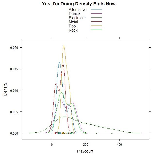
Woohoo, DENSITY PLOTS!
And guess what data I’m using?!
I took a few of the genres out because there were only one/two songs for them, but the remaining ones are all from my top 50. Bet you can guess which point is Sleepyhead.
ALSO THIS:
The most beautiful live performance I’ve ever seen. Thank you, StumbleUpon, for leading me to the song I downloaded yesterday, for it led me to this one.
Today’s song: Flightless Bird, American Mouth (Live) by Iron and Wine
Benford’s Law: The Project
Exploratory Data Analysis Project 3: Make a Pretty Graph in R (NOT as easy as it sounds)
Seriously, the code to make the graphs is longer than the code to extract the individual lists of digits from the random number vector.
Anyway.
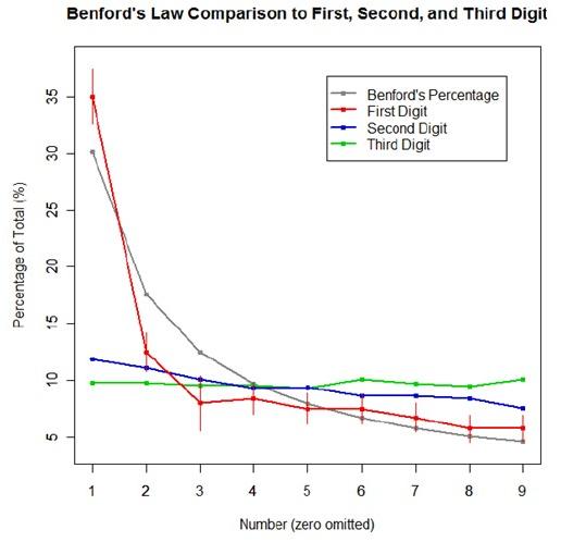
The goal was to show a simple yet informative demonstration of Benford’s Law. This law states that with most types of data, the leading digit is a 1 almost one-third of the time, with that probability decreasing as the digit (from 1 to 9) increases. That is, rather than the probability of being a leading digit being equal for each number 1 through 9 the probabilities range from about 30% (for a 1) to about a 4% (for a 9).
For the first graph, I wanted to show how quickly the law breaks down after the leading digit (that is, I wanted to see if the second and third digit distributions were more uniform). I took a set of 10,000 randomly generated numbers, took the first three digits of each number, and created a data set out of them. I then calculated the proportion of 1’s, 2’s, 3’s…9’s in each digit place and plotted them against Benford’s proposed proportions. Because it took me literally two hours to plot those stupid errors of estimate lines correctly (the vertical red ones), I just did them for the leading digit.
For the second graph, I took a data table from Wikipedia that listed the size of over 1,000 lakes in Minnesota (hooray for Wiki and their large data sets). I split the data so that I had only the first number of the size of the lakes, then calculated the proportion of each number. I left out the zeros for consistency’s sake. I did the same with the first 10,000 digits of pi, leaving out the zeros and counting each number as a single datum. I wanted to see, from the second graph, how Benford’s law applied to “real life” data and to a supposedly uniformly-distributed set of data (pi!).

Yes, this stuff is absolutely riveting to me. I had SO MUCH FUN doing this.

