An Analysis of Letters
So if you recall, not too long ago I analyzed whether the frequencies of letters in the English language change depending on the letter of the word. To do so, I gathered about 5,000 English words and compared the frequency distributions of the letters for the first five letters of the words. Click here to check that out if you haven’t already done so.
I’d wanted to go further into the words, but I didn’t have time/data to do so.
So that’s what I did today!
I pulled large samples of 4-, 5-, 6-, 7-, 8-, and 9-letter words from an online Scrabble dictionary*. For each sample, I went through and found the frequency distribution of the 26 letters of the alphabet for each letter place in the word (e.g., for the 4-letter words, I found the frequency distribution of the 26 letters for the first, second, third, and fourth place in the 4-letter word).
Because I think something like this is something that requires some sort of visual, I made a gif for each word size (4, 5, 6, 7, 8, 9 letters) that compares the letter frequency for each letter place in the word (in red) compared to the overall frequency of the letters in the entirety of the English language (grey). Check them all out and see if you notice a pattern as the gifs progress through the letter places in the words.
Four-letter words:
Five-letter words:

Six-letter words:

Seven-letter words:
Eight-letter words:
Nine-letter words:

Did you notice it? Regardless of word size, the letter frequencies were most different from the overall frequency in the English language near the beginning and end of the words. Near the “middle” of the words (like the fourth and fifth letters of the nine-letter words, for example), the letter frequencies best matched the overall frequency in the English language (that is, the red distribution best matched the grey distribution).
In addition to the graphical aspect, I of course worked this out with numbers. Like last time, I measured “error” as the absolute value of the total difference between the red and grey distributions for each letter of each word. This confirmed what the gifs show: the smallest error was always for the one or two letters in the “middle” of each word, regardless of size.
Pretty damn cool, huh?
FYI, the six gifs sync and “restart” at the same time every 2,520 frames, in case you’re one of those people who wonders about those types of things.
*Yes, I realize the use of a Scrabble dictionary skews the results a bit, considering that plurals are included in the dictionary as well (notice the “S” is really frequent for the last letter in all cases). But plurals are words, after all, so I figured I’d include them anyway. The pattern still exists anyway even if you omit the last letter from all gifs.
Do babies deprived of disco exhibit a failure to jive?
You know, sometimes the most “pointless” analyses turn up the coolest stuff.
Today I had…get ready for it…FREE TIME! So I decided to try analyzing a fairly large dataset using SAS (’cause SAS can handle large datasets better than R and because I need to practice my coding anyway).
I went here to get a list of the 5,000 most common words in the English language. What I wanted to do was answer the following questions:
1. What is the frequency distribution of letters looking at just the first letter of each word?
2. Does the distribution in (1) differ from the overall distribution in the whole of the English language?
3. Does either frequency distribution hold for the second letter, third letter, etc.?
LET’S DO THIS!
So the frequency distribution of characters for the first letter of words is well-established. Wiki, of course, has a whole section on it. Note that this distribution is markedly different than the distribution when you consider the frequency of character use overall.
I found practically the same thing with my sample of 5,000 words.
So this wasn’t really anything too exciting.
What I did next, though, was to look at the frequencies for the next four letters (so the second letter of a word, the third letter, the fourth, and the fifth).
Now obviously there were many words in the top 5,000 that weren’t five letters long. So with each additional letter I did lose some data. But I adjusted the comparative percentages so that any difference we saw weren’t due to the data loss.
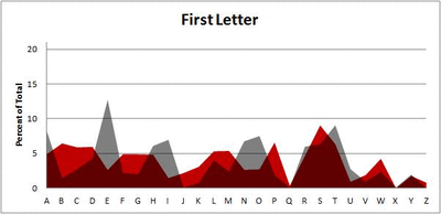
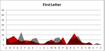
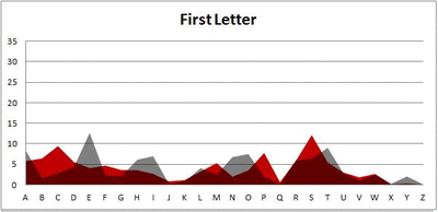
Anyway. So what I did was plot the “overall frequency” in grey—that is, the frequency of each letter in the whole of the English language—against the observed frequency in my sample of 5,000 words in red—again, for the first, second, third, fourth, and fifth letter of the word.
And what I found was actually really interesting. The further “into” a word we got, the closer the frequencies conformed to the overall frequency in the English language.
The x-axis is the letter (A=1, B=2,…Z=26). The y-axis is the number of instances out of a sample of 5,000 words. See how the red distribution gets closer in shape to the grey distribution as we move from the first to the fifth letter in the words? The “error”–the absolute value of the overall difference between the red and grey distributions–gets smaller with each further letter into the word.
I was going to go further into the words, but 1) I left my data at school and 2) I figured anyway that after five letters, I would find a substantial drop in data because there would be a much lower count of words that were 6+ letters long.
But anyway.
COOL, huh? It’s like a reverse Benford’s Law.*
*Edit: actually, now that I think about it, it’s not really a REVERSE Benford’s Law; as I found when I analyzed that pattern, it too rapidly disintegrated as we moved to the second and third digit in a given number and the frequency of the digits 0 – 9 conformed to the expected frequencies (1/10 each).
Artz n’ Letterz
So this is something I noticed a long time ago, but going through my playlists in iTunes this afternoon made the observation come to the forefront of my mind: when I sort my “Top Favorites” playlist by artist, I notice that a large amount of the songs (68%) are by artists whose names begin with a letter from the first half of the alphabet (A – M). When I sort my entire music library in this manner, I find the same proportion (okay, 67%…it’s pretty damn close). And you know what’s more interesting? If I sort by the TITLE of the song, I get the same proportion again! OOH, OOH, and sorting my freaking book list gives the same 67% as the music.
I find this quite fascinating. Has anyone else ever noticed this type of pattern in any of their things? It’s interesting to me that this 2:1 ratio keeps coming up. This requires exploration.
Hypothesis: this 2:1 ratio occurs because the first half of the alphabet contain more letters that appear more often as the first letters in English words.
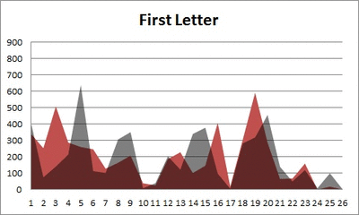
Method: utilizing letterfrequency.org, I found the list of the frequencies of the most common letters appearing as the 1st letter in English words*. I used this list as a ranking and, using a point-biserial correlation, correlated this ranking with a dichotomized list of the letters, in which letters in the first half of the alphabet were assigned a value of “0” and those in the second half of the alphabet were assigned a value of “1.”
Results: here are the two values being correlated alongside their respective letters:

Where the “X” column is ranking by the frequency of appearance as the first letter of a word and the “Y” column is a dichotomized ranking by alphabetical order. Point-biserial correlation necessary because one of the variables is dichotomous. So what were the results of the correlation? rpb = .20, p = .163.
Conclusion: well, the correlation isn’t statistically significant (p < .05) by a long shot, but I’ll interpret it anyway. A positive correlation in this case means that letters with the larger dichotomy value (in this case, those coded “1”) tend to also be those same letters with a “worse” (or higher-value) coding when ranked by frequency as the first letter in English words. So in plain English: there is a positive correlation between letters appearing in the second half of the alphabet and their infrequency as their appearance as the first letter in English words. In other words, letters appearing in the first half of the alphabet are more likely to appear as the first letter in English words. Not statistically more likely, but more likely.
Meh. Would have been cooler if the correlation were significant, but what are you going to do? Data are data.
*Q, V, X, and Z were not listed in the ranking, but given the letters, I assume that they were so infrequent as first letters that they were all at the “bottom.” Therefore, that is where I put them.

