Oh my god there are people out there like me!
LOOK!
I have SO MANY BACKUPS of my nonsense, you have no idea. I have backups on flash drives. On hard drives. Three different computers. In clouds. In my email. In my other email. Google Drive. I carry three of the backups with me. I carry a separate one when I run. I keep one in my office. I keep one in the FREAKING UNITED STATES. I keep one in our safe.
I got the backups, let’s just put it that way.
I’m also a big proponent of physical copies of things if you can get them or make them; that’s the main reason I’m printing all my old blogs. They’re a huge part of my life and I’d be so sad if I ever lost them.
Anyway.
Want Some Data?
Hello again, all.
So it occurred to me that I have thousands of data points in the form of my walking data that I haven’t shared in any form other than yearly summaries and graphs.
So I’ve decided to post a link to my entire Excel file of walking data since moving to Calgary. You know, for anyone who needs data or wants to analyze it or who just thinks I’m making it all up.*
So here ya go! Nerd it up.
*I’m not. Do you know how lazy I am? It would take a lot of effort to realistically fake that much data.
Hee
Haha, this is a well-done music video.
And have another totally unrelated one, because for some reason I was thinking about this music video a while ago and just decided to look it up again.
Data Dump
Holy crapples, I just found the best place for big datasets from online personality tests.
Sample sizes in the ten thousands? WHAT IS THIS NONSENSE
I’m not too concerned about the accuracy, really; it’s data that would be useful for my weekly stats examples. And just screwing around with R.
‘Cause I like that.
Anyway.
Geometry is for Squares
(Note: this has nothing to do with geometry.)
God I love stats.
A lot of the time it seems like the visual representation of data is sacrificed for the actual numerical analyses—be they summary statistics, ANOVAs, factor analyses, whatever. We seem to overlook the importance of “pretty pictures” when it comes to interpreting our data.
This is bad.
One of the first statisticians to recognize this issue and bring it into the spotlight was Francis Anscombe, an Englishman working in the early 1900s. Anscombe was especially interested in regression—particularly in the idea of how outliers can have a nasty effect on an overall regression analysis.
In fact, Anscombe was so interested in the idea of outliers and of differently-shaped data in general, he created what is known today as Anscombe’s quartet.
No, it’s not a vocal quartet who sings about stats (note to self: make this happen). It is in fact a set of four different datasets, each with the same mean, the same variance, the same correlation between the x and y points, and the same regression line equation.
From Wiki:
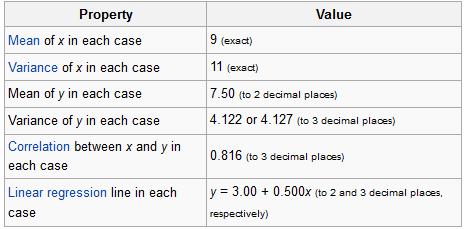
So what’s different between these datasets? Take a look at these plots:

See how nutso crazy different all those datasets look? They all have the same freaking means/variances/correlations/regression lines.
If this doesn’t emphasize the importance of graphing your data, I don’t know what does.
I mean seriously. What if your x and y variables were “amount of reinforced carbon used in the space shuttle heat shield” and “maximum temperature the heat shield can withstand,” respectively Plots 2 and 3 would mean TOTALLY DIFFERENT THINGS for the amount of carbon that would work best.
So yeah. Graph your data, you spazmeisters.
GOD I LOVE STATS.
Dicking around with Data
I have my first ounce of legitimate free time today and what do I do with it?
“I GOTTA ANALYZE SOME DATA!”
Today’s feature: analyzing Nobel laureates by birth dates.
Nobel Prizes are awarded for achievement in six different categories: physics, chemistry, physiology/medicine, literature, peace, and economic sciences. Thus far, there have been 863 prizes awarded to individuals and organizations.
The Nobel website has a bunch of facts on their laureates, including a database where you can search by birthday. So because I’m me and I like to analyze the most pointless stuff possible, here’s what today’s little flirtation with association entails:
1. Does the birth month of the laureate relate in any way to the category of the award (chem, medicine, etc.)?
2. Does the zodiac sign of the laureate in any way to the category of the award?
Vroom, vroom! Let’s do it.
Pre-Analysis: Examining the data
So I should preface this. I decided, upon inspecting the observed contingency table comparing Birth Month and Award Category, to drop the Economics prize altogether. I calculated that the expected cell counts would be very small (because the Economics category is actually the newest Nobel category); such small cell counts would totally throw the chi-square test. So we’re stuck with the other five categories for our analysis.
Question 1: Relation of birth month to award category
Treating Birth Month as a categorical variable (with categories January – December) and Award Category as another categorical variable (with categories equal to the six award categories), I performed a chi-square test to examine if there is an association between the two categories.
Results: χ2 (45)= 81.334, p = 0.0007345. This suggests, using a critical value of .05, that there is a significant relationship between birth month and award category.
Examining the contingency table again (which I’d post here but it’s being a bitch and won’t format correctly, so I’m just going to list what I see):
- Those born in the summer months (June – August) and the months of late fall (October, November) tend to own the Peace and Literature prizes.
- August-, September-, and October-born have most of the Physics prizes.
- The Chemistry prizes seem pretty evenly distributed throughout the months.
- The summer-born seem to have the most awards overall.
Question 2: Relation of zodiac sign to award category.
I suspected this to have a similar p-value, just solely based on the above analysis.
Results: I get a χ2 (54) = 199.8912, p < 0.0001. So this suggests, using our same cutoff value, that there is a significant relationship between zodiac sign and award category. Which makes sense, considering what we just saw with the months. But what’s interesting is that just by looking at the size of the chi-square this relationship is actually stronger than the above one.
Looking at the contingency table for this relationship, here are a few of my observations:
- Aries, Gemini, Virgos, and Libras own the Medicine awards.
- Cancers, Sagittarians, and Aquarians own the Physics awards.
- The first five zodiac signs (Aries – Leo) seem to dominate Literature.
- Capricorns are interesting. They have the least amount of awards overall, but 30% of the awards they do have are in Peace. That’s far more (percentage-wise) than any other sign. Strange noise.
OKAY THAT’S ALL.
Assassinations and the Gregorian Calendar
Long-time readers of my blog may remember the post I did a long time ago in which I looked at the zodiac signs of the Presidents of the United States in conjunction with assassinations/assassination attempts.
For whatever reason, that little exploration popped back into my head the other day so I decided to do a more thorough analysis along the same lines.
I went to Wikipedia’s list of assassinated people and pulled both assassination dates and birthdates (when available) into a huge-ass dataset.
Questions of interest:
- Is there a time of the year where more assassinations have tended to occur throughout the world?
- Do assassination victims tend to be born at certain times of the year (and in certain zodiac signs, just for fun), taking into account the general overall frequencies of specific birthdays?
- (And I was going to see whether trends in assassinations differ between the continents, but I totally forgot to for this blog, haha. Maybe later.)
So! The data!
As I said, I looked at both the birthdate (when available; n = 612) and the assassination date (just month and day, not year; n = 778) for all of the victims. I didn’t think it made any sense doing any sort of paired data analysis (pairing birthdate and death date of each individual) because when you think about it, the two should be independent on one another. My being born on February 2nd shouldn’t affect the day and month on which I’d be assassinated, right?
In fact, I figured there’d be no relationship between birth date and death date at all…but I was kind of wrong.
Take a look at this plot (click to enlarge).

This shows all 1,390 points of data—the 612 birthdates and the 778 death dates—and their frequencies by month of the year. Does anybody else find the fact that the two lines are kind of a reflection of each other along a horizontal axis…strange? Especially the fall/winter months (August – March), holy crap.
Keep in mind that this is NOT paired data. Haha, I had to keep telling myself that while looking at this because I kept trying to make logical sense of it. There’s no reason (that I can think of anyway) why this pattern should be occurring, and yet there it is. Yes, I know it’s not a perfect reflection and I know that the differences in instances given the sample size are pretty small and the differences are exaggerated by the Y-axis range (my fault), but still. You have to admit that’s freaky.
Anyway.
Months in which assassinations were most common: June, February, and October.
Months in which most eventual assassination victims were born: March, January, May, and September. Nothing too remarkable; the general frequency of people born in these months versus the number of assassination victims born in these months doesn’t seem markedly different to me.
Most commonly assassinated zodiac signs: Virgo, Aries, Aquarius, and Gemini (which, if you believe in the zodiac affecting personality, could just mean that people of these signs are more apt to take positions that leave them more vulnerable to assassination attempts).
Vroom!
I love how Windows gets overly defensive when you try and move the location of the calculator
If you ever get the chance to watch Food, Inc., do it. Though it’ll probably make you not want to eat anything ever again. I watched it this afternoon and was subsequently terrified of my pasta. I’m assuming Canadian farming and food industry policies aren’t much different than the ones in the US.
Also, as I was searching related YouTube clips, I came across this one:
Interesting content, eh?
That’s not what caught my attention, though. It was the particular quote at 1:20—“…so Keys did what any dedicated researcher would do: he threw out the data that didn’t fit and published his results.”
Yes, I know the narrator of the documentary says that with a kind of tongue-in-cheek intention, but it bothers me that atrocious “data cleaning” techniques like the one utilized by Keys have become so exposed in the media that this type of behavior is what is now expected when dealing with obtaining and reporting results in scientific literature. “Don’t trust that statistic, it’s probably made up.”
Lies, damn lies, and statistics, right?
Wrong! Statistics isn’t a deceitful, evil field. People who misuse stats give the profession its horrible reputation, not the methods themselves.
Maybe that’s what I’ll study for my philosophy MA…ethics in statistical research and reporting.
How awesome would that be?
Dataaaaaaa!
Must…analyze…all of this…
I found this via this interesting blog post (thanks, StumbleUpon!). I knew philosophy was a male-dominated major, but I didn’t know the gender gap was so large.
I’m going to have to screw with these numbers and come up with some interesting analyses. I LOVE this kind of stuff.
Today’s song: The Boxer by Simon & Garfunkel
Mmm, fresh data!
Hey ladies and gents. NEW BLOG LAYOUT! Do you like it? Please say yes.
Anyway.
So this is some data I collected in my junior year of high school. I asked 100 high schoolers a series of questions out of Keirsey’s Please Understand Me, a book about the 16 temperaments (you know, like the ISFPs or the ENTJs, etc.). When I “analyzed” this for my psych class back then, I didn’t really know any stats at all aside from “I can graph this stuff in Excel!” (which doesn’t even count), so I decided to explore it a little more. I wanted to see if there were any correlations between gender and any of the four preference scales.
The phi coefficient was computed between all pairs (this coefficient is the most appropriate correlation to compute between two dichotomous variables). Here is the correlation matrix:

First, it’s important to note how things were coded.
Males = 1, Females = 0
Extraversion = 1, Introversion = 0
Sensing = 1, Intuiting = 0
Feeling = 1, Thinking = 0
Perceiving = 1, Judging = 0
So what does all this mean? Well, pretty much nothing, statistically-speaking. The only two significant correlations were between gender and Perceiving/Judging and Sensing/Intuiting and Perceiving/Judging. From the coding, the first significant correlation means that in the sample, there’s a tendency for males to score higher on Perceiving than Judging, and for females to score higher on Judging. The second significant correlation means that in the sample, there’s a tendency for those who score high on Feeling tend to score high on Perceiving, and a tendency for those to score high on Thinking to score high on Judging.
The rest of the correlations were non-significant, but they’re still interesting to look at. There’s a positive correlation between being female and scoring high on Extraversion, There’s a correlation between being male and scoring high on Feeling, and there’s a very, very weak correlation between Feeling/Thinking and Extraversion/Introversion.
Woo stats! Take the test, too, it’s pretty cool.
Today’s song: Beautiful Life by Ace of Base
Three Things
ONE!
I love this more than I probably should:
TWO!
Same with this. I need to do something with his data, but I don’t know what yet.
THREE!
Anything named Sexy Hotness is something we should all own.
Sorry, it’s been a slow day.
Today’s song: Melodic Wings by Sean Gordon
IT’S NOT THAT HARD, GET IT RIGHT *frustrationfrustrationfrustration*
You know, I really wish more people would remember that “datum” and “data” are the singular and the plural, respectively.
Remember…if a person’s single, it’s okay to datum.
That is all.

