Can’t Get No STATisfaction
http://apcentral.collegeboard.com/apc/public/courses/teachers_corner/2151.html
http://apcentral.collegeboard.com/apc/public/repository/255123_1997_Statistics_RE.pdf
Haha, dude, I’m so going to take the practice AP statistics exam. We had absolutely nothing resembling any AP math/stats classes at Moscow High School (we had English and, I think, chemistry, but chem was only offered during Zero Hour so screw that) and I don’t know anybody who actually had AP stats as an option, so I don’t know exactly how “advanced” it gets.
Must resist looking through it until I decide to sit down and actually take it.
I’ll let you know how good/crappy I did once I actually sit down and do it.
Oh yes.
Yes, yes, yes.
http://plus.maths.org/issue50/risk/index.html
I think everyone who ever has been or will be exposed to a statistical claim needs to read this (so like the entire population).
That is all. It’s been a crappy day.
Even in my dreams, man, even in my dreams
So I had this dream last night where I had to come up with something to statistically analyze within thirty seconds or this group of guys would murder me. It was like the Statistics Mafia or something.
Anyway.
My idea in the dream was to go to the Sporcle quiz of “50 states in 10 minutes” and see whether or not there were any correlations between the percentage of times a state name is remembered and:
a) Geographical location
b) State population
c) Number of syllables in the state name
My dreams: scary stuff. So guess what I did today?
Part I: Percentage of times a state name is remembered vs. geographical location
States were categorized by geographic location and those locations were numbered from northwest to southeast:
Northwest: 1
Southwest: 2
North central: 3
South central: 4
Northeast: 5
Southeast: 6
The average percent of times the state name is remembered was averaged within each geographic location, and these mean percentages were plotted against the location numbers. Here is said plot:

As you can see, the mean percentage of times that the state name is remembered is lowest for the two central regions and the Northeast. This could be due to lower populations in the central areas and the sheer number of itty bitty states in the Northeast. Or something else, who knows.
Part II: Percentage of times a state name is remembered vs. state population
This was a bit easier. This is just a plot of the percentage versus the state population. Ignore that x-axis; I can’t remember how to quickly fix it in R and it’s late.

Here you’ve got those few outlier states like California and Texas with mega populations that also appear to be at the top of the percentage remembered axis. Other than that, though, there doesn’t appear to be any sort of trend going on here. At least, in my opinion.
Part III: Percentage of times a state name is remembered vs. number of syllables in the state name
The average percent of times the state name is remembered was averaged within each number of syllables (1 through 5), and these mean percentages were plotted against the location numbers.

Haha, I don’t really know what this says. There aren’t that many 2- and 5- syllable states anyway. And Maine is the only 1-syllable. I don’t think this is the best of the three graphs to look at.
Anyway.
Fun times.
Today’s song: Thinking About You by Radiohead
An analysis of statewise uniform population density (according to Craigslist)
So during a study break this afternoon I took a casual little jaunt over to Craigslist to see what those in Vancouver were most recently ranting about. For whatever reason I decided to scroll down the page rather than click the little “Canada” link at the top, and I noticed that a few of the US states had only one little sublisting beneath them (Wyoming, for example).
This got me to wondering: does the way Craigslist create its state listings reflect the uniformity of those states’ population distributions? In other words, for example, if a state only has cities listed as opposed to large areas like “western Wisconsin,” does that reflect the fact that the state has its population “clustered” into small areas and not uniformly distributed throughout the state?
Now of course you know me and you know how I do things, so this wasn’t going to be some simple analysis in which I would merely count up the listings or something and do a rank ordered map thing.
No, no.
It has to be more complicated than that.
So without further ado, here’s what I did:
First I decided to take a look at the sublistings and rank them in order of size. It turns out that there are listings that range from as large as the entire state itself down to just regular cities. Here’s what I’ve got:
– State
– Area (e.g., “northwest CT,” “heartland Florida”)
– County
– Pair of cities (e.g., “Moscow/Pullman”)
– City
Theory: the more uniformly a state’s population is “spread out” in the state, the more likely there will be larger area listings for that state (e.g., just the state listed, or just areas and counties). The less uniformly a state’s population, the more likely that there will be a lot of smaller area listings (like a lot of cities and pairs of cities) rather than large area listings.
Make sense?
Of course, there is the overall population to consider—for example, Wyoming just has “Wyoming” listed ‘cause nobody lives there. But there are slightly more populous states that also have just the state listed. Similarly, there are also slightly more populous states that just have a few cities listed, thus indicating that the small populations of these states are clustered into areas and not uniformly spread out.
So here’s how I quantified “uniformness”—I gave every city listed under every state a value of 1. I then gave ever pair of cities, county, area, and state listed values of .8, .6, .4, and .2, respectively. I then, for every state, summed these numbers and divided by the number of listings. This way, the more uniformly a state’s population is spread out, the closer this final number will be to zero (or .2, rather, because that’s the value I assigned to “state”), and the more clustered the population, the closer this number will be to 1.
Here’s a map with colors! I’m into gradients lately.

If I could find some reference to compare this to I would, but I can’t find one, sorry.
Woo!
Scrabble Letter Values and the QWERTY Keyboard
Hello everyone and welcome to another edition of “Claudia analyzes crap for no good reason.”
Today’s topic is the relationship between the values of the letters in Scrabble and the frequency of use of the keys on the QWERTY layout keyboard.
This analysis took three main stages:
- Plot the letters of the keyboard by their values in Scrabble.
- Plot the letters of the keyboard by their frequency of use in a semi-long document (~50 pages).
- Compute the correlation between the two and see how strongly they’re related.
Step 1
There are 7 categories of letter scores in Scrabble: 1-, 2-, 3-, 4-, 5-, 8-, and 10-point letters. The first thing I decided to do was create gradient to overlay atop a QWERTY and see what the general pattern is. Here is said overlay:

Makes sense. K and J are a little wonky, but that might just be because the fingers on the right hand are meant to be skipping around to all the other more commonly-used letters placed around them. This was the easiest part of the analysis (except for making that stupid gradient; it took a few tries to get the colors at just the right differences for it to be readable but not too varying).
Step 2
I found a 50 or so page Word document of mine that wasn’t on anything specific and broke it down by letter. I put it into Wordle and got this lovely size-based comparison of use:

I then used Wordle’s “word frequency” counter to get the number of times each letter was used. I then ranked the letters by frequency of use.
I took this ranking and compared it to the category breakdown used in Scrabble—that is, since there are 10 letters that are given 1 point each, I took the 10 most frequently used letters in my document and assigned them to group 1, the group that gets a point each. There are 2 letters in Scrabble that get two points each; I took the 11th and 12th most frequently used letters from the document and put them into group 2. I did this for all the letters, down until group 7, the letters that get 10 points each.
So at this point I had a ranking of the frequency of use of letters in an average word document in the same metric as the Scrabble letter breakdown. I made a similar graph overlaying a QWERTY with this data:

Pretty similar to the Scrabble categories, eh? You still get that wonky J thing, too.
Side-by-side comparison:


Step 3
Now comes the fun part! I had two different ways of calculating a correlation.
The first way was the category to category comparison, which would require the use of the Spearman correlation coefficient (used for rank data). Essentially, this correlation would measure how often a letter was placed in the same group (e.g., group 1, group 4) for both the Scrabble ranking and the real data ranking. The Spearman correlation returned was 0.89. Pretty freaking high.
I could also compare the Scrabble categories against the raw frequency data, which would require the use of the polyserial correlation. Since the frequency decreases as the category number increases (group 1 has the highest frequencies, group 10 has the lowest), we would expect some sort of negative correlation. The polyserial correlation returned was -.92. Even higher than the Spearman.
So what can we conclude from this insanity? Basically that there’s a pretty strong correlation between how Scrabble decided to value the letters and the actual frequency of letter use in a regular document. Which is kind of a “duh,” but I like to show it using pretty pictures and stats.
WOO!
Today’s song: Sprawl II (Mountains Beyond Mountains) by Arcade Fire
Multicollinearity revisited
So as none of you probably remember, I did a blog in April (March?) on the perils of dealing with data that had multicollinearity issues. I used a lot of Venn diagrams and a lot of exclamation points.
Today I shall rehash my explanation using the magical wonders that are vectors instead of Venn diagrams. Why?
1. Because vectors are more demonstrably appropriate to use, particularly for multiple regression,
2. I just learned how to do it, and
3. BECAUSE STATISTICS RULE!
So we’re going to do as before and use the same dataset, found here, of the 2010 Olympic male figure skating judging. And I’m going to be lazy and just copy/paste what I’d written before for the explanation: the dataset contains vectors of the skaters’ names, the country they’re from, the total Technical score (which is made up of the scores the skaters earned on jumps), the total Component score, and the five subscales of the Component score (Skating Skills, Transitions, Performance/Execution, Choreography, and Interpretation).
And now we’ll proceed in a bit more organized fashion than last time, because I’m not freaking out as much and am instead hoping my plots look readable.
So, let’s start at the beginning.
Regression (multiple regression in this case) is taking a set of variables and using them to predict the behavior of another variable outside the sample in which the variables were gathered. For example, let’s say I collected data on 30 people—their age, education level, and yearly earnings. What if I wanted to examine the effects of two of these variables (let’s say the first two) on the third variable (yearly earnings) That is, what weighted combination of the variables age and education level best predict an individual’s yearly earnings?
Let’s call the two variables we’re using as predictors X1 and X2 (age and education level, respectively). These are, appropriately named, predictor variables. Let’s call the variable we’re predicting (yearly earnings) Y, or the criterion variable.
Now we can see a more geometric interpretation of regression.

Suppose the predictor variables (represented as vectors) span a space called the “predictor space.” The criterion variable (also a vector) does not sit in the hyper plane spanned by the predictor variables, but instead it exists at an angle to the space (I tried to represent that in the drawing).
How do we predict Y when it’s not even in the hyper plane? Easy. We orthogonally project it into the space, producing a vector Y ̂ that lies alongside the two predictor variable vectors. The projection is orthogonal because we want to make the angle between Y and Y ̂ the smallest in order to minimize errors.

So here is the plane containing X1, X2, and Y ̂, the projection of Y into the predictor space. From here, we can further decompose Y ̂ into portions of the X vectors’ lengths. The b1 and b2 values let you know the relative “weight” of impact that X1 and X2 have on the criterion variable. Let’s say that b1 = .285. That means that for every unit change in X1, it is predicted that Y would change by .285 units. The longer the length of the b, the more influence its corresponding predictor variable has on the criterion variable.
So what is multicollinearity, anyway?
Multicollinearity is a big problem in regression, as my vehement Venn diagrams showed last time. Multicollinearity is essentially linear dependence of one form or another, which is something that can easily be explained using vectors.
Exact linear dependence occurs when one predictor vector is a multiple of another, or if a predictor vector is formed out of a linear combination of several other predictor vectors. This isn’t necessarily too bad; the multiple or linearly combined vector doesn’t add much to the analysis, and you can still orthogonally project Y into the predictor space.
Near linear dependence, on the other hand, is like statistical Armageddon. This is when you’ve got two predictor vectors that are very close to one another in the predictor space (highly correlated). This is easiest to see in a two-predictor scenario.

As you can see, the vectors form an “unstable” plane, as they are both highly correlated and there are no other variables to help “balance” things out. Which is bad, come projection time. In order to find b1, I have to be able to “draw” it parallel to the other predictor vector, which, as you can see, is pretty difficult to do. I have to the same thing to find b2. It gets even worse if you, for example, were to have a change in the Y variable. Even the slightest change would strongly influence the b values, since when you change Y you obviously chance its projection Y ̂ too, which forces you to meticulously re-draw the parallel b’s on the plane.
SKATING DATA TIME!
Technically this’ll be an exact linear dependence example (NOT the stats Armageddon of near linear dependence), but what’re you gonna do?
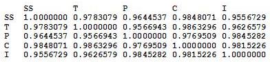
So bad things happen when predictor variables are highly correlated, correct? Here’s the correlation matrix for the five subscales:


I don’t care who you are, correlations above .90 are high. Look at the correlation between Skating Skills and Choreography, holy freaking crap.
So let’s see what happens in regression land when we screw with such highly correlated predictor variables.


If you’re unfamiliar with R and/or regression, I’m predicting the total Composite score from the five subscales. The numbers under the “Estimate” column are the b’s for the intercept and each subscale (SS, T, P, C, and I). But the most interesting part of this regression is under the “Pr(>|t|)” column. These are the p-values which essentially tell you whether or not a predictor significantly* accounts for some proportion of variation in the criterion variable. The generally accepted cutoff point is any value p < .05 (with anything less than .05 meaning that yes, the predictor variable accounts for a significant proportion of variance in the criterion).
As you can see by the values in that last column, not a single one of the predictor variables is considered to be significant. Which is odd, when you think about it initially—after all, we’re predicting the total Composite score, which is composed of these individual predictor variables—why wouldn’t any of them be significant in terms of the amount of variance they account for in the Composite? Well, because the Composite score is the five subscales added together, it’s a direct linear combination of the predictor variables. Because all of the predictor variables appear to account for an equal amount of variance—and because the variance in the Composite score involves a lot of “overlapping” variance from each of the predictors, none of them are deemed statistically significant.
Cool, huh?
*Don’t even get me started on this—this significance is “statistical significance” rather than practical significance, and if you’re interested as to why .05 is traditionally used as the cutoff, I suggest you read this.
Today’s song: Top of the World by The Carpenters
Mmm, fresh data!
Hey ladies and gents. NEW BLOG LAYOUT! Do you like it? Please say yes.
Anyway.
So this is some data I collected in my junior year of high school. I asked 100 high schoolers a series of questions out of Keirsey’s Please Understand Me, a book about the 16 temperaments (you know, like the ISFPs or the ENTJs, etc.). When I “analyzed” this for my psych class back then, I didn’t really know any stats at all aside from “I can graph this stuff in Excel!” (which doesn’t even count), so I decided to explore it a little more. I wanted to see if there were any correlations between gender and any of the four preference scales.
The phi coefficient was computed between all pairs (this coefficient is the most appropriate correlation to compute between two dichotomous variables). Here is the correlation matrix:

First, it’s important to note how things were coded.
Males = 1, Females = 0
Extraversion = 1, Introversion = 0
Sensing = 1, Intuiting = 0
Feeling = 1, Thinking = 0
Perceiving = 1, Judging = 0
So what does all this mean? Well, pretty much nothing, statistically-speaking. The only two significant correlations were between gender and Perceiving/Judging and Sensing/Intuiting and Perceiving/Judging. From the coding, the first significant correlation means that in the sample, there’s a tendency for males to score higher on Perceiving than Judging, and for females to score higher on Judging. The second significant correlation means that in the sample, there’s a tendency for those who score high on Feeling tend to score high on Perceiving, and a tendency for those to score high on Thinking to score high on Judging.
The rest of the correlations were non-significant, but they’re still interesting to look at. There’s a positive correlation between being female and scoring high on Extraversion, There’s a correlation between being male and scoring high on Feeling, and there’s a very, very weak correlation between Feeling/Thinking and Extraversion/Introversion.
Woo stats! Take the test, too, it’s pretty cool.
Today’s song: Beautiful Life by Ace of Base
Correlation vs. covariance: they’re not the same, get it right
Blogger’s note: this is what Teddy Grahams do to me. Keep them away from me.
OKAY PEOPLE…another stats-related blog for y’all. Consider this nice little data set:

Isn’t it pretty? Let’s check out the covariance and correlation:
cov(x, y) = 7.3
cor(x, y) = 0.8706532
Now obviously that one point kind of hanging out there is an outlier, right? So let’s take it out:

Quick, before I do anything else—what do you think will happen to the correlation? What do you think will happen to the covariance?
This was a question for our regression practice midterm, but I heard someone today talking about covariance and correlation and they were completely WRONG…hence this blog. So I remember when I first got this question, I at first thought that both correlation and covariance should increase, but then that seemed like it wouldn’t make sense.
How do we tell?
Equation time!
This is the equation for covariance. As you can see, in the numerator is the sum of the product of all the differences between all the X values and the mean of the X and the differences between the Y values and the mean of Y. The denominator is just the sample size less 1.
![]()
This is the equation for correlation. The numerator is the covariance above, and the denominator is the product of the two standard deviations of X and Y.
So now it’s number time!
Covariance
Here are the values for the X and Y variables:
X
4  5  6  7  8  9 10 11 12 13 14
Y
5.0  5.5  6.0  6.5  7.0  7.5  8.0  8.5  9.0 14.0 10.0
mean(X) = 9
mean(Y) = 7.09091
X - mean(X)
-5 -4 -3 -2 -1  0  1  2  3  4  5
Y - mean (Y)
-2.90909091 -2.40909091 -1.90909091 -1.40909091 -0.90909091 -0.40909091  0.09090909  0.59090909  1.09090909  6.09090909  2.09090909
sum(X - mean(X))*(Y - mean (Y))
73 (numerator)
n - 1
10
73/10 = 7.3 <- covariance!
So what does this all mean? As the value of the numerator decreases, the covariance will decrease too, right?
What’s in the numerator? The differences between all the X values and the mean of X and the differences between all the Y values and the mean of Y. As these differences decrease, even if one difference between and X value and the mean of X decreases, the numerator will decrease, and the covariance will decrease as well.
So what happens when we remove the outlier?
X (outlier removed)
4  5  6  7  8  9 10 11 12 14
Y (outlier removed)
5.0  5.5  6.0  6.5  7.0  7.5  8.0  8.5  9.0 10.0
mean(X) = 8.6
mean(Y) = 7.3
sum(X - mean(X))*(Y - mean (Y))
46.2 (numerator)
n - 1
9
46.2/9 = 5.133 <- covariance!
AHA! Smaller numerator = smaller covariance! Notice how the smaller denominator doesn’t really matter, as the ratio is still different.
Now what?
Correlation
sd(X) = 3.316625
sd(Y) = 2.528025
sd(X)*sd(Y) = 8.38451
7.3/8.38451 =  0.8706532 <- correlation!
Now we remove the outlier!
sd(X) = 3.204164
sd(Y) = 1.602082
sd(X)*sd(Y) = 5.133333
5.133/5.133 = 1 <- correlation!
The correlation, on the other hand, increases, as the variance of Y decreases due to the removed outlier (which has a large difference between the observed Y value and the mean value of Y).
Does anybody else think this is really cool, or is it just me?
It’s probably just me. Sorry.
Today’s song: Hoppípolla by Sigur Ros
Multicollinearity: The Silent Killer
Warning: this whole blog is like a stats orgy for me, but if you’re not into that, feel free to skip.
OKAY, so…last week for my Measurement homework, we were told to analyze data taken from the VANCOUVER 2010 OLYMPIC MALE FIGURE SKATING JUDGING!!!! Yeah, I was super happy.
Anyway, so since the only thing we really looked at was reliability between the judges and the components, I decided to screw around with it more this afternoon. Very quickly, my little fun turned into an exercise of how multicollinearity can destroy an analysis.
First, a brief explanation of the data (which can be found RIGHT HERE). The dataset contains vectors of the skaters’ names, the country they’re from, the total Technical score (which is made up of the scores the skaters earned on jumps), the total Component score, and the five subscales of the Component score (Skating Skills, Transitions, Performance/Execution, Choreography, and Interpretation).
So the first thing I did was find out the correlations between the five subscales. The way the data were initially presented gave the subscale scores broken up by the nine judges (so 45 columns), but since the reliability of the judges was so high, I felt it appropriate to collapse the judges’ ratings into the average judge scores for each subscale. So here’s the correlation matrix:
From this, it’s pretty apparent how related these subscales are.
AND NOW THE REGRESSION!

Here I’m predicting the total Composite score from the five subscales. Intuitively, these subscale coefficients should all be significant, right? Since the Composite score is, you know, entirely dependent on all of them.
Well, if we try this out, we get no significance at the .05 level FOR ALL SUBSCALES.
That’s right, the very variables that CREATE the Composite score don’t explain ANY significant amount of variance in it!
But why, you ask? (And I know you’re asking it!)
MULTICOLLINEARITY!
Regression coefficients are numbers that explain the change in the dependent variable for every unit change in the corresponding independent variable. For example, if the regression coefficient for Skating Skills was 3.52, then we would expect that for every unit change in Skating Skills, the Composite score would increase 3.52 units. Well, how are regression coefficients interpreted? As the amount of change in the dependent variable that can be explained by a single independent variable while holding the other variables constant.
That last part is the most important, and requires a picture.
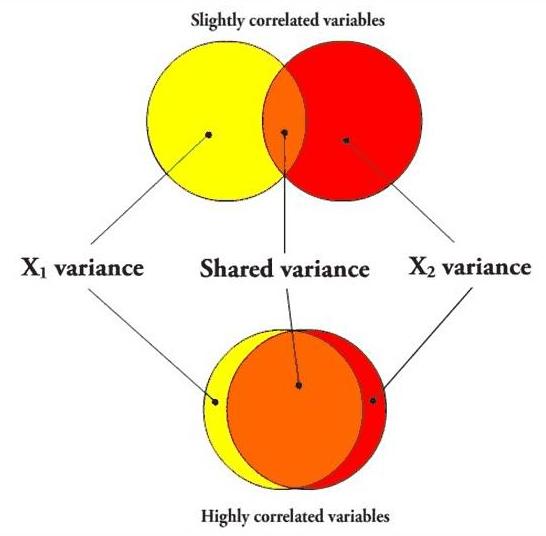
In the first case, if I’m going to predict a variable using X1, the variance that overlaps with X2 (the orange part) will be partialled out when creating the regression coefficient, since X2 is being held constant. However, since the variables aren’t very correlated, there is still a lot of “influence” (the yellow area, independent of X2) that X1 can have on the predictor variable when X2 is held constant.
However, in the second case, the overlapping orange part is huge, leaving only a small sliver of yellow. In other words, when two predictor variables are highly correlated, partialling the second variable (X2) out in order to create the unique predictive power of the first variable (X1) practically removes the entirety of X1, leaving very little influence left over, so even if X1 were highly predictive of the dependent variable, it most likely would not have a significant regression coefficient.
Here’s a picture using the five subscales as the independent variables.
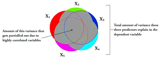
The entire gray area is the amount of the explained variance that gets “covered up” due to the variables all being highly correlated. The colored components are the amount of each independent variable that actually gets to be examined per each regression coefficient. This lack of variance exhibited by each of these little slivers basically causes the independent variables to look insignificant in the amount of variance they explain in the dependent variable.
Another good test for multicollinearity issues is the tolerance. The multiple R2 (in this case, .9926) is the amount of variance in the Composite score that all these variables together predict. Tolerance is 1 – R2, and is 0.0074 in this case. Any tolerance lower than 0.20 is usually an indicator of multicollinearity.
So yeah. How cool is that?
When I do the regression for each subscale predicting the Component score individually, they’re all highly significant (p < 0.001).
MULTICOLLINEARITY DESTROYS REGRESSION ANALYSES!
Yeah.
This made me really happy.
And yes, this was, in my opinion, and excellent use of the afternoon.
Today’s song: Red Alert by Basement Jaxx
Greek letters as broken down by meanings in Statistics: a subjective and torturous endeavor
Included are only the letters I’ve used often…not kappa or zeta or anything else that often just stands for a random variable.
Least scary to scariest. Go!
μ
Good old population mean…you never let us down. The first moment, the best moment, the easiest moment.
π
Proportions! I like proportions. They can be tricky sometimes, but overall they’re pretty basic.
ε
Error! You don’t really ever have to calculate this…you just have to account for it and/or make sure it’s not correlated with anything else.
ρ
Rho! Correlation! Reliability! Looks almost exactly like a p when you write it in print! I like correlation. Correlation is easy and unthreatening, assuming you know what its limitations are.
α
Type I error, level of significance, or Chronbach’s alpha, a measure of reliability. Not too scary on it’s own, but can be confusing when mixed with small beta.
σ
Oh look, it’s the population standard deviation. Hello, population standard deviation. Small sigma isn’t really anything else ever (except standard error, but that’s fairly similar conceptually)…square it and you get variance…that’s about it.
τ
Kendall’s tau, another correlation coefficient. It’s nonparametric, which makes it awesome. Also, since it’s nonparametric, it’s easy to calculate.
β
Itty bitty beta! Regression coefficients, Type II error, or beta distribution for Bayesian insanity. It’s good if you can interpret it, scary if you can’t.
η
Effect size! Easy when you’re just screwing around with means and normal distributions, but a really big pain when you have to deal with itty bitty delta as well.
χ
Oh god, the chi-square distribution…what fun that is. Usually used for ANOVA-related purposes, and ANOVA is evil. The distribution itself is kinda cool, though.
ω
Weights or lengths of vectors…it can be either one! Flashbacks to Multivariate Analysis where we had to make orthogonal vectors of various lengths.
δ
Noncentrality parameter is noncentral (haha, sorry, I had to). This thing is scary as hell to deal with when you’re trying to make confidence intervals, especially when you have to use a different noncentrality parameter for each bound.
λ
OH GOD OH GOD EIGENVALUES HOLY HELL!
ALSO: happy birthday to Sean!
Today’s song: Who Wants to Live Forever by Queen
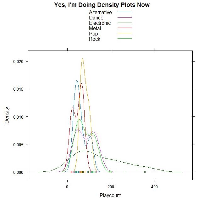
Hammer Time is the fifth dimension
Woohoo, DENSITY PLOTS!
And guess what data I’m using?!
I took a few of the genres out because there were only one/two songs for them, but the remaining ones are all from my top 50. Bet you can guess which point is Sleepyhead.
ALSO THIS:
The most beautiful live performance I’ve ever seen. Thank you, StumbleUpon, for leading me to the song I downloaded yesterday, for it led me to this one.
Today’s song: Flightless Bird, American Mouth (Live) by Iron and Wine
The Beauty of Non-Monotone Relationships
My graphs speak for themselves. They make me very happy. Also, they’re not supposed to be making weird patterns like they are, but it’s still cool.


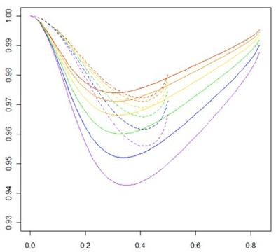
Yes, this is my research.
Give Me Homoscedasticity or Give Me Death!
Oh Canada, you silly country, even your statistics books involve weed.
This was the conclusion the Psyc 366 book came to on a section involving confidence intervals: “You can be reasonably confident your results are due to marijuana and not to chance.”
Best. Phrase. Ever.
Benford’s Law: The Project
Exploratory Data Analysis Project 3: Make a Pretty Graph in R (NOT as easy as it sounds)
Seriously, the code to make the graphs is longer than the code to extract the individual lists of digits from the random number vector.
Anyway.
The goal was to show a simple yet informative demonstration of Benford’s Law. This law states that with most types of data, the leading digit is a 1 almost one-third of the time, with that probability decreasing as the digit (from 1 to 9) increases. That is, rather than the probability of being a leading digit being equal for each number 1 through 9 the probabilities range from about 30% (for a 1) to about a 4% (for a 9).
For the first graph, I wanted to show how quickly the law breaks down after the leading digit (that is, I wanted to see if the second and third digit distributions were more uniform). I took a set of 10,000 randomly generated numbers, took the first three digits of each number, and created a data set out of them. I then calculated the proportion of 1’s, 2’s, 3’s…9’s in each digit place and plotted them against Benford’s proposed proportions. Because it took me literally two hours to plot those stupid errors of estimate lines correctly (the vertical red ones), I just did them for the leading digit.
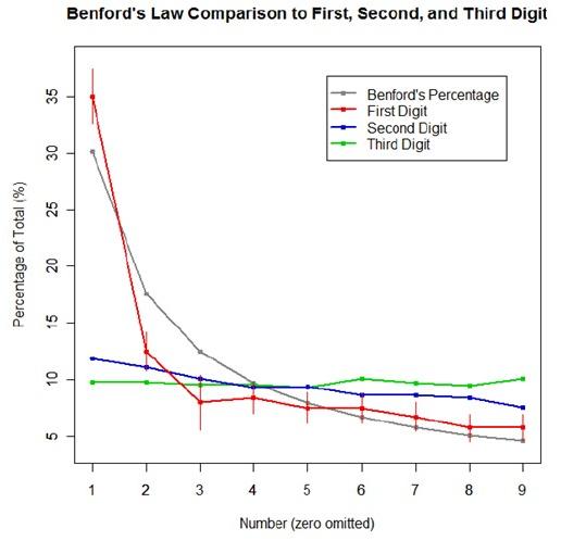
For the second graph, I took a data table from Wikipedia that listed the size of over 1,000 lakes in Minnesota (hooray for Wiki and their large data sets). I split the data so that I had only the first number of the size of the lakes, then calculated the proportion of each number. I left out the zeros for consistency’s sake. I did the same with the first 10,000 digits of pi, leaving out the zeros and counting each number as a single datum. I wanted to see, from the second graph, how Benford’s law applied to “real life” data and to a supposedly uniformly-distributed set of data (pi!).

Yes, this stuff is absolutely riveting to me. I had SO MUCH FUN doing this.
The Statistician’s Prayer
“Our distribution, which art bivariate, normal be thy name. Thy z-scores true, covary too, in yhat as it is in the x’s. Give us this day our regression equation, and forgive us our error, now and in the hour of prediction. Amen.”
Just a little something I came up with last night. None of us know how we did on the midterm, so we all probably did pretty poorly.
But oh well. Right?
Also this. Stifling my laughter ‘cause I was still in my office = fail.
Stats + Primes
So I finished my stats final today. The 3 questions asked resulted in 27 pages of answers, and I think I did pretty well. Here are some things on which we were tested:
- starplots
- biplots
- principle components analysis (PCA)
- exploratory factor analysis (EFA)
- computing the variance of a set of principle component scores (stupid eigenvalues)
- explaining why fitting an EFA model to original data is the same as fitting it to the standardized data
- finding the Fisher direction and standardizing it to unit length, then finding the related Fisher ratio
- finding the value of the Fisher ratio along the first PCA direction
- finding within group variance/covariance matrices
- computing posterior probabilities using the Bayes formula and the normality pdf’s.
Freaking awesome!
I think my favorite’s the non-primes.
Probability in Action!
I LOVE these things.
IT’S NOT THAT HARD, GET IT RIGHT *frustrationfrustrationfrustration*
You know, I really wish more people would remember that “datum” and “data” are the singular and the plural, respectively.
Remember…if a person’s single, it’s okay to datum.
That is all.
It’s a good thing I enjoy this.
So it’s like 3 in the morning and I’m finally done with that damn Stat 422 project. So I shall now show you the basic results, minus all the fancy math and such.
Go!
The Number of Classes Offered by Each College
Agricultural and Life Sciences: 522
Art and Architecture: 209
Business and Economics: 188
Education: 606
Engineering: 647
Letters, Arts, and Social Sciences: 1,419
Natural Resources: 344
Science: 591
TOTAL: 4,526 classes offered
Percentage of Classes that Require Prerequisites, by College (estimated and actual, respectively)
Agricultural and Life Sciences: 25%, 21.6%
Art and Architecture: 25%, 24.9% (holy crap, I was so close!)
Business and Economics: 57.1%, 53.2%
Education: 21.7%, 15%
Engineering: 33%, 32.8% (pretty close here)
Letters, Arts, and Social Sciences: 16.7%, 11.7%
Natural Resources: 15.4%, 11.9%
Science: 36%, 36.5%
TOTAL: 25.1%, 21.8%
Percentage of Classes that Require Prerequisites Outside of the Department, by College (estimated and actual, respectively)
Agricultural and Life Sciences: 5%, 9%
Art and Architecture: 12.5%, 1.9% (haha, wow, that’s way off)
Business and Economics: 0%, 17% (this is even worse!)
Education: 8.7%, 3%
Engineering: 20.8%, 14.8%
Letters, Arts, and Social Sciences: 1.9%, 1%
Natural Resources: 7.7%, 7%
Science: 13.6%, 11.2%
TOTAL: 10%, 6.7%
So here are the final results!
The proportion of University of Idaho courses that require prerequisites was estimated to be 25.14% with a variance of .000858935 and a bound of .0586, or 5.86%.
The proportion of University of Idaho courses that require prerequisites outside of the field of the course in question was estimated to be 10.04% with a variance of .000960987 and a bound of .0619 or 6.19%.
With the bounds in place, the results of these estimates basically tell us that a 95% confidence interval for the proportion of courses offered by the University of Idaho that require prerequisites is between 19.28% and 31%, and that a 95% confidence interval for the proportion of courses offered by the University of Idaho that require prerequisites outside of the field of the course in question is between 3.85% and 16.23%.
Yay!
Essentially, this is frivolity and I should be stopped
Alternate title: LOL BLOG 666 OMG WERE ALL GOING TO DIE!!!11!!ONE!!!
Now that the formalities are over I’d like to get right to the point: I’ve finally decided on what I’m going to analyze with a two-sample t-test in regards to my blogs.
I shall compare my “happy” blogs to my “sad” blogs (both terms to be defined further down) on various constituents (also to be defined further down).
Are you all ready for this?!?!
Goal:
Compare “sad” blogs and “happy” blogs on four independent points: number of words, number of smilies, number of exclamation points (indicative of excitement, frustration, flabbergastment, emphasis), and number of words in italics and/or in all caps (indicative of essentially the same things as exclamation points, but slightly cooler).
Definitions:
~”Happy” blog: a blog in which the mood is set to something indicative of a happy mood or an excited mood (amused, thrilled, silly, relieved, geeky/nerdy/dorky, and, of course, happy*).
~”Sad” blog: a blog in which the mood is set to something indicative of sadness, frustration, or anger (pissed, peeved, depressed, melancholy, sad, frustrated, angry*).
~Number of words: number of words in the body of the blog. The title/headings and the comments are not counted in this total.
~Number of smilies: just what it sounds like. Smilies like “:)” or “:P” used in chat dialogues are not counted.
~Number of exclamation points: as in this: !, not the number of times I say “exclamation points.”
~Number of words in italics and/or in all caps: this or THIS or THIS all count.
Method:
1) Generate an SRS of equal size n for both the happy blog data and the sad blog data
2) Collect data from said SRS
3) Analyze it in SAS
4) Bore you all to death with the results
Formulas in SAS:
proc univariate (for all variables)
proc ttest (for all variables, obviously the most important one if I’m doing t-tests!)
Procedure:
It was first figured that the population size was N = 665, as today’s blog was not counted amongst the viable samples. To determine an appropriate sample size for each category (happy and sad blogs), it was figured that a good n would amount to approximately 7% of the data. An n equal to 25 for both categories was used (thus having a total n = 50).
The blogs were numbered in a rather ingenious manner (thank you very much), and the SRS was obtained through sampling done with a random number table. If a blog obtained was deemed neither happy nor sad (indifferent blogs) it was disregarded and another random number was chosen in its place and sampling continued as normal.
Data was collected for both categories in all variables (see Raw Data) and was then analyzed using SAS. Results are displayed below in the Results section.
Raw data:
Data names: blogno; words; smilies; exclamations; italiccaps; happysad;
89 300 1 9 19 h
156 124 0 0 0 h
574 42 0 1 0 h
166 108 1 1 0 h
389 51 1 2 0 h
422 83 1 0 0 h
556 34 0 0 0 h
446 126 1 2 0 h
653 900 1 9 38 h
275 370 0 6 0 h
371 161 1 0 0 h
465 215 0 1 0 h
637 457 0 10 21 h
3 223 3 4 1 h
351 296 0 12 1 h
167 252 0 2 1 h
52 180 0 1 0 h
649 862 0 34 10 h
631 399 1 8 42 h
64 22 1 2 0 h
55 57 1 0 0 h
237 453 0 32 16 h
236 49 1 3 2 h
298 186 1 2 2 h
20 115 2 1 0 h
643 174 0 3 0 s
186 23 1 0 1 s
316 166 0 0 1 s
90 74 0 0 0 s
161 105 3 3 14 s
115 76 2 2 3 s
439 131 0 1 0 s
522 370 0 3 8 s
202 70 1 1 3 s
8 360 1 15 1 s
381 1258 0 18 38 s
468 128 0 0 2 s
12 59 0 0 0 s
41 21 0 0 0 s
474 174 1 0 0 s
425 459 0 0 0 s
265 236 0 2 1 s
311 64 1 0 0 s
363 5734 0 3 2 s
518 310 0 0 1 s
579 181 1 0 0 s
497 81 0 0 0 s
416 414 0 1 0 s
385 59 0 0 0 s
Results:
OH ARE YOU READY FOR THIS?! This is intense, people.
First up: the results of the univariate procedures for each variable. These data are for the whole sample, remember.
Words
Mean: 336.36 (standard deviation = 815.33)
Minimum: 21
Maximum: 5734
Smilies
Mean: 0.56 (standard deviation = 0.76)
Minimum: 0
Maximum: 3
Exclamation Points
Mean: 3.88 (standard deviation = 7.26)
Minimum: 0
Maximum: 34 (thirty-four exclamation points in a single blog? Good lord)
Italicized and/or All Caps Words
Mean: 4.56 (standard deviation =10.17)
Minimum: 0
Maximum: 42
Second: t-test results!
Words
Mean number of words in happy blogs: 242.6
Mean number of words in sad blogs: 430.12
Using –=.05, the results of the two-sample t-test showed that there was not a significant difference in the mean number of words in the two types of blogs. Though it sure looks like it from comparing the two, doesn’t it? That’s stats for ya.
Smilies
Mean number of smilies in a happy blog: 0.68
Mean number of smilies in a sad blog: 0.44
Sorry guys, this one isn’t showing a significant difference in the means, either. I guess I’m pretty constant with my particulars in my blogs, regardless of how I’m feeling.
Exclamation Points
Mean number of exclamation points in a happy blog: 5.68
Mean number of exclamation points in a sad blog: 2.08
Ooh, we were pretty close on this one! When I saw this result I was tempted to raise my alpha level to .1, thus making this one statistically significant, but then I figured that would be data manipulation, so I didn’t do it. Praise me!
Italicized and/or All Caps words
Mean number of italicized and/or words in all caps in a happy blog: 6.12
Mean number of italicized and/or words in all caps in a sad blog: 3
You guessed it—the means are not statistically significantly different. Strange, huh?
Now you may be thinking I did all this for nothing. Quite the contrary! We’ve learned from a sample of 50 blogs that, according to the data, my happy and sad blogs do not differ in a statistically significant manner on four key points. I find that interesting, myself.
As for you, well…you’re probably nodding off right now, so I’ll stop here.
*Does not encompass all moods used for defining the categories. I could have gone through and listed them all, but I’m too lazy for that.
Waiter! There’s a Super Nova in my ANOVA! How in the World…?
Ladies and gentlemen, I present to you the first actual statistical analysis of my blogs. It’s a crappy one (just a SRS + proportion estimate) because I couldn’t think of anything else that was interesting and thus couldn’t think of anything worthy of a two-sample t-test. So disappointing!
But anyway.
Goal of analysis: to discover what proportion of my blogs are surveys.
Method:
1) estimate several bounds
2) using the best estimated bound, calculate an acceptable sample size (n) from which to gather data.
3) use data gathered in step 2 to calculate the total population proportion of blogs that are surveys with a reasonable bound on the error of estimation.
Formulae used:
To estimate appropriate sample size:
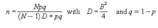
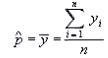
To estimate population proportion:
To estimate variance and bound on the error of estimation, respectively:

Procedure:
The initial N was 663, as that was the total number of blogs. It was found best to set p = .5, as that would give us the most conservative estimate and a sample size larger than would be necessary. Several magnitudes of B were plugged into the sample size equation, and the best was found to be B = .17. This was used in the sample size equation and an n of 33 was obtained.
Using a random numbers table, a SRS of 33 blogs was obtained. Each specific blog was looked up and marked as to whether or not it contained a survey. Results from this SRS are below (a ‘0’ indicates no survey, a ‘1’ indicates a survey):
Blog Survey?
139 0
163 0
198 0
41 0
145 0
66 0
301 0
253 0
380 1
2 0
408 1
400 0
440 1
259 1
351 0
273 0
487 0
183 0
599 1
510 0
473 0
170 0
534 0
257 0
279 0
151 0
394 0
186 0
604 1
577 0
388 0
568 1
221 0
These results were used in the calculation of the total population proportion of the proportion of blogs that were surveys. The result of this equation was .21. The variance of the data in the SRS was then calculated (=.007405213) and then used to calculate the bound on the error of estimation, which came out to be .17.
Therefore, we can extrapolate that 21% +/- 17% of my blogs are surveys. Or, anywhere from 4% to 38% of my blogs are surveys.
Yes, yes, I know that’s a horrible, horrible bound on the error of estimation (seriously, 17% either way?! Blasphemy!) but I don’t think you realize how hard it is to actually go back and figure out the specific number of each blog I’ve ever written. There are 663 of them, you know.
So yeah. That’s all I’ve done tonight, basically. Do you people have any ideas for possible blog-related things I could statistically analyze? I’m dyin’ here.
Statistics-induced strangeness
Haha! So I decided to make a histogram of my 15 most commonly used moods here on MySpace. Some of them, as you can see, are grouped together (mainly because, in my opinion, there aren’t any big differences between “anxious” and “stressed” or “good” and “okay”). The unit on the y-axis is “times used” and the unit on the x-axis is “mood.” Forgot to put those in there…
Oh, and a title! Um…
Not too surprising. Pretty random.
Isn’t it sad I flippin’ made a graph?
I think so.

