Statistics Sunday: An Introductory Post
Every Sunday of this year, I plan on focusing on one of the statistical tests featured in the Handbook of Parametric and Nonparametric Statistical Procedures (5th edition) by David J. Sheskin. I will include the following information in each post:
- When would you use the test? What type of research question might the test help to answer?
- For what type of data is the test appropriate? Do you need interval/ratio data, categorical data, etc.?
- Assumptions. What assumptions must be met in order for the test to be accurately employed?
- Process. The steps (and equations) of the test.
- Example. The test carried out with real data.
- Example in R. The R code for the above example.
I’ll start this tomorrow, and while I’ll probably put a little menu button up at the top of my blog homepage to link to all the tests (a thing like a “Statistics Sundays” button or whatnot), I figured I should explain it here, too.
YAY!
More Stats Planning
HEY PEEPS!
I typed out all the tests from my statistical tests handbook, then narrowed them down to 52 that I want to feature, one per week, on my blogs next year. Check ‘em:
- Week 1: The Single-Sample z Test
- Week 2: The Single-Sample t Test
- Week 3: The Single-Sample Chi-Square Test for a Population Variance
- Week 4: The Single-Sample Test for Evaluating Population Skewness
- Week 5: The Single-Sample Test for Evaluating Population Kurtosis
- Week 6: The Wilcoxon Signed-Ranks Test
- Week 7: The Kolmogorov-Smirnov Goodness-of-Fit Test for a Single Sample
- Week 8: The Chi-Square Goodness-of-Fit Test
- Week 9: The Binomial Sign Test for a Single Sample
- Week 10: The z Test for a Population Proportion
- Week 11: The Single-Sample Runs Test
- Week 12: The t Test for Two Independent Samples
- Week 13: F Test for Two Population Variances
- Week 14: The Median Absolute Deviation Test for Identifying Outliers
- Week 15: The Mann-Whitney U Test
- Week 16: The Kolmogorov-Smirnov Test for Two Independent Samples
- Week 17: The Moses Test for Equal Variability
- Week 18: The Siegel-Tukey Test for Equal Variability
- Week 19: The Chi-Square Test for Homogeneity
- Week 20: The Chi-Square Test of Independence
- Week 21: The z Test for Two Independent Proportions
- Week 22: The t Test for Two Dependent Samples
- Week 23: The Wilcoxon Matched-Pairs Signed-Ranks Test
- Week 24: The Binomial Sign Test for Two Dependent Samples
- Week 25: The McNemar Test
- Week 26: The Single-Factor Between-Subjects Analysis of Variance
- Week 27: The Kruskal-Wallis One-Way Analysis of Variance by Ranks
- Week 28: The van der Waerden Normal-Scores Test for k Independent Samples
- Week 29: The Single-Factor Within-Subjects Analysis of Variance
- Week 30: The Friedman Two-Way Analysis of Variance by Ranks
- Week 31: The Cochran Q Test
- Week 32: The Between-Subjects Factorial Analysis of Variance
- Week 33: Analysis of Variance for a Latin Square Design
- Week 34: The Within-Subjects Factorial Analysis of Variance
- Week 35: The Pearson Product-Moment Correlation Coefficient
- Week 36: The Point-Biserial Correlation Coefficient
- Week 37: The Biserial Correlation Coefficient
- Week 38: The Tetrachoric Correlation Coefficient
- Week 39: Spearman’s Rank-Order Correlation Coefficient
- Week 40: Kendall’s Tau
- Week 41: Kendall’s Coefficient of Concordance
- Week 42: Goodman and Kruskal’s Gamma
- Week 43: Multiple Regression
- Week 44: Hotelling’s T2
- Week 45: Multivariate Analysis of Variance
- Week 46: Multivariate Analysis of Covariance
- Week 47: Discriminant Function Analysis
- Week 48: Canonical Correlation
- Week 49: Logistic Regression
- Week 50: Principal Components Analysis and Factor Analysis
- Week 51: Path Analysis
- Week 52: Structural Equation Modeling
Yeah. It’ll be fun!
Twiddle
Remember this?
It’s the big book of statistical tests that my mom got me back in like 2012. I didn’t know most of the tests in it at the time (mainly because I hadn’t done my stats-emphasis math degree yet), but now I feel a bit more knowledgeable about its contents.
So what I’d like to do as a resolution for 2016 is go through this book and focus on one test (with examples!) every week in my blog. Maybe on Sundays or something.
I’ll post more on this as it gets closer to the new year, but just a warning. There will be stats.
An Exercise in Algebra: The Standard Deviation
Alrighty, you people had better be ready for a stats-related post! You can blame this one on the first assignment for my STAT 213 lab students.
A student emailed me tonight asking how he was to go about solving one of the homework questions. I took a look at the question, and this is what it said:
A data set consists of the 11 data points shown below, plus one additional data point. When the additional point is included in the data set, the sample standard deviation of the 12 points is computed to be 14.963. If it is known that the additional data point is 25 or less, find the value of the twelfth data point.
21, 24, 47, 14, 19, 17, 35, 29, 40, 17, 53
At first, I suspected that there might be a neat little trick you could employ in order to solve this question. But after Nate and I tried several different possible shortcuts, we realized (and this was later confirmed by the instructor for the course) that the only way to actually solve this was to do it longhand: working it out with the formula for the standard deviation.
Which we did, ‘cause we’re badasses.
I want to show you how it’s done, because it’s actually pretty cool to see how you can figure out the missing value (or values, really; there are always two values that can equally change a standard deviation for a given set of data). But I won’t use the numbers above, ‘cause the values/sums get pretty big with that size of a sample and with those numbers. So let’s make a fake problem to solve instead.
A data set consists of the 4 data points 3, 4, 6, and 9, plus one additional data point. When the additional point is included in the data set, the sample standard deviation of the 5 points is computed to be 2.55. Find the two possible values of the fifth data point.
Here’s the longhand:

Cool, huh? You can check it by finding the standard deviations of (3, 3, 4, 6, 9) and (3, 4, 6, 8, 9); they’re both approximately 2.55!
And, of course, here’s a function I wrote in R called “findpoints” that will do the same thing. It will find the two possible values of the missing data point if it’s given the known points and the standard deviation of the complete dataset.
findpoints = function (x, snew){
  n = length(x) + 1
  snew = ((snew)^2)*length(x)
  sumx = sum(x)
  sumxx = sum(x^2)
  snew = snew - sumxx
  a = 1 + (-2*(1/n)) + (n*(1/(n^2)))
  b = ((-2*sumx)*(1/n)) + ((-2*(1/n))*sumx) + ((2*sumx)*(n*(1/(n^2))))
  c = ((sumx^2)*(n*(1/(n^2)))) + (((-2*sumx)*(1/n))*sumx) - snew
  root1 = (-b - (sqrt((b^2) - (4*a*c))))/(2*a)
  root2 = (-b + (sqrt((b^2) - (4*a*c))))/(2*a)
  roots = c(root1, root2)
  return(roots)
}
Let’s try it in R with the data we used for the longhand:
> y = c(3, 4, 6, 9)
> s = 2.55
> findpoints(y, s)
[1] 2.997501 8.002499
Yay!
Sorry, this was a lot of fun, haha.
Edit: the students in STAT 213 were NOT supposed to do it this way! The question was more about using your statistical intuition combined with some guess-and-check to figure out the answer. The way they were supposed to go about it was as follows:
- Figure out the standard deviation of the given data points.
- Compare that standard deviation with the given standard deviation for all the data points. If the standard deviation for n = 11 is smaller than the standard deviation for n = 12, you know that the missing point has to be outside the range of the given data values (either larger or smaller). If the standard deviation for n = 11 is bigger than the standard deviation for n = 12, you know that the missing point has to be a value within the range of the given data values.
- Combine your knowledge from 2) with the fact that you’re told that the missing data value has to be 25 or less to get a reduced range of possible values for your missing data point.
For example, the standard deviation (13.260) for the n = 11 values in the original example is less than the standard deviation we are given (14.963) for the n = 12 values, which suggests that the additional data point is outside the range of the given data values. This, combined with knowing that the additional point is equal to or less than 25, lets me know that the point has to be less than 14 (since that is the smallest value in our given data). From there, I can start plugging in values less than 14 for that additional point and calculating the standard deviation until I find the value that gives me a standard deviation of 14.963
The Central Limit Theorem and You
HELLO, DUDES!
Sit back, relax, and tune your mind to the statistics channel, as today I’m going to blog about the Central Limit Theorem!
What is the Central Limit Theorem? Here’s a simple explanation: take a random sample from a distribution—any distribution—and calculate that sample’s mean. Do this with a bunch of independent samples from that same distribution. As the number of samples increases, the distribution of those sample’s means will approximate a normal distribution, regardless of the shape of the distribution from which the samples were drawn. That is, the sample means will be approximately normally distributed no matter what distribution the samples are from.
ILLUSTRATION TIME!
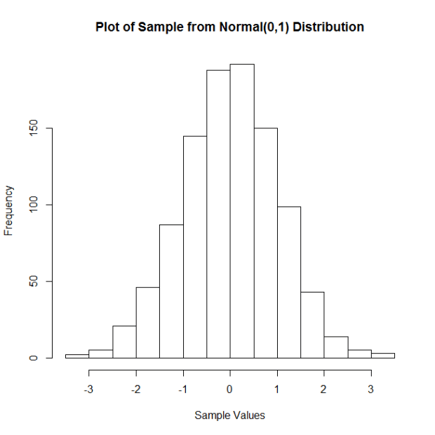
Let’s start with samples from a standard normal distribution, with mean = 0 and standard deviation = 1. Here is a histogram of a sample of 100 observations (n = 100) from this distribution.
Now I’m going to do the following: I’m going to take a certain number (let’s call them “reps”) of samples of size n = 100, calculate the corresponding sample means, and then plot said means. I’m going to do this for 5, 10, 20, 50, 100, 250, 500, 1,000, 5,000, and 10,000 reps of samples of size n = 100. Then I’m going to plot the sample means. The following plots show the results:
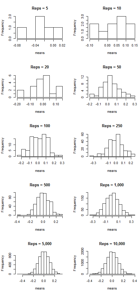
Notice that as the number of samples (the “reps”) increases, the distribution of sample means resembles more and more a normal distribution centered at mean = 0. That suggests that the more samples we take, the more the means “cluster” around the true mean, which in this case is zero.
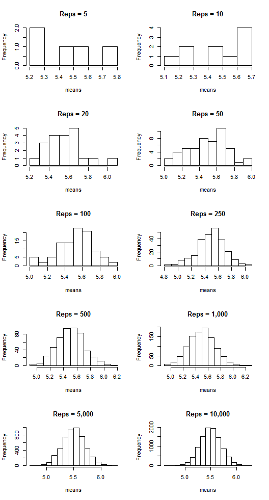
But this doesn’t just work with normal-shaped distributions! Let’s do the same thing, but now by taking samples from a Poisson distribution with lambda = 7. Here is the histogram of a sample of 100 observations (n = 100) from this distribution:
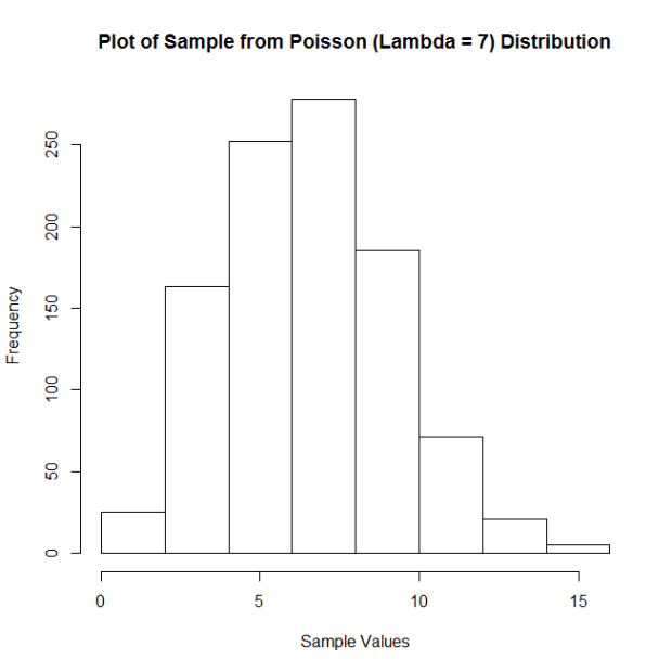
Not quite normal, huh? But look what happens with the means when we employ the same technique as we did above:
The sample means are clustering around the lambda value, 7, and appear more and more normal-shaped as the number of reps increases.
Want a few more examples?
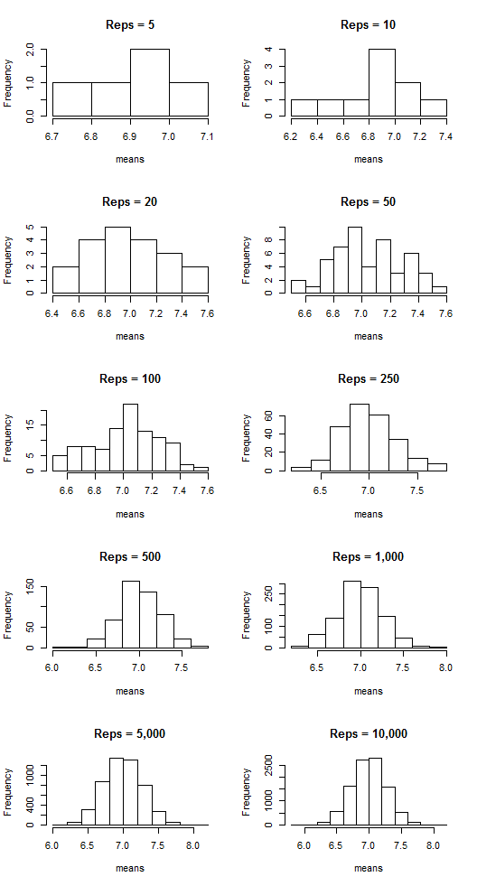
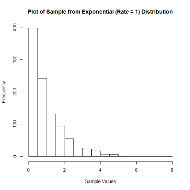
Let’s take samples from an exponential distribution with rate parameter = 1. Here is the histogram of a sample of 100 observations (n = 100) from this distribution:
And the plots of the means:
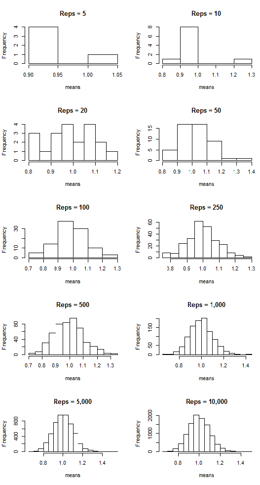
What about samples from a uniform distribution ranging from 2 to 9. Here is the histogram of a sample of 100 observations (n = 100) from this distribution:

And the means:
COOL, HUH??? It’s the CLT in action!
Are You There, God? It’s Me, Non-Normality
I’m here to talk to you today about nonparametric statistics. What are nonparametric statistics, you ask? Well, they’re a collection of statistical tests/procedures that we can use when data do not satisfy the assumptions that need to be met in order for conventional tests/procedures to be carried out. For example, suppose Test A requires that the data are normally distributed. You gather data of interest and find that they are not normally distributed. Thus, Test A should not be used because its results might be inaccurate or maybe even uninterpretable with these non-normal data. Instead, you must use a test for which normality is not a requirement. If such a test exists—say, maybe it’s Test B—then Test B may be considered a nonparametric test. It can be used in place of Test A if Test A’s assumptions are not met. Cool, huh?
Let’s look at a few examples, because I haven’t pressed any statistics on you guys in a while.
Example 1: Comparing Different Treatments
Scenario: You are a plant scientist. You have a specific type of plant and you want to see to what extent lighting affects this plant’s growth. You have three lighting conditions: sunlight, fluorescent light, and red light. Basically, you want to see if there is a significant difference in the amount of growth for plants grown in these three different conditions.
Parametric test: Analysis of variance (ANOVA) seems appropriate here; you can basically assess the differences in growth by comparing the mean growths for each of the three conditions.
Nonparametric test: For ANOVA to be accurate at all, the data need to be normally distributed. Suppose your data aren’t! What do you do instead? A Kruskal-Wallis Test! A Kruskal-Wallis is basically an ANOVA done on the ranked data rather than on the raw data and allows you to compare the groups without needing to meet the assumption of normality.
Example 2: Correlation
Correlation, as I’m sure you’re all aware, is a measure of association. Basically, if you’ve got variables X and Y, correlation is a measure of how much X changes in relation to the changes in Y (or vice-versa). A correlation of 1 suggests that there is a perfect increasing relationship; a correlation of -1 suggests that there is a perfect decreasing relationship.
Scenario: You have a bunch of measurements on two variables. Drug measures the amount of a medicine in a patient’s system. Response measures the amount of some disease marker in the same patient. You want to see if there’s a relationship between the amount of medicine in a patient’s system and the amount of the disease marker present in a patient’s system.
Parametric test: the “usual” correlation, the Pearson Product-Moment Correlation, seems appropriate.
Nonparametric test: The key with the “usual” measure of correlation is that it simply measures the degree of linear association between your variables. If you suspect, for whatever reason, that the relationship between Drug and Response is anything but linear, it’s a good idea to use the Spearman Rank Correlation Coefficient, which is sensitive to non-linear monotonic relationships between variables.
Here, I wanna give you an example of this last one, ‘cause it’s cool. Just as a dumb example, let your sample size be obscenely small (n = 10). Here are your data:
drug response
1     1
2    16
3    81
4   256
5   625
6  1296
7  2401
8  4096
9  6561
10 10000
Notice two things: first, if we plot these two variables, their relationship is clearly nonlinear.

Second, you’ll notice that there is a perfect relationship between drug and response, it’s just not linear. Specifically, Response is just the corresponding Drug value raised to the 4th power, meaning that Response is a perfect monotonic function of Drug! We can easily calculate both Pearson’s and Spearman’s correlations here to see what they’ll say:
Pearson correlation: 0.882
Spearman correlation: 1
Spearman’s picks up on the perfect relationship, but Pearson’s does not! Why? Because it’s not a linear relationship! Pretty cool, huh?
THIS IS WHY YOU ALWAYS PLOT YOUR DATA, DAMMIT.
Side note: Pearson feuded with Spearman over his “adaptation” of Pearson’s beloved correlation coefficient and actually brought the issue in front of the Royal Society for consideration. Oh, you statisticians.
Party all the time
(This is just an excuse to do a dinky little statistical analysis. Because I’m feeling analysis-deprived tonight.)
Long ago (2011) I took a series of online quizzes to figure out when the internet thought my average age of death was (which is a super valid prediction method, right?). Because I’m bored and have no life whatsoever, I’ve decided to re-take those same quizzes today and see if there is a statistically significant difference in the mean age of my death according to the internet.
GO!
The Data:
Year2011 year2015
86       87
70       67
79       79
90       84
89       89
85       85
91       90
85       85
Method: Since this is me just repeating a bunch of tests I’d taken before, this calls for a paired t-test!
H0: there is no difference in the means for 2011 and 2015
Ha: there is a difference in the means for 2011 and 2015
Results: The difference of the sample means is 1.125. With t = 1.3864, p-value = 0.282, we do not have significant evidence to reject the null hypothesis that there is no difference in the means for 2011 and 2015
Basic conclusion: My average lifespan (according to the internet) has neither increased nor decreased since 2011.
The end.
Sorry I’m so boring.
FWEEEEEEEEEEEEEEEEEEEEEEE!!
If you ever want a nice application-based introduction to principal component analysis, check out this article.
It’s short, an interesting example, easy to read, and easy to understand. It also shows a very clear application of PCA for dimension reduction, which is snazzy.
A Visual Explanation of Analysis of Variance (ANOVA)
HOKAY GUYZ. We’re doing ANOVA in two of the lab sessions I’m running. I like explaining ANOVA because it’s something that might seem complicated/difficult if you look at all the equations involved but is actually a pretty intuitive procedure. Back when I taught my class at the U of I, I always preferred to explain it visually first and then look at the math, just because it really is something that’s easier to understand with a visual (like a lot of things in statistics, really).
So that’s what I’m going to do in today’s blog!
The first confusing thing about ANOVA is its name: analysis of variance. The reason this is confusing is because ANOVA is actually a test to determine if a set of three or more means are significantly different from one another. For example, suppose you have three different species of iris* and you want to determine if there is a significant difference in the mean petal lengths for these three species.
“But then why isn’t it called “analysis of means?” you ask.
Because ANOME is a weird acronym
Because—get this—we actually analyze variances to determine if there are differences in means!
BUT HOW?
Keep reading. It’s pretty cool.
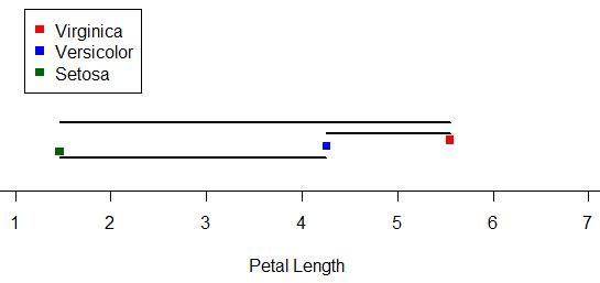
Let’s look at our iris example. The three species are versicolor, virginica, and setosa. Here I’ve plotted 50 petal lengths for each species (150 flowers total). The mean for each group is marked with a vertical black line. Just looking at this plot, would you suspect there is a significant difference amongst the means (meaning at least two of the means are statistically significantly different)? It looks like the mean petal lengths of virginica and versicolor are similar, but setosa’s kind of hanging out there on its own. So maybe there’s a difference.

Well, ANOVA will let us test it for sure!
Like the name implies, ANOVA involves looking at the variance of a sample. What’s special about ANOVA, though, is the way it looks at the variance of a sample. Specifically, it breaks it down into two sources: “within-groups” variance and “between-groups” variance. I’ll keep using our iris sample to demonstrate these.
Within-groups variance is just as it sounds—it’s the variation of the values within each of the groups in the sample. Here, our groups are the three species, and our within-groups variance is a measure of how much the petal length varies within each species sample. I’ve taken the original plot and changed it so that the within-groups variance is represented here:

You can think of the sum of the lengths of these colored lines as your total within-groups variance for our sample.**
What about between-groups variance? Well, it’s pretty much just what it sounds like as well. It’s essentially the variance between the means of the groups in the sample. Here I’ve marked the three species means and drawn black line segments between the different means. You can think of the sum of the lengths of these black lines as your total between-groups variance for the sample:
ALRIGHTY, so those are our two sources of variance. Looking at those two, which do you think we’d be more interested in if we were looking for differences amongst the means? Answer: between-groups variance! We’re less concerned about the variance around the individual means and more concerned with the variance between the means. The larger our between-groups variance is, the more evidence we have to support the claim that our means are different.
However, we still have to take into account the within-groups variance. Even though we don’t really care about it, it is a source of variance as well, so we need to deal with it. So how do we do that? We actually look at a ratio: a ratio of our between-groups variance to our within-groups variance.
In the context of ANOVA, this ratio is our F-statistic.*** The larger the F-statistic is, the more the between-groups variance—the variance we’re interested in—contributes to the overall variance of the sample. The smaller the F-statistic, the less the between-groups variance contributes to the overall variance of the sample.
It makes sense, then, that the larger the F-statistic, the more evidence we have to suggest that the means of the groups in the sample are different.

Above are the length-based loose representations of our between- and within-groups variances for our iris data. Notice that our between-groups variance is longer (and thus larger). Is is larger enough for there to be a statistically significant difference amongst the means? Well, since this demo can only go so far, we’d have to do an actual ANOVA to answer that.
(I’m going to do an actual ANOVA.)
Haha, well, our F = 1180, which is REALLY huge. For those of you who know what p-values are, the p-value is like 0.0000000000000001 or something. Really tiny. Which means that yes, there is a statistically significant difference in the means of petal length by species in this sample.
Brief summary: we use variance to analyze the similarity of sample means (in order to make inferences about the populatoin means) by dividing variance into two source: within-groups variance and between-groups variance. Taking a ratio of these two sources, the larger the ratio is, the more evidence there is to suggest that the variation between groups is great–which in turn suggests the means are different.
Anyway. Hopefully this gave a little bit more insight to the process, at least, even if it wasn’t a perfectly accurate description of how the variances are exactly calculated. I still think visualizing it like this is easier to understand than just looking at the formulae.
*Actual data originally from Sir Ronald Fisher.
**That’s not exactly how it works, but close enough for this demo.
***I won’t go much into this here, either, just so I don’t have to explain the F distribution and all that jazz. Just think of the F-statistic as a basic ratio of variances for now.
R Stuff!!!!!1!!!!11one11!
HI GUYS!
I have something cool today. (Well, not really. It’s cool to me, at least, but that means absolutely nothing as far as it’s actual coolness goes. And it’s R code, so who knows if that is really anything interesting to any of you out there. It’s not even the code itself; I’m just showing the results. Whatevs, just read. Or don’t!).
Now that I’ve parentheticalled you all to death, here’s the story:
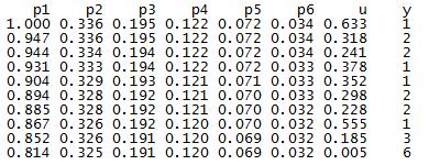
One of the ladies in the office next to ours is a second year Master’s and is working on her thesis. She has a lot of huge matrices of data and is doing a lot of the matrix construction in R. I don’t know her research very well or why she had to remedy this particular problem, but today she came to me with this question: she has a matrix that looks like this (this is just an example of the first few rows):
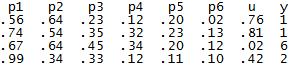
The columns p1 through p6 contain probabilities based on some distribution (I can’t remember which one, it was a weird one), the column u contains probabilities from a uniform distribution between 0 and 1, and the y column contains values based on properties of the other columns. For example, if the u probability is greater than p2 but smaller than p1 for a specific row, that row’s y value is 2. If the u probability for another row is greater than p4 but smaller than p5, that row’s y value is a 4. Things like that. The problem, though, is that because of the distribution from which the p1-p6 values are drawn, there are a lot more 1’s and 2’s in the resulting y column than there are 3’s, 4’s, 5’s, etc. So she wanted to know if there was an easy way to “even out” the distribution of the y numbers so that their frequencies are approximately equal (that is, there are about as many 1’s as 2’s, 2’s as 3’s, 3’s as 4’s, etc.) while still being initially based on the p1-p6 values.
Because of a few other stipulations, it took me awhile to work it out, but I finally got some code that did it! To test it, I wrote some other code that generated a matrix similar to hers:
Here are the frequencies of the numbers in the y column prior to applying my fixing code:
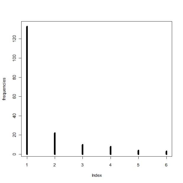
And after:
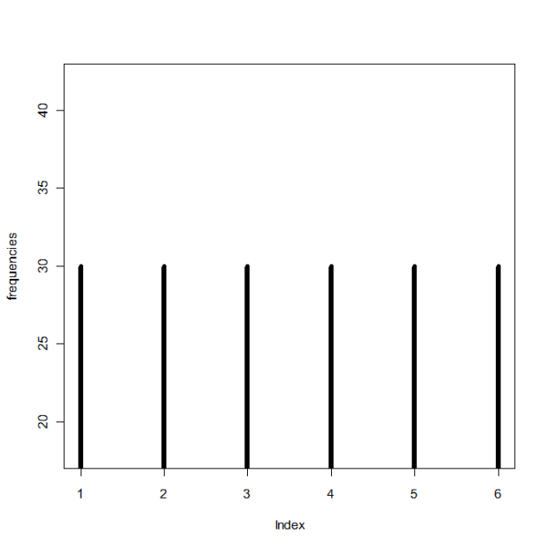
Yay! I hope it’s what she wanted.
Correlation and Independence for Multivariate Normal Distributions
OOOOH, thisiscoolthisiscoolthisiscool.
So today in my multivariate class we learned that two sets of variables are independent if and only if they are uncorrelated—but only if the variables come from a bivariate (or higher multivariate dimension) normal distribution. In general, correlation is not enough for independence.
ELABORATION!
Let X be defined as:
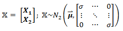
meaning that it is a matrix containing two sets of variables, X1 and X2, and has a bivariate normal distribution. In this case, X1 and X2 are independent, since they are uncorrelated (cov(X1, X2)=cor(X1,X2) = 0, as seen in the off-diagonals of the covariance matrix).
But what happens if X does not have a bivariate distribution? Now let Z ~ N(0,1) (that is, Z follows a standard normal distribution) and define X as:

So before we even do anything, it’s clear that X1 and X2 are dependent, since we can perfectly predict X2 by knowing X1 or vice versa. However, they are uncorrelated:

(The expected value of Z3 is zero, since Z is normal and the third moment, Z3, is skew.)
So why does zero correlation not imply independence, as in the first example? Because X2 is not normally distributed (a squared standard normal variable actually follows the chi-square distribution), and thus X is not bivariate normal!
Sorry, I thought that was cool.
Idea
I have a good idea for a project! So remember that Project Euler website I mentioned a month (or so) ago? If you don’t, it’s a website that contains several hundred programming problems geared to people using a number of different programming languages, such as C, C++, Python, Mathematica, etc.
I was thinking today that while R is a language used by a small number of members of Project Euler, a lot of the problems seem much more difficult to do in R than in the more “general” programming languages like C++ and Java and the like. Which is fine, of course, if you’re up for a “non-R” type of challenge.
However, I was thinking it would be cool to design a set of problems specifically for R—like present an R user some problem that must be solved with multiple embedded loops…or show them some graph or picture and ask them to duplicate it as best they can…or ask them to write their own code that does the same thing as one of the built-in R functions.
Stuff like that. I’ve seen lots of R books, but none quite with that design.
I know that my office mate has been wanting to learn R but says that he learns a lot better when presented with a general problem—one that might be above his actual level of knowledge with R—and then allowed to just screw around and kind of self-teach as he figures it out.
Miiiiiiiight have to make this my first project of 2015.
Woo!
An Exploration of Crossword Puzzles (or, “How to Give Yourself Carpal Tunnel Syndrome in One Hour”)
Intro
Today I’m going to talk about a data analysis that I’ve wanted to do for at least three years now but have just finally gotten around to implementing it.
EXCITED?!
(Don’t be, it’s pretty boring.)
Everybody knows what a crossword puzzle looks like, right? It’s a square grid of cells, and for each cell, it’s either blank, indicating that there will be a letter placed there at some point, or solid black, indicating no letter placement.
Riveting stuff so far!!!!!
Anyway, a few years back I got the idea that it would be interesting to examine a bunch of crossword puzzles and see what cells were more prone to be blacked out and what cells were more prone to being “letter” cells. So that’s what I finally got around to doing today!
Data and Data Collection
Due to not having a physical book of crossword puzzles at hand, I picked my sample of crosswords from Boatload Puzzles. Each puzzle I chose was 13 x 13 cells, and I decided on a sample size of n = 50 puzzles.
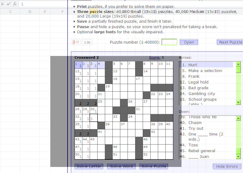
For each crossword puzzle, I created a 13 x 13 matrix of numbers. For any given cell, it was given the number 1 if it was a cell in which you could write a letter and the number 2* if it was a blacked out cell. I made an Excel sheet that matched the size/dimensions of the crossword puzzle and entered my data that way. I utilized the super-handy program Peek Through, which allowed me to actually overlay the Excel spreadsheet and see through it so I could type the numbers accurately. Screenshot:
Again, I did this for 50 crossword puzzles total, making a master 650 x 13 matrix of data. Considering I collected all the data in about an hour, my wrists were not happy.
Method and Analysis
To analyze the data, what I wanted to do was to create a single 13 x 13 matrix that would contain the “counts” for each cell. For example, for the first cell in the first column, this new matrix would display how many crosswords out of the 50 sampled for which this first cell was a cell in which you could write a letter. I recoded the data so that letter cells continued to be labeled with a 1, but blacked-out cells were labeled with a zero.
I wrote the following code in R to take my data, run it through a few loops, extract the individual cell counts across all 50 matrices, and store them as sums in the final 13 x 13 matrix.
x=read.table('clipboard', header = F)

#converts 2's into 0's for black spaces; leaves 1's alone
for (y in 1:650) {
  for (z in 1:13){
    if (x[y,z] == 2) {
       x[y,z] = 0
 }}}

attach(x)  #new x with recoded 0's and 1's

n = (as.matrix(dim(x))[1,])/13  #gives number of puzzles in dataset
bigx = matrix(rep(NaN, 169), nrow = 13, ncol = 13) #big matrix for sums

hold=rep(NaN, n) #create blank "hold" vector

for (r in 1:13) {
  for (k in 1:13) {
    hold = rep(NaN, n) #clear "hold" from previous loop
      for (i in 0:n) {
        if (i < n) {
        hold[i+1] = x[(i*13)+r,k] #every first entry in first row
    }}
    bigx[r,k] = sum(hold) #fill (r,k)th cell with # of white spaces
  }}
Then I made a picture!
library(gplots)
ax = c(1:13)
ay = c(13:1)
par(pty = "s")
image(x = 1:13, y = 1:13, z = bigx, col = colorpanel((50-25), "black", "white"),
 axes = FALSE, frame.plot = TRUE,
 main = "Letter vs. Non-Letter Cells in 50 13x13 Crossword Puzzles",
 xlab = "Column", ylab = "Row")
axis(1, 1:13, labels = ax, las = 1)
axis(2, 1:13, labels = ay, las = 2)
box()

#optional gridlines
divs = seq(.5,13.5,by=1)
abline(h=divs)
abline(v=divs)
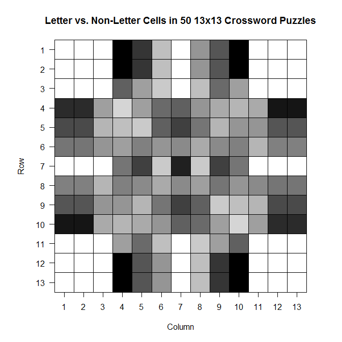
The darker a cell is, the more frequently it is a blacked out cell across those 50 sample crosswords; the lighter a cell is, the more frequently it is a cell in which you write a letter.
And while it’s not super appropriate here (since we’ve got discrete values, not continuous ones), the filled contour version is, in my opinion, much prettier:
library(gplots)
filled.contour(bigx, frame.plot = FALSE, plot.axes = {},
col = colorpanel((max(bigx)-min(bigx))*2, "black", "white"))
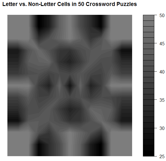
Note that the key goes from 25 to 50–those numbers represent the number of crosswords out of 50 for which a given cell was a cell that could be filled with a letter.
Comments
It’s so symmetric!! Actually, when I was testing the code to see if it was actually doing what I wanted it to be doing, I did so using a sample of only 10 crosswords. The symmetry was much less prominent then, which leads me to wonder that if I increased n, would we eventually get to the point where the plot would look perfectly symmetric?
Also: I think it would be interesting to do this for crosswords of different difficulty (all the ones on Boatload Puzzles were about the same difficulty, or at least weren’t labeled as different difficulties) or for crosswords from different sources. Maybe puzzles from the NYT have a different average layout than the puzzles from the Argonaut.
WOO!
*I chose 1 and 2 for convenience; I was doing most of this on my laptop and didn’t want to reach across from 1 to 0 when entering the data. As you see in the code, I just made it so the 2’s were changed to 0’s.
Plotting
Aalskdfsdlhfgdsgh, this is super cool.
Today in probability we were talking about the binary expansion of decimal fractions—in particular, those in the interval [0,1).
Q: WTF is the binary expansion of a decimal fraction?
A: If you know about binary in general, you know that to convert a decimal number like 350 to binary, you have to convert it to 0’s and 1’s based on a base-2 system (20, 21, 22, 23, 24, …). So 350 = 28 + (0*27) + 26 + (0*25) + 24 + 23 + 22 + 21 + (0*20) = 101011110 (1’s for all the “used” 2k’s and 0’s for all the “unused” 2k’s).
It’s the same thing for fractions, except now the 2k’s are 2-k‘s: 1/21, 1/22, 1/23, …).
So let’s take 5/8 as an example fraction we wish to convert to binary. 5/8 = 1/21 + (0*1/22) + 1/23, so in binary, 5/8 = 101. Easy!*
So we used this idea of binary expansion to talk about the Strong Law of Large Numbers for the continuous case (rather than the discrete case, which we’d talked about last week), but then we did the following:

where x = 0.x1 x2 x3 x4… is the unique binary expansion of x containing an infinite number of zeros.
Dr. Chen asked us to, as an exercise, plot γ1(x), γ2(x), and γ3(x) for all x in [0,1). That is, plot what the first, second, and third binary values look like (using the indicator function above) for all decimal fractions in [0,1).
We could do this by hand (it wasn’t something we had to turn in), but I’m obsessive and weird, so I decided to write some R code to do it for me (and to confirm what I got by hand)!
Code:
x = seq(0, 1, by = .0001)
x = sort(x)
n = length(x)
y = matrix(NaN, n)
z = matrix(NaN, n)
bi = matrix(NaN, n, nrow=n, ncol=3)

for (i in 1:n) {
   pos1 = trunc(x[i]*2)
   if (pos1 == 0) {
      bi[i,1] = 1
      y[i] = x[i]*2
      }
   else if (pos1 == 1) {
      bi[i,1] = -1
      y[i] = -1*(1-(x[i]*2))
      }
   pos2 = trunc(y[i]*2)
   if (pos2 == 0) {
      bi[i,2] = 1
      z[i] = y[i]*2
      }
   else if (pos2 == 1) {
      bi[i,2] = -1
      z[i] = -1*(1-(y[i]*2))
      }
   pos3 = trunc(z[i]*2)
   if (pos3 == 0) {
      bi[i,3] = 1
      }
   else if (pos3 == 1) {
      bi[i,3] = -1
      }
   }

bin = cbind(x,bi)
bin = as.matrix(bin)
plot(bin[,1],bin[,2],  type = 'p', col = 'black', lwd = 7,
     ylim = c(-1, 1), xlim = c(0, 1), xlab = "Value",
     ylab = "Indicator Value",
     main = "Indicator Value vs. Value on [0,1) Interval")
lines(bin[,1],bin[,3], type='p', lwd = 4, col='green')
lines(bin[,1],bin[,4], type='p', lwd = .25, col='red')
Results:

(black is 1/2, green is 1/4, red is 1/8)
I tried to make the plot readable so that you could see the overlaps. Not sure if it works.
Makes sense, though. Until you get to ½, you can’t have a 1 in that first expansion place, since 1 represents the value 1/21. Once you get past ½, you need that 1 in the first expansion place. Same things with 1/22 and 1/23.
SUPER COOL!
(I love R.)
*Note that this binary expression is not unique. All the work we did in class was done under the assumption that we were using the expressions that had an infinite number of zeroes rather than an infinite number of ones.
The question is, “why DIDN’T the chicken cross the road?
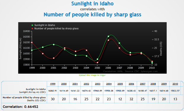
So I just found the greatest freaking website to demonstrate that correlation != causation.
Check it out.
Some of my favorites:
- http://www.tylervigen.com/view_correlation?id=7
- http://www.tylervigen.com/view_correlation?id=3857 (Look at how freaking strong that correlation is, holy hell)
- http://www.tylervigen.com/view_correlation?id=1273
- http://www.tylervigen.com/view_correlation?id=36
You can also discover your own:
“Trompe l’oeil” is a fantastic phrase
HEY FOOLIOS!
So I’ve always had this suspicion that, on average, grades are better in the spring semesters than in the fall.
And because I’m an idiot, I didn’t find this until just now.
So let’s do some analyses!
The U of I has data from fall 2003 until fall 2013. I decided to use the “all student average” value for my analysis, and I also decided to do a paired means test where the “pairs” were made up of the average for the fall semester paired with the average for the following spring semester. Since most students start in any given fall semester and graduate in any given spring semester, it made the most sense to thing of fall-spring sets, since a fall semester and the following spring semester would most likely be made up of most of the same students, at least in comparison to any other pairing.
Also, there are a total of 10 pairs, so the sample size is OBSCENELY SMALL, but I’m doing it anyway.
Here we go!
Hypothesis: the average GPA for a year of UI students will be lower in the fall than in the spring. In other words, µfall < µspring.
Method: averages were collected for all spring and fall semesters between fall 2003 and spring 2012. Fall and subsequent spring semesters were paired.
Analysis: a paired t-test was performed on the 10 pairs of data and the above hypothesis was tested at an α = .05 level.
Results: here’s the table!
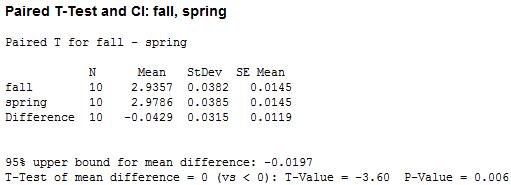
We’ve got a small p-value! That suggests, at a .05 level, that we can reject the hypothesis that the average GPA in fall and spring are equal and conclude in favor of the hypothesis that average GPA is lower in the fall than in the spring.

WOO!
brb, sleeping furiously
HELLO PEOPLE!
So today is the closing ceremony of the 2014 Winter Olympics. SADNESS!
This year’s Olympics prompted me to do a little stats project: specifically, I wanted to see if there was any sort of correlation between latitude and the quantity of medals earned in both the summer and winter games.
Now before I show you the results/plots, yes, I know that there are a lot of other factors aside from latitude that affect countries medaling in the games (wealth, government, national/international politics, geography, etc.). In fact, I’m sure that several such factors correlate somewhat with latitude on their own—for example, industrialized nations send waaaay more athletes than less-industrialized/developing nations, and many nations that are considered industrialized just happen to be at higher latitudes…that’s just one example. So take all of this nonsense with a grain of salt, m’kay?
Anyway.
Procedure:
I denoted a country’s latitude by the latitude of their capital city. For example, the US is at latitude 38º53’ N, ‘cause that’s where Washington, D.C. is. I realize that this method of measuring latitude is not so accurate for some countries whose capitals are either at the extreme south or extreme north of the country, but I didn’t want to go by, say, the “average” latitude of a country ‘cause then I would have never finished this freaking thing. So capital latitude it was.
I then consulted the almighty Wikipedia for a table of the number of medals won by country in both the summer and winter games (and within both, the total number of gold, solver, and bronze). So medal counts + latitude = my dataset!
Analyses:
First things first: correlations!
- Correlation between latitude and the number of medals won overall: 0.374
- Correlation between latitude and the number of medals won in the summer games: 0.353
- Correlation between latitude and the number of medals won in the winter games: 0.393
The above correlations do not take into account the fact that some countries have participated in almost every Olympic games (like the US) and some have participated in like four or five of them. So I made a new set of variables that took that into account. I took the ratio of the number of medals won to the number of games participated in (so they’re kind of a “how many medals per Olympics” set of variables). I did this for the summer and winter games separately as well as “overall.” The “adjusted” correlations were:
- Correlation between latitude and the number of medals won overall: 0.397
- Correlation between latitude and the number of medals won in the summer games: 0.390
- Correlation between latitude and the number of medals won in the winter games: 0.411
So not too much of a change, especially for the winter games.
(One other correlation to note when looking at the above results: the correlation between latitude and the total number of games participated in is 0.609)
Now let’s look at some graphs!
This first one shows medal count by latitude, split by type (gold, silver, bronze) for the summer games:

(Note that countries who haven’t won a medal are not plotted; those values that look like “zero” are actually indicating that one medal of that respective color has been won.)
(Another note: these are “absolute” latitudes, meaning that I’m not distinguishing between degrees north vs. degrees south; I’m really just interested in how far away from the equator countries are.)
This second one shows medal count by latitude, split by type (gold, silver, bronze) for the winter games:
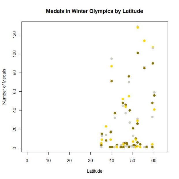
Also, I didn’t catch this until after I made the graphs (and am too lazy to go back and fix it), but notice the difference in the scales of the y-axes for summer vs. winter.
Anyway.
Cool, huh?
Americans
Here is a super interesting interactive graphic showing how different groups of Americans spend their day.
Examples:
- “At 3 AM, 95% of Americans are sleeping” (guess when I’m typing this)
- “At 8 AM, 23% of Americans are at work” (I’m in that group on T/Th!)
- “At 3:30 PM, 27% of Americans are at work” (I’m in that group on M/W/F!)
- “At 8 PM, 1% of Americans are shopping” (that’s usually when I hit up WinCo/Walmart/whatev)
Click through by activity type or sort by sex, education, age, race, etc.!
Stats Land
Just some stats-related links today! Too nervous about school to do anything else.
- Probability and Statistics Cookbook
- Free stats software!
- This is such an interesting blog!
- A Tour through the Visualization Zoo
- I’ve probably already liked to the Probability and Statistics Blog here somewhere, but I don’t care!
Post It!
So remember that interactive chart of statistical distributions? Remember how I said it would be cool if that was offered as a poster?
YAAAAAAAAAAAAAAAAAAAAAAY!
IlovethisIlovethisIlovethis
This is honestly the coolest, most informative thing I’ve found on the internet this year.
From the “about” page: The list on the left-hand side displays the names of the 76 probability distributions (19 discrete and 57 continuous) present in the chart. Hovering your mouse over the name of a distribution highlights the distribution on the chart, along with its related distributions…Each distribution on the chart, when clicked, links to a document showing detailed information about the distribution, including alternate functional forms of the distribution and the distribution’s mean, variance, skewness, and kurtosis.
This makes me SO. HAPPY.
Freaking LOOK at some of these:
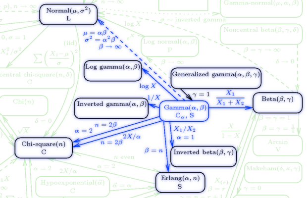
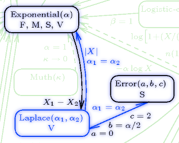
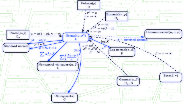
I really, really want a poster of this whole thing.
“How Long Have You Been Waiting for the Bus?” IT DOESN’T MATTER!
Today I’m going to talk about probability!
YAY!
Suppose you just went grocery shopping and are waiting at the bus stop to catch the bus back home. It’s Moscow and it’s November, so you’re probably cold, and you’re wondering to yourself what the probability is that you’ll have to wait more than, say, two more minutes for the bus to arrive.
How do we figure this out? Well, the first thing we need to know is that things like wait time are usually modeled as exponential random variables. Exponential random variables have the following pdf:
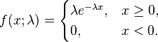
where lambda is what’s usually called the “rate parameter” (which gives us info on how “spread out” the corresponding exponential distribution is, but that’s not too important here). So let’s say that for our bus example, lambda is, hmm…1/2.
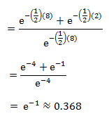
Now we can figure out the probability that you’ll be waiting more than two minutes for the bus. Let’s integrate that pdf!
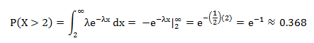
So you have a probability of .368 of waiting more than two minutes for the bus.
Cool, huh? BUT WAIT, THERE’S MORE!
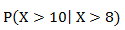
Now let’s say you’ve waited at the bus stop for eight whole minutes. You’re bored and you like probability, so you think, “what’s the probability, given that I’ve been standing here for eight minutes now, that I’ll have to wait at least 10 minutes total?”
In other words, given that the wait time thus far has been eight minutes, what is the probability that the total wait time will be at least 10 minutes?
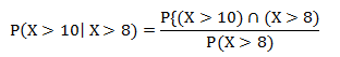
We can represent that conditional probability like this:
And this can be found as follows:
Which can be rewritten as:
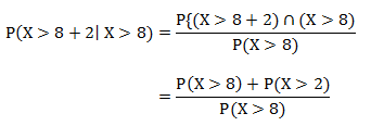
Which is, using the same equation and integration as above:
Which is the exact same probability as the probability of having to wait more than two minutes (as calculated above)!
WOAH, MIND BLOWN, RIGHT?!
This is a demonstration of a particular property of the exponential distribution: that of memorylessness. That is, if we select an arbitrary point s along an exponential distribution, the probability of observing any value greater than that s value is exactly the same as it would be if we didn’t even bother selecting the s. In other words, the distribution of the remaining function does not depend on s.
Another way to think about it: suppose I have an alarm clock that will go off after a time X (with some rate parameter lambda). If we consider X as the “lifetime” of the alarm, it doesn’t matter if I remember when I started the clock or not. If I go away and come back to observe the alarm hasn’t gone off, I can “forget” about the time I was away and still know that the distribution of the lifetime X is still the same as it was when I actually did set the clock, and will be the same distribution at any time I return to the clock (assuming it hasn’t gone off yet).
Isn’t that just the coolest freaking thing?! This totally made my week.
Facebook Stalking for DATA!
Here’s more “Claudia is bored” random thingies.
I have 111 friends on Facebook. I wanted to see the distribution of birthdays across the months (and the zodiac signs, because why not?). So I Facebook stalked everyone and found that 97 of my 111 friends had their birthdays listed (at least month and day). Here’s the distribution by month:

I knew I had a lot of February, May, and November, but I didn’t know I had so many April and July. Haha, look at August and September. Very interesting, especially in comparison to this.
And here’s some zodiac just ‘cause:

Stats Oddity
Holycrapholycrapholycrapholycrap this is cool!
Alright. This blog is about odds ratios, when they’re useful, and when they’re not.
Part I: WTF is an odds ratio?
So I feel really dumb because I’ve been dealing with odds ratios all summer for my other job and I just realized that I actually freaking teach odds ratios in class.
Durh.
An odds ratio is exactly what it sounds like: a ratio of odds (HOLY CRAP NO WAY!). So to better understand it, let’s look at what odds are. Odds are basically ratios of probabilities—specifically, the ratio of the probability of some even happening to the probability of it not happening.
Example: suppose you had 9 M&Ms in a bag (for some strange reason), three of which were red, five of which were green, and one of which is brown. To calculate your odds of pulling a red M&M, take the number of red M&Ms (3) over the number of non-red M&Ms (6). So the odds of pulling a red M&M are 3:6, or 1:2.
So what’s an odds ratio? It’s taking two of these odds and comparing them in ratio form (so it’s like a ratio of ratios). Wiki says it nicely: The odds ratio is the ratio of the odds of an event occurring in one group to the odds of it occurring in another group. If you’ve got the odds for Condition 1 as the numerator and the odds for Condition 2 as the denominator of your odds ratio, interpretation is as follows:
- Odds ratio = 1 means that the event is equally likely to occur in both Condition 1 and Condition 2.
- Odds ratio > 1 means that the event is more likely to occur in Condition 1
- Odds ratio < 1 means that the event is more likely to occur in Condition 2
Got it?
Good.
Part II: Where would you see an odds ratio?
RIGHT HERE!
My dad is involved in writing and distributing a water quality/water attitudes survey. Over the years such surveys have been distributed to 30-some-odd states and tons of data have been collected. A big part of my job this summer was to go through data from 2008, 2010, and 2012 for the four Pacific Northwest states, AK, ID, OR, and WA.
We looked specifically at a couple questions with binary answers. So let’s take this question as an example.
“Have you received water quality information from environmental agencies?” People could answer “yes” or “no.” So what we were interested in was the proportion of people who answered “yes” for several different demographics. For this example, let’s just use age. We could express this info in two different ways. The raw proportions (proportion saying “yes”) for each age range we defined:
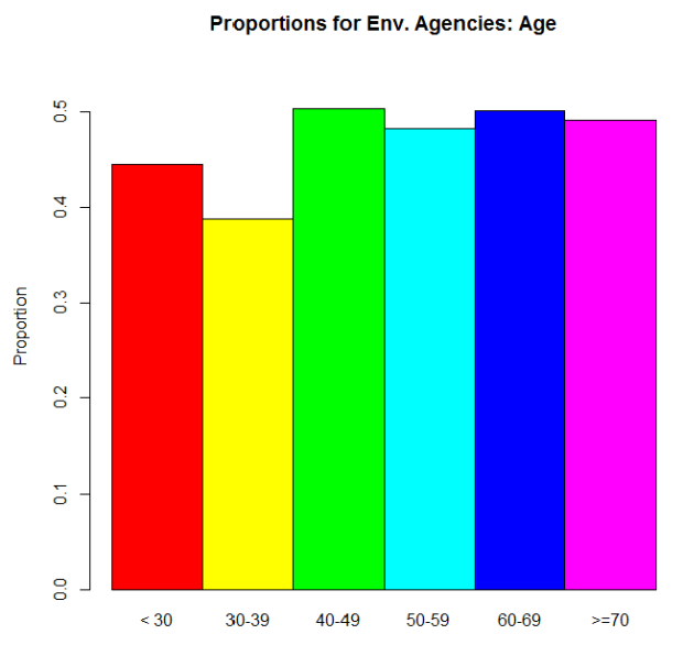
And then the odds ratios:
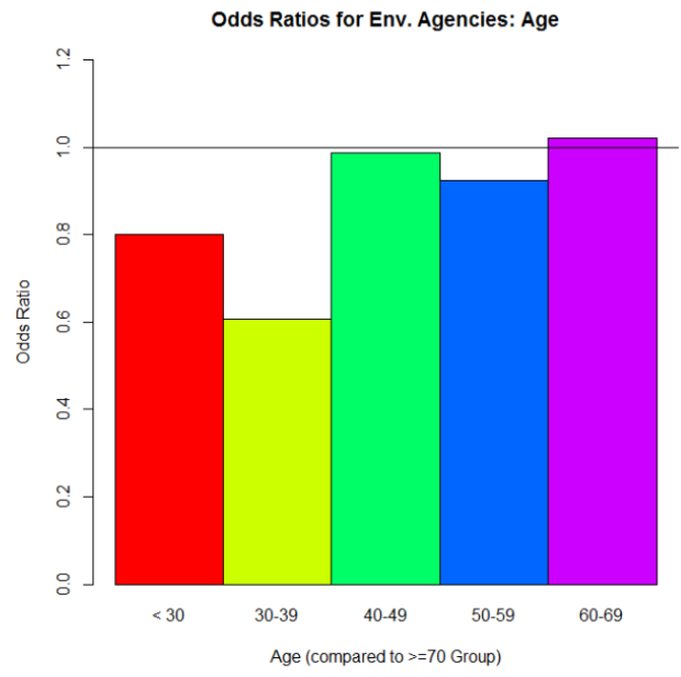
Why is the >70 group missing on this plot? Because we’re using its odds as the denominator for each of the odds ratio calculations involving the other five age categories. To calculate the odds for the >70 group, we take the proportion of “yes” over the proportion of “no.” Let’s call that odds value D. Now let’s say we want the odds ratio for the < 30 group to the >70 group (the red bar in the second graph up there). We calculate its odds the same way we did for the >70 group. Let’s call that odds value N. Then to get that odds ratio value, we take N/D. Simple as that!
But what’s it telling us? If we look at that red bar in the second graph, it’s an odds ratio of about .8. Since .8 is less than 1, we can say that people who are in the >70 group are more likely to say “yes, I’ve gotten water quality info from environmental agencies” than are people in the <30 group. And we can actually see that difference reflected in the proportions graph: the >70 group’s proportion for “yes” is higher than the <30 group’s. In fact, look at the similar shapes of the two graphs overall.
Part III: Here’s where things get interesting.
So pretty cool so far, right? When you read papers that involve a lot of proportions for binary data like this, the researchers really like to give you odds ratios, sometimes in plots like this. And sometimes it works out where that’s okay, ‘cause the odds ratios reflect what’s actually going on with the raw proportions.
But as is often the case with real data, things aren’t always nice and pretty like that.
Let’s look at another question from the surveys: “How important is clean drinking water?” This was actually originally a Likert scale question (5 different importance values were possible) but we combined ratings to make it binary in the end: “Not Important” vs. “Important.” And again, we wanted to compare answers for several different demographics. Let’s just look at age again. Here’s the odds ratio plot, again using the odds for the >70 group as our denominator for the odds ratio calculations:
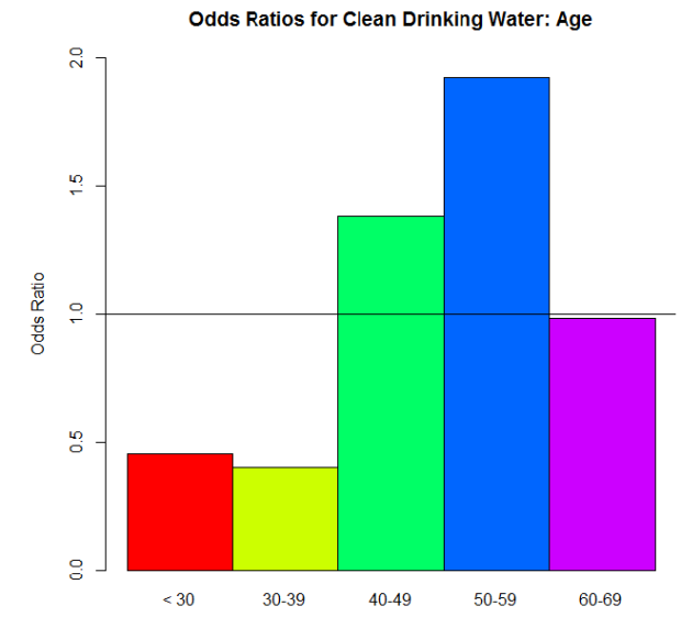
Woah! Big differences, huh? I bet the proportions differ dramatically between the age groups too—
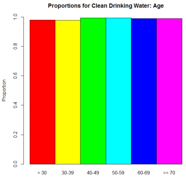
Oh.
Wait, then what the hell is going on with those odds ratios?
Here, dear reader, is where we see an instance of “stuff that works well under normal circumstances goes batshit crazy when we reach extremes.” Take another look at those proportions. No one’s going to say that clean drinking water isn’t important, right? Those are definitely high proportions. Extremely high, one might say. So when we take an odds—the ratio of the proportion for “Very Important” to the proportion for “Not Important.”–we’re seeing relatively big proportions being divided by relatively small proportions. The result? Big numbers (example: .97/.03 = 32.33, compared to a modest .56/.44 = 1.27…, for example). But the most important thing is that when you’re dealing with those extreme proportions, small differences are very much exaggerated in the odds ratios.
Suppose the proportion for the >70 group is .97. So its odds would be .97/.03 = 32.33. That 32.33 is our D again. And let’s say that the proportion for the 40 – 49 group is .98 (which I think it was, actually). Its odds would be .98/.01 = 98. The odds ratio: 98/32.33 = 3.03. A huge odds ratio! That on its own would suggest quite a big difference in proportions for these two groups…when in fact, they only differ by .01.
Part IV: So what?
This whole rambling thing has a point, I promise. As I mentioned, when you see data like this in studies and papers and stuff, you’ll often see odds ratios reported. You won’t see the actual raw proportions nearly as often. In the examples I used here, the “environmental agencies” question was an example where the differences in the odds ratios are actually meaningful, since they reflect the actual trend in the proportions. The “drinking water” question, on the other hand, was an example where the odds ratios on their own are practically meaningless. They’re dramatic, but they over-dramatize very small differences in the actual proportions. You can’t trust them on their own. If they are provided, look at the raw proportions. If not, ask yourself if dramatic odds ratios make sense. Would you expect big differences in proportions across groups, or no? Is there something else going on instead?
So the moral of the story is this: be wary as you traverse the vast universe of academic papers! Odds ratios in the mirror may be less impressive than they appear.
DONE!
(Edit: good lord, this is long. I envisioned it as like three paragraphs. Sorry.)
Geometry is for Squares
(Note: this has nothing to do with geometry.)
God I love stats.
A lot of the time it seems like the visual representation of data is sacrificed for the actual numerical analyses—be they summary statistics, ANOVAs, factor analyses, whatever. We seem to overlook the importance of “pretty pictures” when it comes to interpreting our data.
This is bad.
One of the first statisticians to recognize this issue and bring it into the spotlight was Francis Anscombe, an Englishman working in the early 1900s. Anscombe was especially interested in regression—particularly in the idea of how outliers can have a nasty effect on an overall regression analysis.
In fact, Anscombe was so interested in the idea of outliers and of differently-shaped data in general, he created what is known today as Anscombe’s quartet.
No, it’s not a vocal quartet who sings about stats (note to self: make this happen). It is in fact a set of four different datasets, each with the same mean, the same variance, the same correlation between the x and y points, and the same regression line equation.
From Wiki:
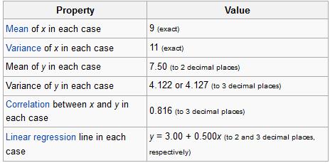
So what’s different between these datasets? Take a look at these plots:

See how nutso crazy different all those datasets look? They all have the same freaking means/variances/correlations/regression lines.
If this doesn’t emphasize the importance of graphing your data, I don’t know what does.
I mean seriously. What if your x and y variables were “amount of reinforced carbon used in the space shuttle heat shield” and “maximum temperature the heat shield can withstand,” respectively Plots 2 and 3 would mean TOTALLY DIFFERENT THINGS for the amount of carbon that would work best.
So yeah. Graph your data, you spazmeisters.
GOD I LOVE STATS.

