Look, it’s Anscombe’s quartet on steroids!
Q: What is Anscombe’s quartet?
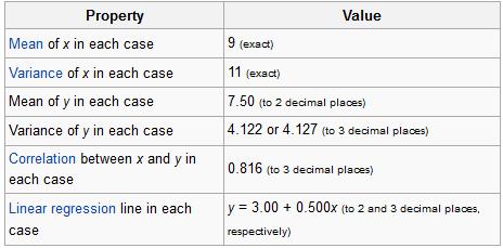
A: Anscombe’s quartet is a set of four datasets, each with 11 observations on two variables x and y, that all have (nearly) identical descriptive statistics but appear very different when graphed. The datasets all have approximately the same means (for both X and Y), variances (for both X and Y), correlations, linear regression lines, and coefficients of determination. But they look like this when graphed:

The idea behind the quartet of datasets, developed by Francis Anscombe in 1973, was to demonstrate the importance of graphing/visualizing your data in addition to just looking at its summary values.
One thing that’s not known about these datasets is exactly how Anscombe created them. But a 2017 paper titled “Same Stats, Different Graphs: Generating Datasets with Varied Appearance and Identical Statistics through Simulated Annealing” shows a method for creating differently “shaped” datasets that all have the same summary values. In this paper, the “Datasaurus Dozen” are produced: a set of 12 differently-shaped datasets (when graphed) that have the same summary stats. The paper talks about a method used to create these datasets.
It’s super cool and very interesting. Check it out here!
Random Thought of the Week
If “Anscombe’s Quartet” isn’t the name of some statistics department’s barbershop quartet somewhere, then there is something seriously wrong with this universe.
Geometry is for Squares
(Note: this has nothing to do with geometry.)
God I love stats.
A lot of the time it seems like the visual representation of data is sacrificed for the actual numerical analyses—be they summary statistics, ANOVAs, factor analyses, whatever. We seem to overlook the importance of “pretty pictures” when it comes to interpreting our data.
This is bad.
One of the first statisticians to recognize this issue and bring it into the spotlight was Francis Anscombe, an Englishman working in the early 1900s. Anscombe was especially interested in regression—particularly in the idea of how outliers can have a nasty effect on an overall regression analysis.
In fact, Anscombe was so interested in the idea of outliers and of differently-shaped data in general, he created what is known today as Anscombe’s quartet.
No, it’s not a vocal quartet who sings about stats (note to self: make this happen). It is in fact a set of four different datasets, each with the same mean, the same variance, the same correlation between the x and y points, and the same regression line equation.
From Wiki:
So what’s different between these datasets? Take a look at these plots:

See how nutso crazy different all those datasets look? They all have the same freaking means/variances/correlations/regression lines.
If this doesn’t emphasize the importance of graphing your data, I don’t know what does.
I mean seriously. What if your x and y variables were “amount of reinforced carbon used in the space shuttle heat shield” and “maximum temperature the heat shield can withstand,” respectively Plots 2 and 3 would mean TOTALLY DIFFERENT THINGS for the amount of carbon that would work best.
So yeah. Graph your data, you spazmeisters.
GOD I LOVE STATS.

