(Note: this has nothing to do with geometry.)
God I love stats.
A lot of the time it seems like the visual representation of data is sacrificed for the actual numerical analyses—be they summary statistics, ANOVAs, factor analyses, whatever. We seem to overlook the importance of “pretty pictures” when it comes to interpreting our data.
This is bad.
One of the first statisticians to recognize this issue and bring it into the spotlight was Francis Anscombe, an Englishman working in the early 1900s. Anscombe was especially interested in regression—particularly in the idea of how outliers can have a nasty effect on an overall regression analysis.
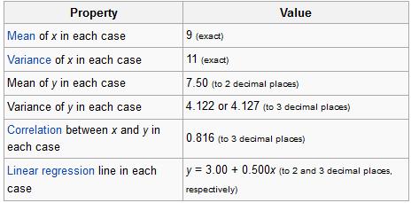
In fact, Anscombe was so interested in the idea of outliers and of differently-shaped data in general, he created what is known today as Anscombe’s quartet.
No, it’s not a vocal quartet who sings about stats (note to self: make this happen). It is in fact a set of four different datasets, each with the same mean, the same variance, the same correlation between the x and y points, and the same regression line equation.
From Wiki:
So what’s different between these datasets? Take a look at these plots:

See how nutso crazy different all those datasets look? They all have the same freaking means/variances/correlations/regression lines.
If this doesn’t emphasize the importance of graphing your data, I don’t know what does.
I mean seriously. What if your x and y variables were “amount of reinforced carbon used in the space shuttle heat shield” and “maximum temperature the heat shield can withstand,” respectively Plots 2 and 3 would mean TOTALLY DIFFERENT THINGS for the amount of carbon that would work best.
So yeah. Graph your data, you spazmeisters.
GOD I LOVE STATS.


One of the things that I remember from my Americian gov class is how a visual display of data could be spun to look like whatever the presenter wanted. The visual presentation is important! I feel things should look nice as well as be informative.
LikeLike
Exactly! I think intro stats books should have (at least) a chapter devoted solely to visual presentation that’s informative, accurate, and easy to interpret.
LikeLike