Color Palette
Y’know what? I’m not mad at it.
I still have my standard favorites when it comes to colors (orange, lime green, yellow, red, mainly), but I think my enjoyment of non-standards has broadened over the past several years.
Like…I used to really dislike neon. I like bright colors and always have, but bright rich colors, not neon. But I really started to dig neon around the end of 2019 or so.
Same thing with pastels. I’m still not a huge fan, but I’ve grown very fond of mint and lavender (that’s why I wanted an iPhone 12 – I wanted that lavender color!).
So peach fuzz? Definitely not a color I would choose as a favorite or to wear, but I appreciate it.
The end.
My Accent Color is Red
My backpack. My phone. My AirPods case. The mouse for my laptop. The one cup I always drink out of at home. At least two pairs of my winter gloves. The most commonly-used color on my nighttime running glowies. My umbrella.
Edit from the future: my desktop computer’s accent light.
Pantone Perfection

WHEN YOUR PANTS MATCH YOUR SHOES
AND YOU CAN’T SING THE BLUES
CAMOUFLAGÉ
(total rip-off of the wonderful “when the moon hits your knees / and you mispronounce trees / sycamore”)
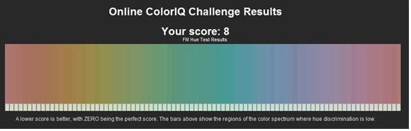
This is super fun!
How good are you? Some colors I can match almost immediately, but there’s this green color that’s like one tick away from the given green color in “easy” mode and I can’t freaking get it, haha.
WOO!
Feelin’ Blue? Feelin’ Rare?
Here’s a cool article about why blue is such a rare color in nature. Basically, it boils down to how and why color is perceived. An object looks blue because that object is absorbing the red part of the visible spectrum. Red (and colors closer to it on the spectrum) has longer wavelengths compared to blue (and the colors closer to it on the spectrum), and thus is “low energy” compared to the other colors. For an object to appear blue, it must have molecules that can absorb very small amounts of energy. These types of molecules are difficult for plants to produce, and in animals, blue usually arises out of some sort of physical property of the animal that manipulates layers of light to produce only blue (like some butterfly wings or bird feathers).
The most interesting part of the article for me, though, was the discussion of how the word for blue was something that came much later in most languages compared to the words for, say, black, yellow, or red. It reminded me of a conversation we had in…I want to say Emotional Psychology class?…where we were talking about certain languages that didn’t/don’t have a different name for the colors blue and green – they are considered the same color, so they are named the same. I want to say Korean is one of these languages, but I could be wrong.
Anyway. Thought that was cool.
One Word, Two Words, Red Words, Blue Words
This and this. Try them. How did you do?
I’m sure a (big?) portion of your ability to see the words has to do with the color/brightness/contrast settings on your monitor, but still. It’s fun to try.
I got 9/10 on the blue one and 8/10 on the red one.
Seriously, what the hell is that? There’s no word in there. Liars.
TO MS PAINT!
Fuck.
OH GOD I’M SO BAD AT THIS

I thought I was cool. I am not.
COLOR!
I was planning on doing my first “Canadian Mall” installment for Calgary today, but I had to wait around for my new fridge and didn’t have enough time to walk before any of the malls closed. So that’ll probably happen tomorrow.
BUT ANYWAY.
I know this blog probably won’t be posted until like November with my horrible uploading schedule, but I’m assuming that by the time you read this you will have noticed that there have been some design changes to my blog—specifically in the color and font departments.
That’s because I was talking to my mom tonight and debating whether to buy the custom colors/fonts option on WordPress ($30/month) and she ran and got her credit card and got it for me.
My mom is awesome. Now my blog can be even more eye-gougingly colorful!
Thanks, mom!
COLORZ
Oh my…the colors…what is this I don’t even…
I want those arm sleevy things and rainbow bow that first model’s wearing.
This looks like the most fun thing ever. 2:06? I would wear that 24/7, indecency laws be damned.
Also, Superbass is enhanced supremely by the addition of stringed instruments.
BLOG OVER!
Weekly Wiki: Cosmic Latte
Caffeine from the moon? Starbucks from the stars?
Nope! It’s the color of the universe, according to astronomers from Johns Hopkins University.
Described by Wiki as “a slightly beigeish white,” cosmic latte is the average color of the universe across the spectral range of light sampled from a large section of the universe. The average color was actually originally purported to be a light teal, but that was due to an error with the software the scientists were using. Hahaha.
The article also has a list of a bunch of different names that were proposed for the color…I personally like Big Bang Beige and Skyvory.
Too Cool for No School
I want school. I is good at book learnin’.
Anyway.
This is my closet.

The left 1/3rd is pants/skirts/dresses. The right 2/3rds is shirts of various sleevage. I own one black shirt. It’s got Hume on it.
I don’t really understand why more adults don’t wear color. I mean seriously, what’s wrong with a little bright clothing to cheer up others? Back at the U of I I recall at least seven distinct times when I was told by someone that their seeing me on campus all decked out in the rainbow made their day significantly nicer.
So why don’t more adults wear bright clothing? Possible reasons:
1. It’s freaking hard to find any. The only reason I have so much bright clothing is because I’ve been stockpiling it up since junior high. There’s a red pair of pants in there I’ve had since seventh grade. I’m probably irrationally attached to my clothes collection simply because it’s taken me so long to acquire it. ‘Cause hey, they don’t make shirts like this just anywhere:

2. Bright clothing is associated with children/childhood, and is thus not “appropriate” attire for adults. Similarly, bright clothing is associated with “oddness” (maybe because careers for which adults don colors are traditionally weird and/or are occupied by strange people—you know, clowns and audacious performers and such) and thus is stigmatizing to wear.
I know it’s how we as humans judge things—first impressions and all that happy jazz—but it still bothers me when people form first impressions of others based on clothing. As long as I don’t have >40% of my boobage hanging out or let people walking behind me see my butt crack, what’s wrong with a rainbow shirt and bright lime green pants?
Clothing is definitely a form of expression, yeah, but maybe it can be viewed as an outlet of creative expression in a world where, for most people, creative expression is otherwise oppressed. If a person is supposed to be reserved and focused on a diligent schedule at their work, for example, perhaps it would be beneficial for them to express their creative side via their clothing? Crappy example, I know, but you get what I’m saying, right?
Blah. I don’t know. I’m just tired of getting evil stares just because I’m not wearing jeans and a dull shirt.
Give me my lime green and orange. I’ll be happy.
The Use of Color in “Seven Brides for Seven Brothers”
You know what’s a fantastic movie?
Seven Brides for Seven Brothers.
Not just because it’s a ridiculously awesome musical, but because of the COLORS.
Near the middle of the movie the seven brothers (well, the six that aren’t married yet), now tamed by Millie, go to a barn raisin’ in town. Ladies and gentlemen, Team Rainbow:

I think I first saw this movie when I was eight or something, and I always remembered the barn raisin’ and the dancin’ that happened before it. I remembered it because of the colors.
If six backwoodsmen dressed as the visible spectrum wasn’t enough, you’ve got the ladies as well, seen here dancing with their boring monochromatic boyfriends.

By the way, pardon my crappy screencaps; the easiest way I could get these pics was by renting the movie on iTunes and using ScreenHunter to somewhat haphazardly get these shots.
Anyway.
The dancing sequence (perhaps one of the coolest of all time) has some pretty hot color-on-color action.
Three primaries with two primaries and a secondary.

Primary, secondary, and pink with two primaries and a secondary.

And again, but with a different male primary.

The Roy G. Biv brothers battle for the women!

I love this ending shot. None of the color pairs match. The next time you’ll see them all this happy is months after they’ve kidnapped all the women and have forced an avalanche between the lady-folk and themselves and the rest of the town.

Go watch this movie, seriously. It rocks.
TWSB: BLACKER THAN THE BLACKEST BLACK TIMES INFINITY
Oh, NASA.
NASA’s telescopes and cameras in space require the use of a super black paint dubbed Z306 in order to reduce photon contamination by absorbing erratic light that ricochets off the instrument components.
However, Z306 is apparently not black enough, as NASA scientists have been working towards and have finally developed a new material that is like 10 times blacker than Z306 and is made of carbon nanotubes grown on titanium. The big breakthrough here, aside from the DARKNESS THAT IS THE NEW BLACK, is the fact that the scientists were able to develop a material that would allow the nanotubes to stick effectively to it, therefore reducing the risk of them scratching off under wear.
You can read more about it here. Sounds pretty snazzy, if you ask me.
Today’s song: Creep by Scala & Kolacny Brothers
Oh, iTunes. iTunes, iTunes, iTunes…
Welcome to another installation of “companies that randomly change their logos and make themselves look dumb.” Today our guest will be Apple—specifically, iTunes.
For whatever the hell reason, Apple decided to entirely re-do their iTunes feel, as well as the logo.

Clicky clicky to enlarge.
Now there’s practically NO color so the whole thing looks like an inactive window (you know, when you have a window open but you’re using a different one, and the colors in the inactive one are dulled in most color schemes). And then there’s Ping, which…well, I’m still not entirely sure what its purpose is.
Then there’s this:

I suppose the CD is that out-of-date now, but still. The blue notes on CD thing was a very signature logo. To go from that to something that has very little similarities to past designs seems…odd. But I suppose “hey, let’s change things up for no reason!” is the style nowadays. Sorry, but this kind of stuff really bugs me.
I really don’t understand it, but what’re you gonna do, eh?
Today’s song: Tiny Face by Tipper
Short and sweet (the blog, not me)
I had some real trouble with that third one, but overall:
Fun times.
Today’s song: Alla Som Inte Dansar by Maskinen
I am enlightened, for I have dreamt of Lady Gaga
Seriously. Weirdest, most vivid dream I’ve had in awhile: I’m in this big theatre thing downtown with the intention of going to a Muse concert. However, the tickets are $300 or something, so I’m standing around debating whether or not to do it. I leave the main part of the theatre and go out into the front atrium, where there are a bunch of these video screens.
I stand in the corner watching one of the screens when all of a sudden Lady Gaga walks in with all these bodyguard guys. She books it over to me and hands me two key rings FULL of keys, saying, “these are keys to boats, houses, and cars. I’ll give you all of these if you give me the rights to your MySpace song.” Apparently, in the dream, I had written my MySpace song, and she wanted it badly. So I was all, “okay, cool!” Then she and I got in a limo and went to god knows where and she showed me some of her moves.
Then we went back to her place and I slept on her couch, amidst all of her panties. All I can remember from this part is that I was ridiculously happy, and I wanted to try on her shorts. Ga-ga, ooh-la-la, indeed.
Yeah. I know. What the hell is going on in my subconscious.
Anyway.
Today was “let’s defer our panic over finals with some sushi” day with the psych buddies. Everyone was going back to campus for some theatre thing afterwards, but I just wanted to go home, so I went the opposite way. I was standing at the bus stop waiting for #33 and some dude came and stood beside me. After about five minutes, I saw him look down at my pants and go: “Wow, those are lime green fleece pants!”
No kidding. I’m not colorblind.
Then: “You have more courage than I do to wear those!”
And what’s that supposed to mean, random stranger whom I’ve never before met?
It’s not courage. It’s style. MY style. If I were deliberately trying to make some sort of statement against the norm with my awesome pants, yeah, sure, I’m sure there would be some element of courage involved, but I’m not. Stop insinuating that not wearing the same style as everyone else implies I have courage. I don’t call the majority of Vancouverites cowards because they all wear the same goddamn jacket (seriously, there’s like one style of jacket up here).
I like lime green. I had the volition sometime a few years ago to make some lime green pants. And so I did. Big deal, end of story. Holy crap, you mean you wear it ‘cause you like it? Bingo, Sherlock.
I like color, thus I wear a lot of it. You probably like denim, ‘cause you were wearing way more of it than I thought was humanly possible. Was I about to say this to you? No, because you seemed quite comfortable in your style and I didn’t want to screw with your self-image by telling you that you looked like you fell out of a Levi’s shipment truck.
Can we leave each others’ fashions alone? As long as we’re not exposing obscene amounts of butt/boobs/privates, I don’t see what the problem is.
Today’s song: Launch from the soundtrack to Armageddon
Colors always win
Crayola’s freaking badass.
http://en.wikipedia.org/wiki/Crayola
http://www.sil.si.edu/exhibitions/doodles/cf/doodles_enlarge.cfm?id_image=167 (“toxicity = OK!”)
http://en.wikipedia.org/wiki/List_of_Crayola_crayon_colors
I don’t know what happened to Radical Carrot…I KNOW that was a crayon color, ‘cause we named a superhero after it in elementary school. “There isn’t any person quite like Radical Carrot!” God, I still remember the sing-song tone we yelled that in.
Anyway.
Apparently the scent of Crayola crayons is more recognizable than the scent of cheese. Rock on.
Fun with quizzes I

Rhombus, eh? Fun!
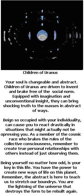
“Child of Uranus”…*snicker*…I’m so immature…
ORANGE: Lovers of the color orange lean toward sexual fantasies. The sex act is regarded as a dramatic one-act play in which they are the star. Foreplay is as important as the act of love. They whisper sweet nothings, meaningless dialogue; they feel it is their image. Orange people often do not experience orgasm – but they put on a darn good act. Men tend to pull their partner’s hair, and women leave red welts on the sex partner’s back.
Why are these so accurate?!

