Oooooo, I like it!
As many of y’all know, I like logos/emblems/symbols/etc. In the past, I have offered my praise/critique of various Olympics emblems over the years, so let’s look at some of those logos now that the Paris Olympics are fast approaching, shall we?
In fact, let’s start with that one:

Not bad. Nice and simple. The woman depicted in the flame is Marianne, a symbol of the French Republic that represents “humanism, fraternity, generosity, and sharing.”
What about Winter 2026, set to be held in Milan and Cortina?

Eh. A little bland.
Summer 2028, held in Los Angeles?
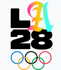
I like it! And the cool thing is that this isn’t the only emblem they’ve got. Apparently this is one of 32 37 different variations. Each variation features a different design of the “A” by various athletes, actors, artists, singers, etc.
That’s pretty freaking cool. I dig it.
That’s as far ahead as the emblems go so far. Hopefully future ones are cool as well!
Thanks, I…don’t hate it
I have ranted on here multiple times about companies changing their logos for no goddamn reason. My Google one is probably the most…passionate.
(Edit: when searching my blog for this post, I realized I’ve ranted about Google’s logo multiple times. Why? BECAUSE THEY KEEP CHANGING IT LSFJDSLKDFJSLKF)
Anyway.
I saw an article on CNN titled “Jell-O’s new look emphasizes its ‘jiggly goodness’” and I was like aw hell, here we go.
BUT…
Looky:

I’m…I’m not mad about that. It’s more simplified than the previous logo, which is a really crappy trend that’s been removing recognizable features from famous logos/symbols for a while now, but I think it actually works here. I’m not sensing ‘jiggly goodness’ anymore than I did with the original logo (I guess the lemon and lime are WIGGLY BITCHES in the new one), but I think it looks more retro and more “summery,” which is the perfect time to have Jell-O.
And I like that the “O” is a little elevated compared to the rest of the text; it matches the little “J-E-L-L…O!” jingle.
Warning: excessive cursing ahead (blame Google)

What the fuck is this
What in the fuck is this
WHAT IN THE ACTUAL FUCK IS THIS
Google, you inconsistent pile of nonsense, what was wrong with your previous logo?
Hell, what was wrong with your previous font? Anybody who knows me knows how much I hate sans serif fonts.
(For anybody that doesn’t know me: it’s a lot.)
I don’t like that using a sans-serif is becoming the equivalent of being “modern.” It’s not being modern. It’s being shit. I think there’s a correlation between how long a site’s been using a sans-serif font as their logo (or as part of their logo) and how much that site sucks.
Let me give you some examples:
![]()
Twitter has always had a sans serif font, and Twitter has always sucked. And what’s with the “t” in this font? It looks like a little airplane seat.
An airplane seat for losers.
![]()
![]()
Facebook has always had a sans serif font, too. Coincidentally, Facebook has pretty much always sucked as well.
Now let’s look at some websites that don’t suck. Notice that they all use serif fonts.
![]()
![]()
![]()
HOLY SHIT IT’S A CONSPIRACY.
Nnnngh the sans serif nonsense is such an annoying fad. Like, I know Google has changed its logo in the past, but this is too dramatic, I think. Seriously, Google, you were doing fine with variations of this…

(source)
It’s a good font. A good font. But then you somehow find the font equivalent of diarrhea residue and MAKE IT YOUR NEW LOGO’S TYPEFACE?
I am so irrationally aaaaaaaaaaaaaaaangry because of this.
At least they’re still capitalizing their name.
So help me god, if they stop capitalizing their name…
Edit: if you search “Google logo” you get this field of insanity. I don’t know about you, but this looks terrifying.

TWSB: The Colors of Google
So as is tradition, there’s some sort of major character death in my NaNoWriMo novel. At least this time it doesn’t happen until the end. Or near the end.
Or both.
Anyway.
I was going to put up my ending as an excerpt to torture you all today, but then I stumbled across a really cool science article. Considering I haven’t done my science blog yet this week, you get that instead!
Well, I guess it’s more math/pattern analysis, but hell, that’s science, ain’t it? I need to add a “math” category to my blog.*
Alrighty. So I stumbled upon this article by Ric Dragon of DragonSearch Marketing in which he makes a few educated conjectures about what the next color would be in the sequence if the Google logo had another letter.

The Google logo, as pictured above, has four colors: blue, red, yellow, and green. Mr. Dragon breaks up the letters into sequences of three to get this pattern:
- 1st sequence: blue, red, yellow (compliment to the combo of blue and red, purple)
- 2nd sequence: red, yellow, blue (compliment to the combo of red and yellow, orange)
- 3rd sequence: yellow, blue, green (combo of yellow and blue)
- 4th sequence: blue, green, red. Green = blue + yellow, but since blue is already in the sequence, he takes green-blue=yellow; thus the sequence is blue, yellow, red, with red being the compliment of blue and yellow, green.
From this, he makes the claim that the third color in any three-letter sequence must always be the result of mixing the first two colors or is the compliment of those first two colors.
So, again after removing the blue from the green in that last sequence, the next sequence of three would be yellow, red, ?
So if the rule here is combo, the next color would be orange (yellow + red)
But if the rule is compliment, the next color would be blue (compliment of yellow + red)
He talks a bit about iGoogle, too, which kind of messes up his patterns, but I actually just realized that I have a lot of stuff I should be doing other than blogging, so you’re just gonna have to read the article instead of my crappy summarizing. But it’s a cool thing to think about, eh? The mysteries of Google.
CLAUDIA OUT!
*Of course, that will require eliminating an old category to keep the total number of categories at 35. So some reassigning shall have to happen. Not that anyone else cares about that. Why the hell am I still talking?
LAKFAJLALSDJFLDHF FREAKING COMPANIES
I’m not a frequenter of eBay, at least not to the extent I used to be. But I logged on today ’cause I wanted to see if anyone was selling any Alex Colman pants.
But before I could even start my shoppin’, this caught my eye:


What in the hell nonsense is this?! Seriously. The old eBay logo was iconic enough that I remember it as being one of the first “brands” on the internet from way back when I first started using it.
But I guess the 17-year-old company didn’t think of that in its throws of teen rebelliousness. It looks like eBay president Devin Wenig ran off to Fonts.com and snatched up the first sans serif that looked trendy, much like a young hipster runs to a newly-opened Hot Topic store to buy a crappy Twilight shirt.
And the result?
A colorful Bing wannabe that unfortunately loses the iconic trigger of the old, playful, “stop bidding against me, or I will INVADE YOU!” eBay.

It’s a sad day for the internet.
Oh, iTunes. iTunes, iTunes, iTunes…
Welcome to another installation of “companies that randomly change their logos and make themselves look dumb.” Today our guest will be Apple—specifically, iTunes.
For whatever the hell reason, Apple decided to entirely re-do their iTunes feel, as well as the logo.
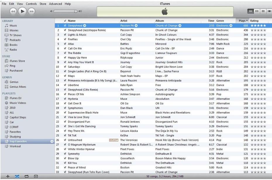
Clicky clicky to enlarge.
Now there’s practically NO color so the whole thing looks like an inactive window (you know, when you have a window open but you’re using a different one, and the colors in the inactive one are dulled in most color schemes). And then there’s Ping, which…well, I’m still not entirely sure what its purpose is.
Then there’s this:
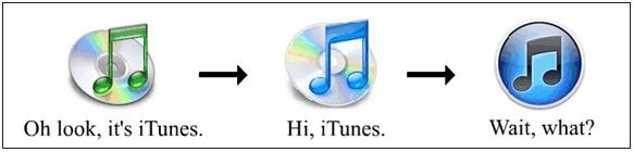
I suppose the CD is that out-of-date now, but still. The blue notes on CD thing was a very signature logo. To go from that to something that has very little similarities to past designs seems…odd. But I suppose “hey, let’s change things up for no reason!” is the style nowadays. Sorry, but this kind of stuff really bugs me.
I really don’t understand it, but what’re you gonna do, eh?
Today’s song: Tiny Face by Tipper
Claudia the Angry Blogger Presents: Yet Another Rant against Pretty Much Everything
Alternate title: I’M ALL FIRED UP, WHAT’RE YOU GONNA DO ABOUT IT?!
I had a frustrating day today for various reasons. This little rant was inspired by a Google search (and Facebook). Haha, it’s a LOT longer than it was originally intended to be, so ignore it if you don’t want to read my incoherent ramblings about stuff that really doesn’t matter at all.
Perhaps the large businesses, website designers, and marketing department heads are familiar with the old adage, “if it ain’t broke, don’t fix it.” If they are, I truly doubt that they actually know what it means, as it is quite obvious by the state of change things are in nowadays that they currently have no intention of heeding its message.
I have a Bachelor’s degree in Psychology. It may not sound like much (and it’s not), but there’s one thing in particular that stuck with me throughout my undergraduate education that has, now that I think about it, been backed up by pretty every situation I’ve ever been in: people dislike change. I’m not talking about change that brings about better circumstances, either immediately or in the distant future (though usually we’re more apt to appreciate change that leads to things improving immediately, as we as a species pretty much suck at appreciating delayed rewards). I’m also not talking about change that occurs because something is broken or something isn’t working to the best of its capability. Of course they should change the design of, for example, a hammer, if the way it’s designed now causes people to take two hours to pound a nail into a board. I’m not talking about that kind of change.
I’m talking about change for the sake of change—changing stuff just because it’s felt that a new layout is needed, or “modernization” must occur. There’s no real payoff from it, so there’s really no reason to do it—and yet it’s done anyway. I know everyone knows what I mean because as of late, websites, companies, and everybody else who gets their hands on their own logo all seem to be really desperate to do this. I noticed it a few years ago with brand logos and designs suddenly changing to look more “modern”—in particular, I recall the old M&M’s packages being replaced with the newer, hipper, 90’s versions (more flashy text, a more ‘animated’ package background).
Why? No real reason whatsoever. I know that logos and packages are a somewhat different field than websites (and actual products themselves), but every time I see a newly re-designed package with a sticker that claims something to the effect of “new design, same great product!” I have to wonder, “then why change the packaging?”
As I said, though, packaging and brand logos are in a different league than websites. Web design is something that, when it’s done right, is not noticed at all. Herein lies the problem with sudden unnecessary change, and I will show you why:
Pick a website whose design you admire for its simplicity and ease of use. This whole thing started with Google’s desire to change things up for no reason, but let’s pick another website just for the sake of demonstrating my point with even more strength: Facebook. I was not on Facebook myself until it underwent its first (and possibly second, I can’t remember) layout overhaul2. I wasn’t really interested in what it had to offer, but I do remember that the tabs at the top weren’t yet present, the “mini-feed” still existed, and things ran pretty smoothly and information was easy enough to locate.
Not long after this, however, things began to change for no reason other than to…well, I still don’t know why they thought changing stuff around was a good idea. The tabs arrived, and if I recall correctly they were met with such opposition that I had, at one point, multiple friends inviting me to join multiple groups that either protested the new layout or that claimed they had a way to change your profile back to the “old Facebook.” Then the “news feed” thing came, along with its ability to seemingly randomly switch between the “most popular” and the “most recent” feeds. Same story, same opposition.
Deny it all you like, there’s no getting around the fact that there are a lot of people who dislike the changes Facebook has made (and, for reasons seemingly unknown, keeps making). It doesn’t take much to realize why. When I first started using Facebook, I really didn’t pay any attention to the layout, mainly for this reason alone: it worked. It did what it was supposed to do, and it was fairly efficient at doing so. I got all the information I wanted to see on one page with no unnecessary fluff or clicks.
When Facebook suddenly made the tab change, I (as well as everyone else) was forced to “retrain” our methods of navigating the website. Whether the new design was in actuality more efficient than the old one was not the point in question—when the mini-feed vanished on us, we had to expend extra effort to retrain our brains to recognize that it was now under the “wall” tab and not right in front of us when we went to our profile.
The point I’m trying to make now is the fact that unnecessary layout changes are not only, you know, unnecessary, but they draw the attention to any shortcomings that may have, by accident, been included with the new layout upgrade. All of a sudden our ability to rate videos has disappeared on YouTube. Though there are claims that the overall “clutter” of the site has been reduced3, how many people notice anything other than the fact that they can’t rate something as having five stars (or still notice that the layout is still not the greatest)? That’s the point I’m trying to make: when website layouts or designs change for no obvious reason than to just change, we don’t notice the good things. We notice the failures. So what do we do? We do what only comes natural: we bitch about it.
Note, however, that this bitching does absolutely nothing. And now we come to the reason why I went on this long rant in the first place: Google. There are several things that I have always expected to remain constant (or at least, said to remain constant) within my lifetime. Among such things are:
– the speed of light in a vacuum
– Planck’s constant
– the gravitational constant
– Google
So imagine my surprise when I Googled something this afternoon and, upon viewing the search results, found that I was privy to Google’s experimental (and possibly soon-to-be-permanent) sidebar. Immediately annoyed by its intrusion into my search results, I did a search on it itself and within the top few results were—guess what?—people bitching about the experimental sidebar. “I hate this format- I like Google because it was clean and simple and now it’s all cluttered like every other search engine out there4.” There appear to be pro-Google individuals in digital tears over the possibility that a sidebar will be a permanent addition to their search results pages.
And now we come very quickly to the second point I wish to make: bitching does absolutely nothing (most of the time). Again, this has to do with the fact that people are both creatures of habit and lazy, as well as the fact that there are about five websites, in my opinion, that most people use without thinking much about it. I have friends in another country; I log onto Facebook to see if there’s any recent news about them. No real thought, it just happens. It’s like this with all the big and popular sites, and no amount of changes will probably mess with that.
When a member of the Internet Axis of Power (Google, Yahoo!, Facebook, YouTube, those such sites)1 pulls a change on the public, of course there is going to be outrage. There certainly was when YouTube changed its format and not too long ago. Comments of “the new YouTube layout sucks!” were quickly thumbed up and became the most liked comments on quite a few of the videos I’ve watched.
Why does this happen? I reiterate: if something’s working fine, and there is a sudden change that doesn’t really do much to improve aesthetics, functionality, or ease of use, it generally messes with peoples’ minds in a way that makes them upset. They have to expend effort, either getting used to a whole new way of navigating a website in the most extreme cases (Facebook), or just getting their brains used to a new visual cue on their search results page in the milder ones (a la Google’s experimental sidebar). And people don’t like effort.
But these websites are still the strongest ones out there. YouTube could make us have to type a captcha to comment on a video or Facebook could make us do the same to post on our friend’s wall, and we’d probably still use them. Why? Because they’re there. Because they’re the websites we’ve grown to love and depend on and automatically scroll to in our list of bookmarked sites. It’s basically a battle between putting up with pointless, needless site changes, or changing ourselves to not go to those sites. And we all know what side wins every time.
I’m certainly not suggesting that these websites are the bourgeoisie oppression to our proletarian desires to breeze about the internet unheeded. I’m simply saying that we can bitch all we like—if we continue to use their sites, and those in charge see no significant drop in web traffic as a result of the changes they made, then really, what’s been accomplished but a lot of angry video comments, irate Facebook groups, and upset Google users posting “it’s the end of the universe!” on forums?
One or two user casualties will ultimately do nothing, and I’m nearly stating fact when I say this: is there really anything that Google, YouTube, or Facebook could (in their right minds) do to their sites to render a huge drop in web traffic? Will a sidebar on Google’s results pages actually cause us to go elsewhere if we want to search for something? And for those of us Facebook addicts (or Facebook addicts in training), will a more-difficult-to-navigate interface really deter us much from checking the news feed every five minutes?
I started this rant with the intention of complaining about the problems of superfluous changes in web design—specifically, I wanted to point out that websites that change their layout for no other apparent reason than to simply change things up a bit get negative feedback and may lose some of their credibility (though that’s not the word I’m looking for, but I can’t think of a better one at the moment). However, the point I seem to have made in the end is that we’re pretty much tied to the major websites—and to any website we use with consistency, really—to the point where these little changes, as frustrating as they may be, will do little to deter us from partaking in the
services said websites offer. So I guess the best we can do is hold our little bitch-fests and hope the web designers happen to read video comments.
Edit: I also just came across this tidbit of information while researching for this little rant.
“‘There is nothing wrong with the logo,’ said Google product manager Nundu Janakiram. ‘We wanted to brighten it up and make some tweaks to it.'”
“There is nothing wrong with the logo.”
“There is nothing wrong with the logo.”
“There is nothing wrong with the logo.”
Sigh.
1 By traffic: http://mostpopularwebsites.net/
2 http://en.wikipedia.org/wiki/Facebook
3http://techcrunch.com/2010/01/21/new-youtube/
4 http://www.google.com/support/forum/p/Web+Search/thread?tid=67f6459e09a827ee&hl=en
Today’s song: Pompeii by E.S. Posthumus

