Do babies deprived of disco exhibit a failure to jive?
You know, sometimes the most “pointless” analyses turn up the coolest stuff.
Today I had…get ready for it…FREE TIME! So I decided to try analyzing a fairly large dataset using SAS (’cause SAS can handle large datasets better than R and because I need to practice my coding anyway).
I went here to get a list of the 5,000 most common words in the English language. What I wanted to do was answer the following questions:
1. What is the frequency distribution of letters looking at just the first letter of each word?
2. Does the distribution in (1) differ from the overall distribution in the whole of the English language?
3. Does either frequency distribution hold for the second letter, third letter, etc.?
LET’S DO THIS!
So the frequency distribution of characters for the first letter of words is well-established. Wiki, of course, has a whole section on it. Note that this distribution is markedly different than the distribution when you consider the frequency of character use overall.
I found practically the same thing with my sample of 5,000 words.
So this wasn’t really anything too exciting.
What I did next, though, was to look at the frequencies for the next four letters (so the second letter of a word, the third letter, the fourth, and the fifth).
Now obviously there were many words in the top 5,000 that weren’t five letters long. So with each additional letter I did lose some data. But I adjusted the comparative percentages so that any difference we saw weren’t due to the data loss.
Anyway. So what I did was plot the “overall frequency” in grey—that is, the frequency of each letter in the whole of the English language—against the observed frequency in my sample of 5,000 words in red—again, for the first, second, third, fourth, and fifth letter of the word.
And what I found was actually really interesting. The further “into” a word we got, the closer the frequencies conformed to the overall frequency in the English language.
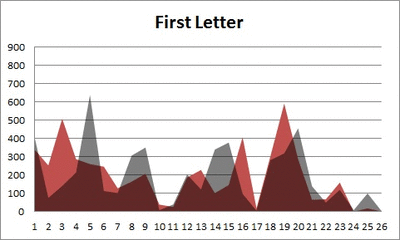
The x-axis is the letter (A=1, B=2,…Z=26). The y-axis is the number of instances out of a sample of 5,000 words. See how the red distribution gets closer in shape to the grey distribution as we move from the first to the fifth letter in the words? The “error”–the absolute value of the overall difference between the red and grey distributions–gets smaller with each further letter into the word.
I was going to go further into the words, but 1) I left my data at school and 2) I figured anyway that after five letters, I would find a substantial drop in data because there would be a much lower count of words that were 6+ letters long.
But anyway.
COOL, huh? It’s like a reverse Benford’s Law.*
*Edit: actually, now that I think about it, it’s not really a REVERSE Benford’s Law; as I found when I analyzed that pattern, it too rapidly disintegrated as we moved to the second and third digit in a given number and the frequency of the digits 0 – 9 conformed to the expected frequencies (1/10 each).
Benford’s Law? More like Benford’s LOL
Okay, today’s going to be a quick little blog ‘cause I’m busy trying to organize/transfer/protect from any possible massive hard drive failures my music library. It’s stressing me out.
While I was working on the “References” section of a textbook today at work, I noticed a pattern that I’ve come in contact with several times: there appeared to be a lot more “entries” that started with a letter from the first half of the alphabet (A – M) rather than the latter half (N – Z). I’ve done at least one other analysis regarding this topic, but I decided to do another slightly different one to see if it applied in this case.
QUESTION OF INTEREST
So what is Benford’s Law? For those of you who don’t want to click the link (lazy fools!), Benford’s Law states that with most types of data, the leading digit is a 1 almost one-third of the time, with that probability decreasing as the digit (from 1 to 9) increases. That is, rather than the probability of being a leading digit being equal for each number 1 through 9, the probabilities range from about 30% (for a 1) to about a 4% (for a 9).
What I want to see is this: is there a “Benford’s Law” type phenomenon for the letters of the alphabet? That is, do letters in the first half of the alphabet appear as the first letter of words more often than letters in the latter half of the alphabet?
HYPOTHESIS
In a given set of random words, a greater number of words will start with a letter between A and M than with a letter between N and Z.
METHOD
Using this awesome little utility, I generated (approximately) 5,000 words each from The Bible, Great Expectations, and The Hitchhiker’s Guide to the Galaxy. I then counted how many words there were starting with A, how many words there were starting with B, and so on for each letter of the alphabet.
I then did two other breakdowns of the letters:
A) I divided the alphabet in half (A – M and N – Z) and counted the total number of words for each group.
B) In order to “mirror” a sort of Benford’s Law type of structure, I divided the 26 letters into nine groups (eight groups of three letters each, one group of two letters). I wanted to make a similar breakdown of groups to the nine numbers that Benford’s Law applies to, just to see if that sort of arbitrary screwing around did anything. Visualization ‘cause I suck at explaining stuff when I’m in a hurry:

Kay? Kay.
RESULTS
I made charts!
By letter:

By “half of the alphabet” in what is probably the most worthless visual ever:

By semi-arbitrary group (dark blue) with Benford’s percentages by number (light blue) for comparison:

DISCUSSION
Well, that whole thing sucked. Okay, so obviously it’s not a perfect pattern match and I didn’t do any stats (I WAS IN A HURRY) to see whether there was any statistical significance or anything, but it was fun to screw around with for an hour or so. I wonder how different the results would be (if at all) if I were to use truly random words from the English language, not just random words selected out of three works of fiction. Perhaps material for a later blog…?
END!
Benford’s Law: The Project
Exploratory Data Analysis Project 3: Make a Pretty Graph in R (NOT as easy as it sounds)
Seriously, the code to make the graphs is longer than the code to extract the individual lists of digits from the random number vector.
Anyway.
The goal was to show a simple yet informative demonstration of Benford’s Law. This law states that with most types of data, the leading digit is a 1 almost one-third of the time, with that probability decreasing as the digit (from 1 to 9) increases. That is, rather than the probability of being a leading digit being equal for each number 1 through 9 the probabilities range from about 30% (for a 1) to about a 4% (for a 9).
For the first graph, I wanted to show how quickly the law breaks down after the leading digit (that is, I wanted to see if the second and third digit distributions were more uniform). I took a set of 10,000 randomly generated numbers, took the first three digits of each number, and created a data set out of them. I then calculated the proportion of 1’s, 2’s, 3’s…9’s in each digit place and plotted them against Benford’s proposed proportions. Because it took me literally two hours to plot those stupid errors of estimate lines correctly (the vertical red ones), I just did them for the leading digit.
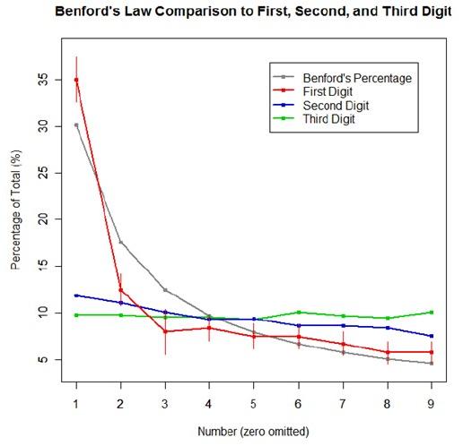
For the second graph, I took a data table from Wikipedia that listed the size of over 1,000 lakes in Minnesota (hooray for Wiki and their large data sets). I split the data so that I had only the first number of the size of the lakes, then calculated the proportion of each number. I left out the zeros for consistency’s sake. I did the same with the first 10,000 digits of pi, leaving out the zeros and counting each number as a single datum. I wanted to see, from the second graph, how Benford’s law applied to “real life” data and to a supposedly uniformly-distributed set of data (pi!).

Yes, this stuff is absolutely riveting to me. I had SO MUCH FUN doing this.

