p00t
I feel MEH today so have this:
The end.
Run in the AM
I went on my run today at 3 AM, which is about four hours earlier than normal.
I’d forgotten how NICE early AM runs are. Like, apart from the getting up at 2 AM part, I absolutely love them. There’s no one out, there’s minimal traffic, it’s super tranquil and lonely, and it just feels really good.
It’s a little creepy getting down to the path in the dark. And the end of Bowness Park (before the bridge) is REALLY dark and isolated.
But it’s all still so good.
(Except for getting up that early. That’s hard.)
Conflicted
What I want: to go to the Vancouver Coldplay concert in September
What I don’t want: Covid
What will probably be at the Vancouver Coldplay concert in September: Covid
Yes, I know I can wear a mask. And I definitely would if I end up going. But you need to understand something: I’m going to be at a Coldplay concert. All I’ll want to be doing is screaming and singing and crying, and none of those activities jive very well with wearing a mask.
Like…I REALLY want to go, but do I want to risk possible lifelong issues due to Covid for a two- or three-hour window of absolute bliss?
I don’t know.
Good lord, what is this
Welcome to the experimental film stylings of Young Claudia.
I have no idea how old I was when I made this, but that looks like the house on Borah, so maybe 5th or 6th grade?
Either way, I was freaking Spielberg.
BURN IT DOWN
British Columbia is ON FIRE!
Spokane is ON FIRE!
But let’s pretend they’re not and check out the fact that I walked/ran the distance of the Appalachian Trail.

(It’s a lie, I earned this on the 19th, but didn’t sync until the 20th.)
Eye See You!
(That’s the most unoriginal blog title ever, sorry)
Look at this eye I sketched:

Doesn’t it look like I drew it with a pencil?
WRONG!
I drew it with one of the pencil brushes in Procreate. It looks so much like real pencil, though!
I guess this is my first “digital art.”
Now I’m tempted to redo my Nick Gehlfuss drawing entirely in Procreate and see how different it looks from the pencil version.
You know, in all that free time I have.
(Maybe over Christmas break.)
10,000
A’IGHT, BITCHES, GUESS WHAT?
(Aggressively typing because I’m excited)
I just finished a pair of shoes the other day, so I logged all the miles I’ve walked on that pair into my little spreadsheet that contains my yearly distances. Observe a piece of this:

My yearly total mileage right now (or at the end of this pair of shoes) is 3933.83.
If I want to hit 10,000 kilometers for the year (6213.712 miles), I’ll need to walk/run another 2279.885 miles in the remaining 137 days of the year.
That’s an average of 16.6415 miles a day OR an average of 116.4905 miles per week (since I don’t walk/run the same distance every day).
I’ve been averaging about 130 miles a week recently.
SO. If I’m able to keep up that pace (or even a little bit less) per week, I should hit my goal of walking/running 10,000 kilometers this year!
That makes me super happy, yo. I didn’t know if it would even be possible.
But now I HAVE to do it.
Question:
How many emotional breakdowns is one allowed to have over one’s tenure application?
Asking for a friend.
HAIR
This is probably a 9” x 9” square of hair. This is what emerged when I used my thinning scissors.

Keep in mind that it had only been a month since I last used these scissors (I had cut my hair normally in the meantime.)
Keep in mind that I still have my really short hair.
Also, upon the exodus of this giant mop of hair, the back of my hair was still thick enough for my comb to get caught in it.
I have thick hair, is what I’m saying.
HAHAHA
It’s good to know 5secondfilms is still as high quality as it used to be, oh my god.
Complacency? STUPIDITY
Why are people so okay with getting (AND SPREADING) COVID?
The comments are the worst. This is absolutely maddening. Mask, you fart-for-brains.
This makes me even more hesitant for the Coldplay concert, and I am already nervous about it (mostly because of COVID). I’ll be wearing an N-99 mask, at least.
A List of Things I Will Get Up Early For:
- Running
That’s it.
Hey!
Do you want to watch Ocean’s Eleven, but don’t have 127 minutes and/or don’t want to watch a bunch of attractive actors?
Have an 11-minute, Lego stop-motion version instead! Brought to you by me, when I was a senior in high school with way too much time on my hands.
I hate myself.
Today Sucks.
Leg hurts.
I gotta do stuff and I don’t wanna do stuff.
I’m feeling angry and frustrated about other stuff.
I got freaking DUMPED ON by a storm when I was walking home.
UGH.
RGuides Redux
So remember in August like two years ago when I put all my R stuff on a Google Sites page?
Turns out you can only view a Google Sites page if you have a Google account and are signed into it.
Which pretty much sucks.
So GoDaddy it is, then.
(In case anyone cares.)
In This Blog: Claudia Ranks the City Connect Uniforms
Why? Because I’m bored and I have opinions.
Let’s go from best to worst.
#1: San Diego Padres
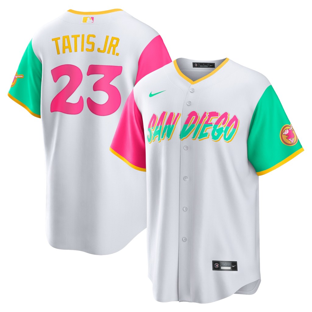
These are SO colorful and SO unique. The whole point of this project with Nike was to create uniforms that reflect cultural aspects of each team’s home city, right? This does a great job of highlighting the colors of the coastal community of San Diego and (apparently) Tijuana as well. Sunsets, surfing, skating. I love this uniform.
#2: Houston Astros
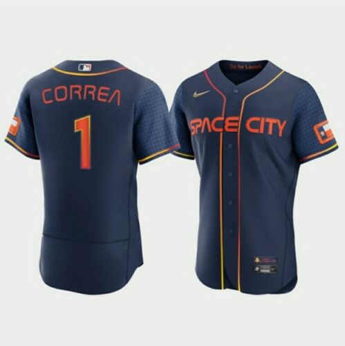
The Astros can go suck it, but I like this jersey design. I love the gradient in the striping (Houston seems to like gradients in their uniforms) and the “futuristic” font. The accompanying hats are cool, too.

#3: Seattle Mariners

I dig these. They’re old school, especially with that font choice and blue/yellow combo. I like the shadowing behind the letters/numbers and the “PNW” on the sleeve. That’s very PNW, haha. The accompanying hat has a trident on it, too, which is another throwback. This is a very history-aware jersey and I’m here for it.
#4: Colorado Rockies
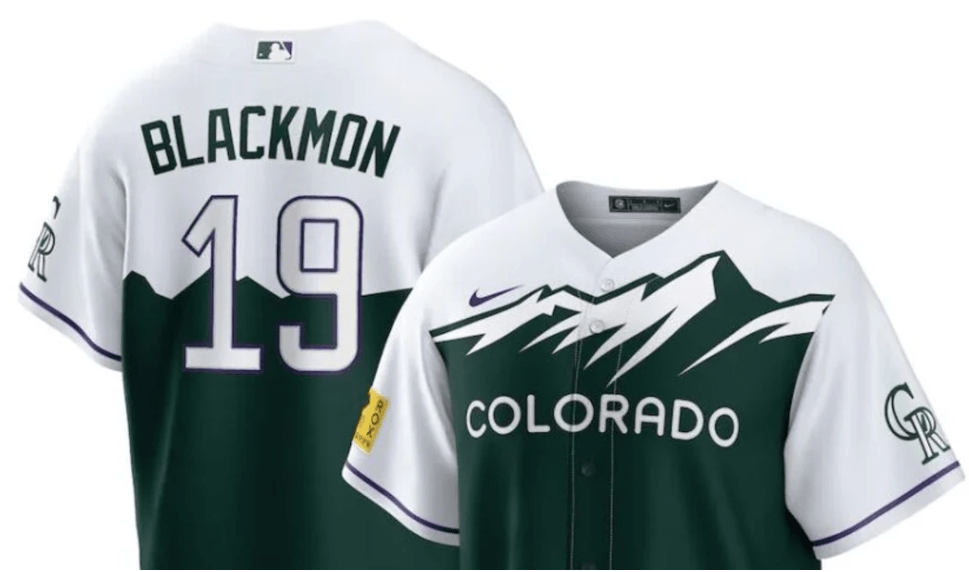
I like how they just put the license plate design on a jersey, haha. I wish this was purple because I love the Rockies’ purple, but I guess green fits better for the design. The hat’s a little off, though. But very Colorado.
#5: Washington Nationals

This seems to be, by a wide margin, everyone’s favorite City Connect design. I like it; it’s unique. But it’s not my favorite. It’s a little washed out (or should I say…WSH’d out? HAHAHAHAHA) and kind of…blah? I think if the “WSH” or the cherry blossom cluster on the front had had a thicker, darker outline to it, it would look better.
#6: Boston Red Sox
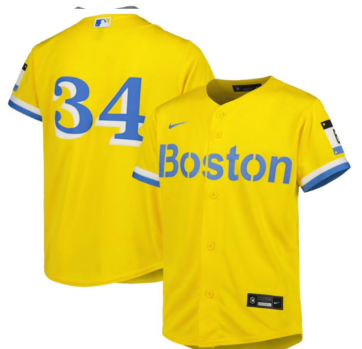
The lack of red is…well, weird. But again, the whole point of these was to represent some connection to the city’s culture. The Boston Marathon, perhaps the most famous race in the world, have blue and yellow at the finish line. There’s also a patch in the shape of a marathon bib with “617” on it to represent Boston’s area code. It’s different than what’s expected, and I like that.
#7: Pittsburgh Pirates
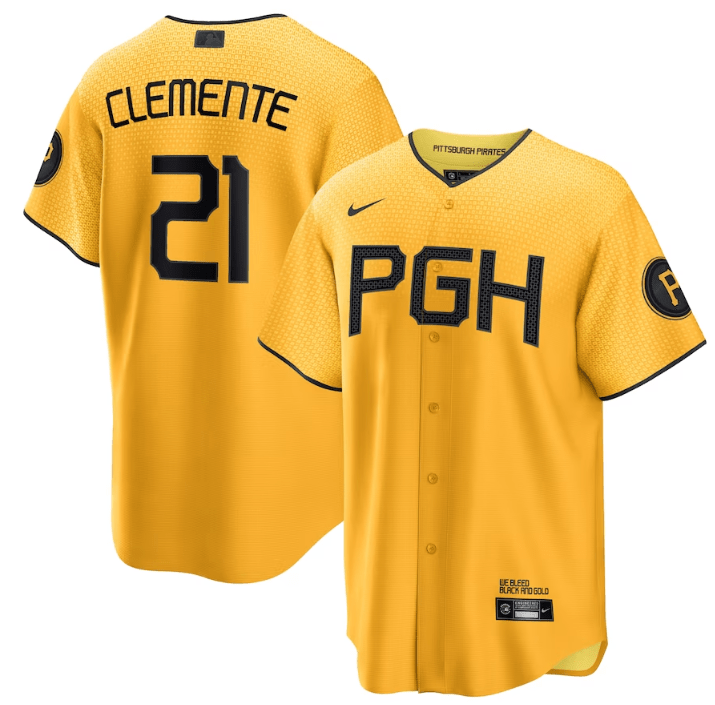
I love the yellow and I love the pattern on the jersey. There’s even a pattern on the black lettering. I just wish these patterns were easier to see! Like, up close they’re pretty prominent, but the further away you are from it, the harder it is to see those subtle details. Maybe that’s the point, but I’d like it if they were a bit more obvious.
#8: Milwaukee Brewers

I like the “Brew Crew” and I love how their logo is prominent on the sleeve. They’ve got one of the cooler logos. I guess powder blue and yellow are on the People’s Flag of Milwaukee (didn’t know that was a thing) and the blue also is supposed to pay tribute to the blue skies of summer in the city. Looks a little too safe, though.
#9: Los Angeles Angels

These are okay. I like the font of the “Angels” on the front and like the cream color. You get a beach vibe from it, which is what they were going for. Works well with LA and keeps the classic colors, too.
#10: Baltimore Orioles
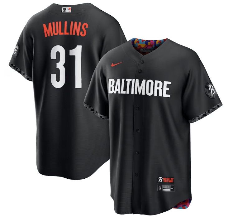
Oh, Baltimore. Why did you hide that beautiful color pattern (representing the neighborhoods of the city) on the inside? I mean, I guess they had a reason: to show on the outside how Baltimore is typically thought of versus, on the inside, the vibrant nature of the culture that actually exists there. Still, though, seeing even a hint of that color on the outside would be awesome. It does look like players often role up the cuffs of the sleeves to show off that color, though, so I guess. I think they should have incorporated Maryland’s flag somehow, too.
#11: Arizona Diamondbacks

I don’t know how I feel about the color itself, but I like the snake as the “S” and I like that it’s in Spanish. They’ve got the Arizona flag on the sleeve, too, which is a pretty flag. Honestly, they can’t do worse than this atrocity.
#12: Chicago White Sox
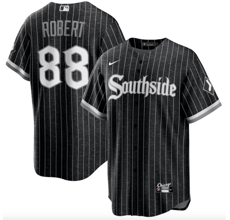
I feel bad for the White Sox because they’re basically stuck with black and white for everything, but I think they did the best they could. I think the pinstripes are unexpected and I like the font.
#13: Atlanta Braves

This is so…meh. Maybe because it looks like a uniform they already have. And that blue is just a little too light or washed out or something. At least the “A” is capitalized.
#14: Kansas City Royals
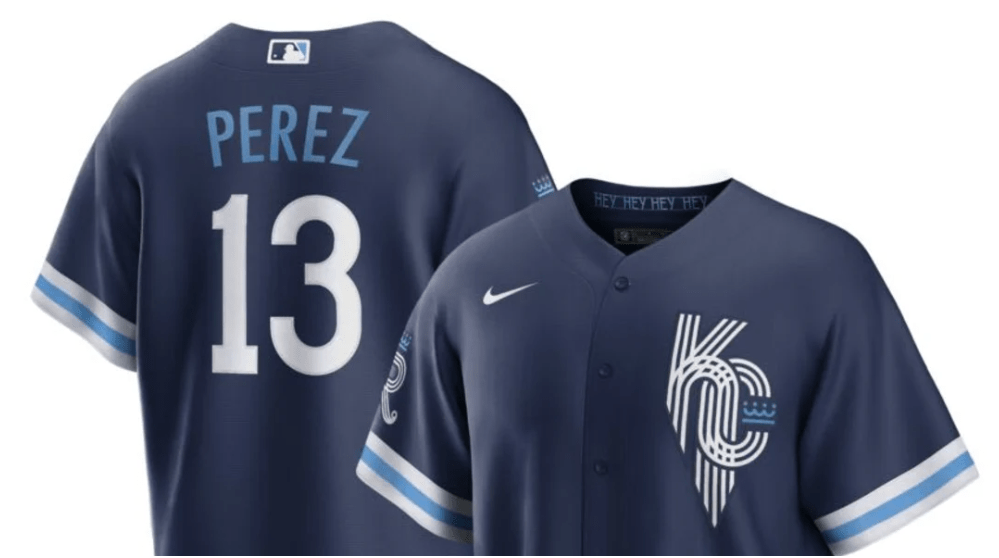
Another meh. It’s too safe. I get that they were trying to be cool with that funky “KC” on the front, but it just reminds me of the design vomit that was the Mexico ’68 Olympic logo. Too many freaking lines (Edit: JESUS CHRIST WAS THIS REALLY A THING?)

#15: Cincinnati Reds

It’s so hard to read! It’s so dark! I like the stripes on the sleeve cuffs, but other than that, blegh.
#16: Chicago Cubs
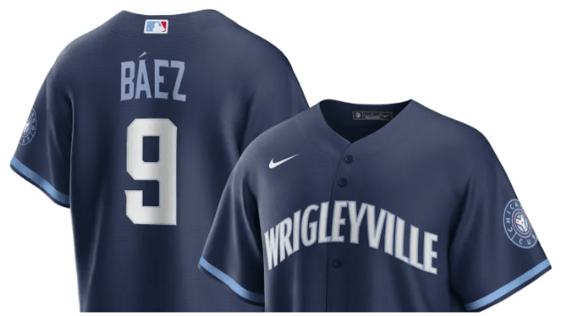
Another meh. It’s just so…plain. I don’t even have anything else to say.
#17: Los Angeles Dodgers

Oh my god, they’re BORING! Why are they so BORING?
#18: Texas Rangers

This is just a weird-ass uniform. I get no “Texas Rangers” vibe from this at all. I don’t like that dark blue and that red together. I don’t like the fonts. It’s like a really bad collage.
#19: San Francisco Giants

Oh. Oh no. It’s pretty bad when the most prominent feature of your uniform is a really bad fade to represent fog. And that creamsicle orange is yuck. Like a lot of these lower-tier uniforms, it’s too safe. But also not safe enough? I don’t even know.
#20: Miami Marlins
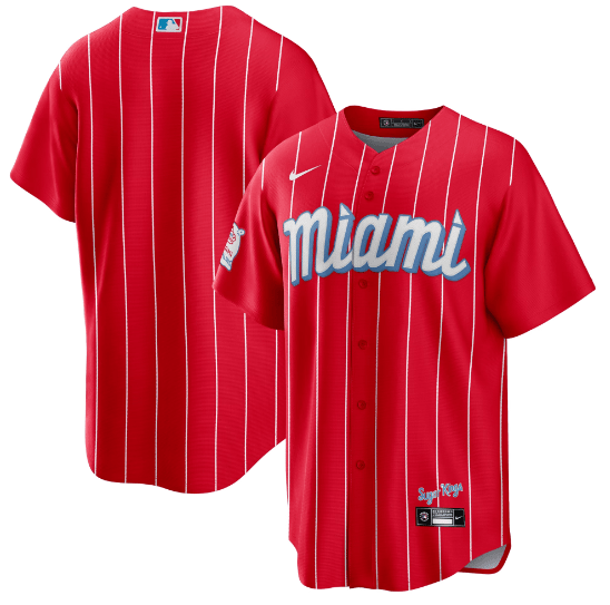
Remember that fantastically gaudy and ostentatious home run sculpture that the Marlins used to have? Remember when the sculpture got moved out of the park because Jeter hates fun? This is the uniform equivalent of that. If you think of Miami, you think of neon, beaches, palm trees, and warm nights. You think of colors and of fun. You don’t think of a puke-inducing color combination of blood red and powder blue with out-of-place pinstripes. This uniform actually almost makes me physically sick. It’s the Smurf Turf of uniforms.
In conclusion:

Thank you for coming to my Ted Talk.
Thanks, I…don’t hate it
I have ranted on here multiple times about companies changing their logos for no goddamn reason. My Google one is probably the most…passionate.
(Edit: when searching my blog for this post, I realized I’ve ranted about Google’s logo multiple times. Why? BECAUSE THEY KEEP CHANGING IT LSFJDSLKDFJSLKF)
Anyway.
I saw an article on CNN titled “Jell-O’s new look emphasizes its ‘jiggly goodness’” and I was like aw hell, here we go.
BUT…
Looky:

I’m…I’m not mad about that. It’s more simplified than the previous logo, which is a really crappy trend that’s been removing recognizable features from famous logos/symbols for a while now, but I think it actually works here. I’m not sensing ‘jiggly goodness’ anymore than I did with the original logo (I guess the lemon and lime are WIGGLY BITCHES in the new one), but I think it looks more retro and more “summery,” which is the perfect time to have Jell-O.
And I like that the “O” is a little elevated compared to the rest of the text; it matches the little “J-E-L-L…O!” jingle.
Yo Dawg, I Herd U Like French
So I put some French synonyms in your French definitions so you can learn French while you learn French.
Anyway.
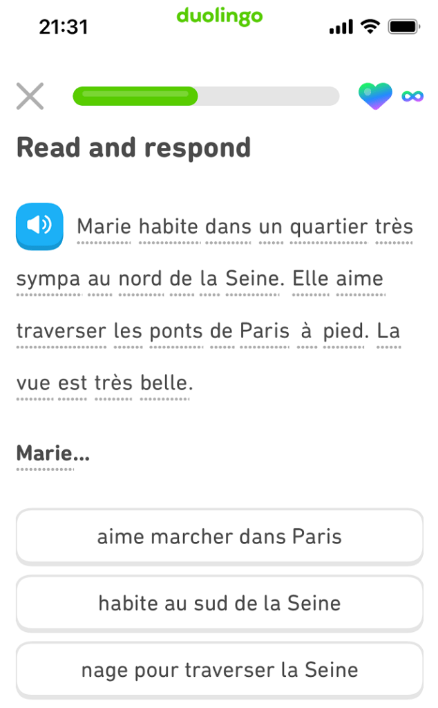
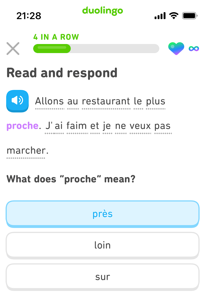
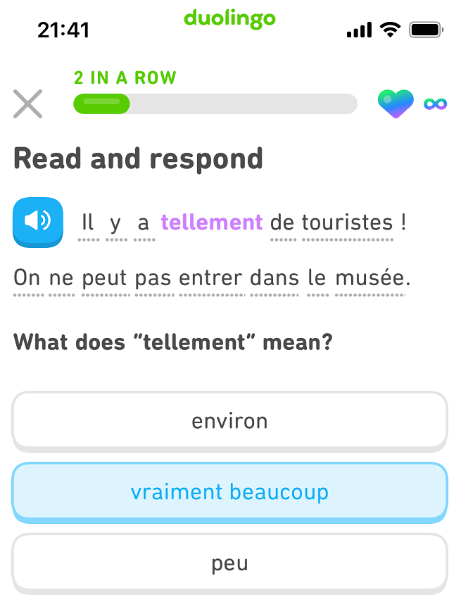
This is a new type of Duolingo exercise, and I really like it. You’re getting your current knowledge of French tested at the same time you’re learning new words. I hope there are a lot more exercises like this!
Freaking Baseball, Man.
The Mets traded Canha. I knew they were going to, but I’m still sad.
I freaking LOVE Canha, yo. He was easily one of my favorite Mets (basically him and McNeil).
Edit:
At least he’s with the Brewers, so there’s a chance he’ll get to the playoffs.
Anniversary!
Ahoy, butt-bombs!
Nate and I have been married for SEVEN YEARS now!
That’s pretty wild. Seven years is a long time.
(Says the blogger who’s been blogging for 17+ years)
