Yeah, No Thanks
Article (not sure if you can access it without permissions, though)
But here’s the abstract:
Dressing formally or informally as an academic may be a trade-off when it comes to managing impressions towards students, but the extant body of literature remains limited with only mixed results. This research is the first focussed investigation to examine the effects of academic dress formality on the ‘big two’ of impression formation, perceptions of warmth and competence. In a series of three controlled laboratory experiments (total N = 1361), we find dress formality to increase perceptions of competence but to decrease perceptions of warmth, which leads to ‘downstream’ effects on students’ evaluations of instructors and behavioural intentions to enrol in a course. Furthermore, we demonstrate that perceptions of competence may be subject to other information cues (success communication and discipline norms) that can mitigate negative effects associated with dress informality. Implications for higher education practitioners are provided.
Yeah, I’m never going to change the way I dress. I don’t care how “incompetent” it makes me look. I’ve always worn weird and colorful clothing. It’s part of who I am. And I will not sacrifice that part of my identity to “look the part” of an academic. It’s not like I’m showing too much skin or wearing offensive graphic tees or wearing jewelry that clinks together and makes noise when I lecture.
I wear color. I keep it bold but simple. I usually stick with two main colors (pants and shirt) and match one to my earrings and the other to my eyeshadow.
Oh yeah, I’m not toning down the eyeshadow, either.
Students can think what they want of me. I like to think I earn “looking competent” by, I don’t know, being competent. If they can’t get past the way someone’s dressed, that’s their problem.
Also, I’ve never had anyone comment on my apparel other than to say that the colors help brighten their day or that they like the way I always match or that they like that I don’t wear “blacks and grays.”
So fight me.
I’m gaga for Gaga
Which is substantially cooler than being cuckoo for Coco Puffs.
Or so I assume.
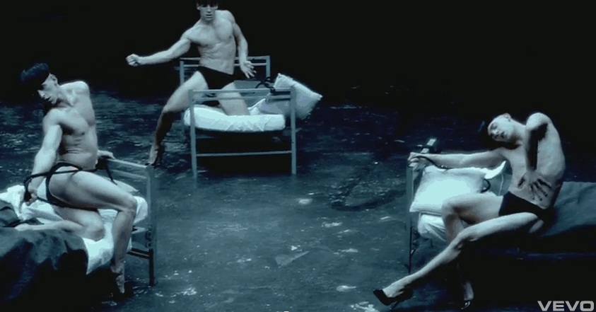
Anyone who knows me knows I’ve got a major crush on Lady Gaga. As much as I think becoming a super celebrity can destroy a person’s soul, I think that there’s still something genuine about her. And I dig her outfits. I also really, really like her music videos (edit: forgive the crappy quality of the pics; I took them using a screenshot program, haha).
Bad Romance
Aside from Just Dance, this was the second Gaga video I’d ever seen. I think I like it because of the different little segments as defined by her outfits.
Judas
I initially didn’t like this song or the video, but I watched it about three or four more times and now it’s one of my favorite Gaga songs AND vids. I really like the costuming in this one, too.
And, like pretty much everything else Gaga writes, this makes you want to freaking dance.
Alejandro
Oh. My. Goodness. The dancers.
Anyone notice how freakishly beautiful her eyes are?

There. Just a little shot of Gaga love. I hope she comes to Toronto soon.
Looking for the best font for you? I got the answer right here for the low low price of $19.99!
Due to several (two) conversations with several (two) people, I have decided to take several (twelve) fonts and analyze the personalities of the people who might use them!
Be aware: some of the fonts are a little hard to read. If you can’t read them, I would advise you to copy and paste them into Word and transform them into a font you can more easily read.
Also be aware: I am a dork.
Here we go!
Bauhaus 93
After much deliberation, Maggie and I decided that this was the font of Millard Fillmore (but only if it were colored fuchsia). Why?
Because it reminded us of sex. The only problem with this font is the ‘s’, but that will not be a problem unless “Millard Fillmore had promiscuous sex in Mississippi (and now has syphilis).”
No one can use this except Millard Fillmore (and his spawn).
Chiller
Ah, the good o’l serial killer font. If you use this you may very well feel the need to dress up as a clown and kill people in their bathtubs.
Curlz MT
Like, OMG! This totally reminds me of, like, those girls who are always like talking and stuff? And, you know, they like aren’t very smart? And they’re like everywhere? I totally think they’d, like, use this font!!!!!!11
Eras Light ITC
Ah, the font God uses. So perfect in its lettering and so heavenly, no mortal can use it.
Possible side-effects of this font include incredible healing powers, the ability to walk on water, the ability to rise from the dead after a short period of time, and a strong affiliation with one’s Father.
And God said, “Let there be Eras Light!”
Juice ITC
This font is probably the most inappropriately named font there is. I would never call this font “Juice,” and I’m sure that any other non-blind person would have to agree. It’s more “Stick Up My Ass ITC” than anything.
This person will appear to be a fun-loving individual, but the moment something goes wrong or a task to be completed is assigned, he’ll crush you beneath his foot and never crack a smile again. The best example of personality change in this person would be if Bill Cosby suddenly, in a nanosecond, became Hitler.
“Juice.”
Please.
OCR A Extended
Gay marriage is wrong. Abortion is wrong. George W. Bush is a great president.
Sorry…
Republican font.
Avoid at all costs.
Perpetua Tilting MT Bold
This font compels one to use black and to speak in complete sentences. One feels they must use correct capitalization, though It does not matter when typing in this font. They may feel the urge to go to Wall Street.
Playbill
This person will enjoy calling you “pardner” even if you’re their mortal enemy. They are most likely very bow-legged and are a bit too close to their horse. They will see something—–say, a pie–—and claim it is not big enough for the both of you.
On the bright side, they are very good with ropes.
Rockwell Extra Bold
Hell yeah! This guy’s a man! He eats steak! He doesn’t wear a shirt! He likes to crush cans against his forehead! He likes using the phrases “dude!” and “touchdown!” and “get me a beer, woman!”. This guy has way too much testosterone for his own good. He enjoys nachos, barbeques, and barbequed nachos.
Oh, and sex.
Showcard Gothic
This is the type of person who is on the edge of using the “chiller” font. They probably press so hard when writing that they make impressions in the table/desk/steel plate beneath the paper. They’re the 34-year-olds who have worked at burger king their entire lives and are damn bitter about it.
When you are around this person, try not to use any phrase with the word “Whopper” in it.
Viner Hand ITC
This font shows the progress of the serial killer after they’ve been in prison for several decades and have been released back into society. Note the subtle hits of “Chiller” still breaking through the “nicer” lettering.
Watch the hell out for the person who uses this font.
Wide Latin
Does this font make my words look fat?
Only people who weigh upwards of 300 pounds should use this, unless one wants to convey a physical appearance of inescapable fat rolls. I honestly can’t see this font leading to a positive result on a dating site:
Sexybabe69: Hay there sexi ;) !!!
Joe100: Hello
Joe100: hold on]
Joe100: font chnge
Sexybabe69: hurry back k
Joe100: alright im back
Joe100: sexybabe
[sexybabe69 logged off]
Joe100: ello
Joe100: dam
See what I mean? Fonts can mess with people. I urge you to take this list to heart, no matter how crappily thrown together it is.
Special thanks to: Aneel (Thursday’s victim) and Maggie (Friday’s victim).


