
What the fuck is this
What in the fuck is this
WHAT IN THE ACTUAL FUCK IS THIS
Google, you inconsistent pile of nonsense, what was wrong with your previous logo?
Hell, what was wrong with your previous font? Anybody who knows me knows how much I hate sans serif fonts.
(For anybody that doesn’t know me: it’s a lot.)
I don’t like that using a sans-serif is becoming the equivalent of being “modern.” It’s not being modern. It’s being shit. I think there’s a correlation between how long a site’s been using a sans-serif font as their logo (or as part of their logo) and how much that site sucks.
Let me give you some examples:
![]()
Twitter has always had a sans serif font, and Twitter has always sucked. And what’s with the “t” in this font? It looks like a little airplane seat.
An airplane seat for losers.
![]()
![]()
Facebook has always had a sans serif font, too. Coincidentally, Facebook has pretty much always sucked as well.

Now let’s look at some websites that don’t suck. Notice that they all use serif fonts.
![]()
![]()
![]()
HOLY SHIT IT’S A CONSPIRACY.
Nnnngh the sans serif nonsense is such an annoying fad. Like, I know Google has changed its logo in the past, but this is too dramatic, I think. Seriously, Google, you were doing fine with variations of this…
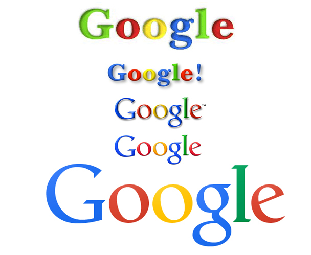
(source)
It’s a good font. A good font. But then you somehow find the font equivalent of diarrhea residue and MAKE IT YOUR NEW LOGO’S TYPEFACE?
I am so irrationally aaaaaaaaaaaaaaaangry because of this.
At least they’re still capitalizing their name.
So help me god, if they stop capitalizing their name…
Edit: if you search “Google logo” you get this field of insanity. I don’t know about you, but this looks terrifying.


[…] I don’t know if I can pick just one. People who don’t know how to courteously use a sidewalk. Company logos changing for no good reason. […]
LikeLike