Do babies deprived of disco exhibit a failure to jive?
You know, sometimes the most “pointless” analyses turn up the coolest stuff.
Today I had…get ready for it…FREE TIME! So I decided to try analyzing a fairly large dataset using SAS (’cause SAS can handle large datasets better than R and because I need to practice my coding anyway).
I went here to get a list of the 5,000 most common words in the English language. What I wanted to do was answer the following questions:
1. What is the frequency distribution of letters looking at just the first letter of each word?
2. Does the distribution in (1) differ from the overall distribution in the whole of the English language?
3. Does either frequency distribution hold for the second letter, third letter, etc.?
LET’S DO THIS!
So the frequency distribution of characters for the first letter of words is well-established. Wiki, of course, has a whole section on it. Note that this distribution is markedly different than the distribution when you consider the frequency of character use overall.
I found practically the same thing with my sample of 5,000 words.
So this wasn’t really anything too exciting.
What I did next, though, was to look at the frequencies for the next four letters (so the second letter of a word, the third letter, the fourth, and the fifth).
Now obviously there were many words in the top 5,000 that weren’t five letters long. So with each additional letter I did lose some data. But I adjusted the comparative percentages so that any difference we saw weren’t due to the data loss.
Anyway. So what I did was plot the “overall frequency” in grey—that is, the frequency of each letter in the whole of the English language—against the observed frequency in my sample of 5,000 words in red—again, for the first, second, third, fourth, and fifth letter of the word.
And what I found was actually really interesting. The further “into” a word we got, the closer the frequencies conformed to the overall frequency in the English language.
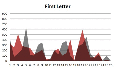
The x-axis is the letter (A=1, B=2,…Z=26). The y-axis is the number of instances out of a sample of 5,000 words. See how the red distribution gets closer in shape to the grey distribution as we move from the first to the fifth letter in the words? The “error”–the absolute value of the overall difference between the red and grey distributions–gets smaller with each further letter into the word.
I was going to go further into the words, but 1) I left my data at school and 2) I figured anyway that after five letters, I would find a substantial drop in data because there would be a much lower count of words that were 6+ letters long.
But anyway.
COOL, huh? It’s like a reverse Benford’s Law.*
*Edit: actually, now that I think about it, it’s not really a REVERSE Benford’s Law; as I found when I analyzed that pattern, it too rapidly disintegrated as we moved to the second and third digit in a given number and the frequency of the digits 0 – 9 conformed to the expected frequencies (1/10 each).

