War of the Words: Nate and Claudia Play Scrabble
Hello, people! So I did all of this stuff over the weekend/in the airport, but because of craziness with the flight and everything yesterday, I’m just posting it now.
Okay? Okay.
Nate and I have been playing Scrabble approximately once a week since the beginning of the year.* We have been recording our scores since we first started playing (for a total of 26 games), and I have been taking pictures of our completed Scrabble boards for the past 17 games.
NOW IT IS TIME FOR OUR SCRABBLE GAME-RELATED STATS.
Before we look at our performances, I want to preface this by saying that Nate has the incredible talent of pulling all the vowels all the time, which is the only reason his average is lower than mine. I’m sure if he didn’t have the Scrabble Curse of Vowels and was able to pull the Q, J, and X as often as I do, our scores would be much more equal.
Just sayin’.
Here are our point stats.

Holy crap, my standard deviation is huge. Nate’s super consistent; I’m all over the place.
Here are box plots!

I should do a test of equal means (paired t-test) and a test of equal variance, but I’m pretty sure they’d both come up as significantly different.**
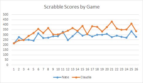
Here are our score trends across the 26 games.
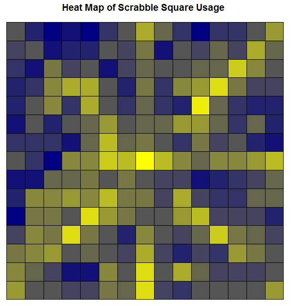
I also made a heat map of the Scrabble board! Here is a heat map of our most frequently used tile spaces based on the 17 pictures of our completed boards. Yellower squares indicate more frequent use; bluer squares indicate less frequent use. Obviously the center square is the yellowest because the first word in every game has to touch it. This center square had the maximum number of uses (17), but all tile spaces were used at least once.
There was another heat map I made which highlighted which squares had the highest number of points placed on them across the 17 games (calculated by just summing the point totals of all the tiles placed on each given square over all the games), but that wasn’t as interesting.
Now we have SUPER SCRABBLE, so that’s going to start happening soon. New data!
*Not every week, though, and we played a few games in 2014, but that’s all irrelevant anyway.
**They did.
Scrabble Letter Values and the QWERTY Keyboard
Hello everyone and welcome to another edition of “Claudia analyzes crap for no good reason.”
Today’s topic is the relationship between the values of the letters in Scrabble and the frequency of use of the keys on the QWERTY layout keyboard.
This analysis took three main stages:
- Plot the letters of the keyboard by their values in Scrabble.
- Plot the letters of the keyboard by their frequency of use in a semi-long document (~50 pages).
- Compute the correlation between the two and see how strongly they’re related.
Step 1
There are 7 categories of letter scores in Scrabble: 1-, 2-, 3-, 4-, 5-, 8-, and 10-point letters. The first thing I decided to do was create gradient to overlay atop a QWERTY and see what the general pattern is. Here is said overlay:

Makes sense. K and J are a little wonky, but that might just be because the fingers on the right hand are meant to be skipping around to all the other more commonly-used letters placed around them. This was the easiest part of the analysis (except for making that stupid gradient; it took a few tries to get the colors at just the right differences for it to be readable but not too varying).
Step 2
I found a 50 or so page Word document of mine that wasn’t on anything specific and broke it down by letter. I put it into Wordle and got this lovely size-based comparison of use:

I then used Wordle’s “word frequency” counter to get the number of times each letter was used. I then ranked the letters by frequency of use.
I took this ranking and compared it to the category breakdown used in Scrabble—that is, since there are 10 letters that are given 1 point each, I took the 10 most frequently used letters in my document and assigned them to group 1, the group that gets a point each. There are 2 letters in Scrabble that get two points each; I took the 11th and 12th most frequently used letters from the document and put them into group 2. I did this for all the letters, down until group 7, the letters that get 10 points each.
So at this point I had a ranking of the frequency of use of letters in an average word document in the same metric as the Scrabble letter breakdown. I made a similar graph overlaying a QWERTY with this data:

Pretty similar to the Scrabble categories, eh? You still get that wonky J thing, too.
Side-by-side comparison:


Step 3
Now comes the fun part! I had two different ways of calculating a correlation.
The first way was the category to category comparison, which would require the use of the Spearman correlation coefficient (used for rank data). Essentially, this correlation would measure how often a letter was placed in the same group (e.g., group 1, group 4) for both the Scrabble ranking and the real data ranking. The Spearman correlation returned was 0.89. Pretty freaking high.
I could also compare the Scrabble categories against the raw frequency data, which would require the use of the polyserial correlation. Since the frequency decreases as the category number increases (group 1 has the highest frequencies, group 10 has the lowest), we would expect some sort of negative correlation. The polyserial correlation returned was -.92. Even higher than the Spearman.
So what can we conclude from this insanity? Basically that there’s a pretty strong correlation between how Scrabble decided to value the letters and the actual frequency of letter use in a regular document. Which is kind of a “duh,” but I like to show it using pretty pictures and stats.
WOO!
Today’s song: Sprawl II (Mountains Beyond Mountains) by Arcade Fire

