Stats Oddity
Holycrapholycrapholycrapholycrap this is cool!
Alright. This blog is about odds ratios, when they’re useful, and when they’re not.
Part I: WTF is an odds ratio?
So I feel really dumb because I’ve been dealing with odds ratios all summer for my other job and I just realized that I actually freaking teach odds ratios in class.
Durh.
An odds ratio is exactly what it sounds like: a ratio of odds (HOLY CRAP NO WAY!). So to better understand it, let’s look at what odds are. Odds are basically ratios of probabilities—specifically, the ratio of the probability of some even happening to the probability of it not happening.
Example: suppose you had 9 M&Ms in a bag (for some strange reason), three of which were red, five of which were green, and one of which is brown. To calculate your odds of pulling a red M&M, take the number of red M&Ms (3) over the number of non-red M&Ms (6). So the odds of pulling a red M&M are 3:6, or 1:2.
So what’s an odds ratio? It’s taking two of these odds and comparing them in ratio form (so it’s like a ratio of ratios). Wiki says it nicely: The odds ratio is the ratio of the odds of an event occurring in one group to the odds of it occurring in another group. If you’ve got the odds for Condition 1 as the numerator and the odds for Condition 2 as the denominator of your odds ratio, interpretation is as follows:
- Odds ratio = 1 means that the event is equally likely to occur in both Condition 1 and Condition 2.
- Odds ratio > 1 means that the event is more likely to occur in Condition 1
- Odds ratio < 1 means that the event is more likely to occur in Condition 2
Got it?
Good.
Part II: Where would you see an odds ratio?
RIGHT HERE!
My dad is involved in writing and distributing a water quality/water attitudes survey. Over the years such surveys have been distributed to 30-some-odd states and tons of data have been collected. A big part of my job this summer was to go through data from 2008, 2010, and 2012 for the four Pacific Northwest states, AK, ID, OR, and WA.
We looked specifically at a couple questions with binary answers. So let’s take this question as an example.
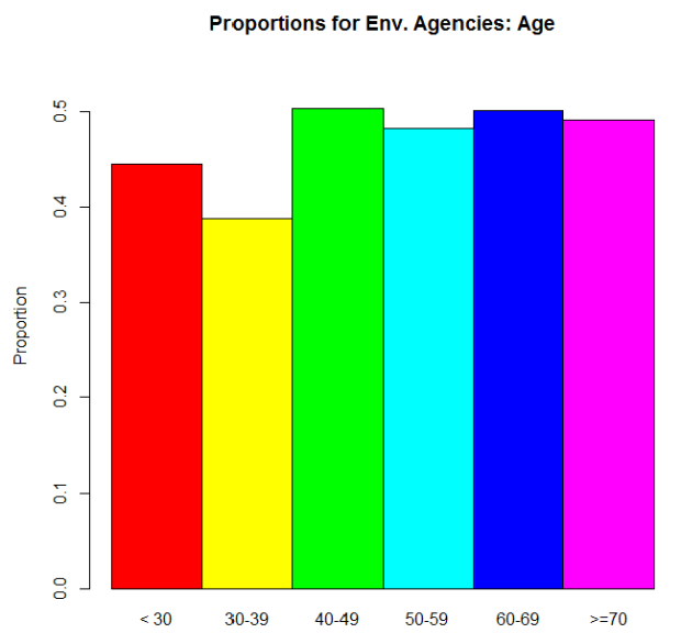
“Have you received water quality information from environmental agencies?” People could answer “yes” or “no.” So what we were interested in was the proportion of people who answered “yes” for several different demographics. For this example, let’s just use age. We could express this info in two different ways. The raw proportions (proportion saying “yes”) for each age range we defined:
And then the odds ratios:
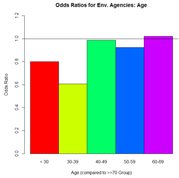
Why is the >70 group missing on this plot? Because we’re using its odds as the denominator for each of the odds ratio calculations involving the other five age categories. To calculate the odds for the >70 group, we take the proportion of “yes” over the proportion of “no.” Let’s call that odds value D. Now let’s say we want the odds ratio for the < 30 group to the >70 group (the red bar in the second graph up there). We calculate its odds the same way we did for the >70 group. Let’s call that odds value N. Then to get that odds ratio value, we take N/D. Simple as that!
But what’s it telling us? If we look at that red bar in the second graph, it’s an odds ratio of about .8. Since .8 is less than 1, we can say that people who are in the >70 group are more likely to say “yes, I’ve gotten water quality info from environmental agencies” than are people in the <30 group. And we can actually see that difference reflected in the proportions graph: the >70 group’s proportion for “yes” is higher than the <30 group’s. In fact, look at the similar shapes of the two graphs overall.
Part III: Here’s where things get interesting.
So pretty cool so far, right? When you read papers that involve a lot of proportions for binary data like this, the researchers really like to give you odds ratios, sometimes in plots like this. And sometimes it works out where that’s okay, ‘cause the odds ratios reflect what’s actually going on with the raw proportions.
But as is often the case with real data, things aren’t always nice and pretty like that.
Let’s look at another question from the surveys: “How important is clean drinking water?” This was actually originally a Likert scale question (5 different importance values were possible) but we combined ratings to make it binary in the end: “Not Important” vs. “Important.” And again, we wanted to compare answers for several different demographics. Let’s just look at age again. Here’s the odds ratio plot, again using the odds for the >70 group as our denominator for the odds ratio calculations:
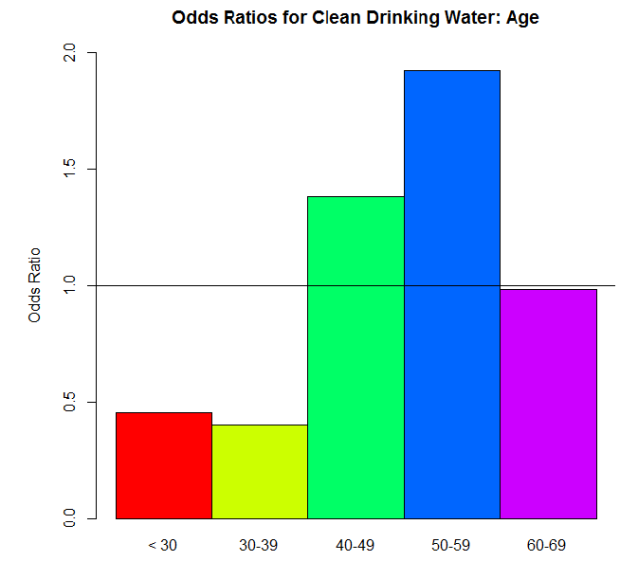
Woah! Big differences, huh? I bet the proportions differ dramatically between the age groups too—
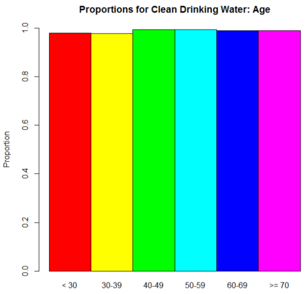
Oh.
Wait, then what the hell is going on with those odds ratios?
Here, dear reader, is where we see an instance of “stuff that works well under normal circumstances goes batshit crazy when we reach extremes.” Take another look at those proportions. No one’s going to say that clean drinking water isn’t important, right? Those are definitely high proportions. Extremely high, one might say. So when we take an odds—the ratio of the proportion for “Very Important” to the proportion for “Not Important.”–we’re seeing relatively big proportions being divided by relatively small proportions. The result? Big numbers (example: .97/.03 = 32.33, compared to a modest .56/.44 = 1.27…, for example). But the most important thing is that when you’re dealing with those extreme proportions, small differences are very much exaggerated in the odds ratios.
Suppose the proportion for the >70 group is .97. So its odds would be .97/.03 = 32.33. That 32.33 is our D again. And let’s say that the proportion for the 40 – 49 group is .98 (which I think it was, actually). Its odds would be .98/.01 = 98. The odds ratio: 98/32.33 = 3.03. A huge odds ratio! That on its own would suggest quite a big difference in proportions for these two groups…when in fact, they only differ by .01.
Part IV: So what?
This whole rambling thing has a point, I promise. As I mentioned, when you see data like this in studies and papers and stuff, you’ll often see odds ratios reported. You won’t see the actual raw proportions nearly as often. In the examples I used here, the “environmental agencies” question was an example where the differences in the odds ratios are actually meaningful, since they reflect the actual trend in the proportions. The “drinking water” question, on the other hand, was an example where the odds ratios on their own are practically meaningless. They’re dramatic, but they over-dramatize very small differences in the actual proportions. You can’t trust them on their own. If they are provided, look at the raw proportions. If not, ask yourself if dramatic odds ratios make sense. Would you expect big differences in proportions across groups, or no? Is there something else going on instead?
So the moral of the story is this: be wary as you traverse the vast universe of academic papers! Odds ratios in the mirror may be less impressive than they appear.
DONE!
(Edit: good lord, this is long. I envisioned it as like three paragraphs. Sorry.)
I think I’m a witch, guys
Remember that whole creepy-beating-the-odds thing with the 13-digit number last week? Well today my TA returned a stack of homeworks to me so I brought them to my office and started in on alphabetizing them. This involved splitting the big pile into two smaller ones. So I attempt to do that, but it turns out that the unsorted pile was actually naturally divided into two sections: the first containing last names starting with A – L, the other containing last names starting with M – Z.
Which is creepy on its own.
So I go through the A – L pile and alphabetize, then I go on to the M – Z pile. Well, guess what?
IT WAS ALREADY ALPHABETIZED.
Please keep I mind that my TA does not attempt to alphabetize the homeworks as he grades and has told me that he usually grades them in the order they are in the original pile I hand him.
So yeah.
Creepy stuff, man.
What are the odds?
Holy freaking crap, you guys.
HOLY. FREAKING. CRAP.
I beat some incredibly ridiculous odds today.
I was in the library this afternoon writing my lecture. This week we’re talking about random variables, so I wanted to create an example of both a discrete random variable and a continuous random variable. I wanted to show that a continuous variable can take on ANY value in a given interval, so I decided to just mash the number pad on the keyboard to come up with a number with a bunch of decimals. So I mashed away and got this: 128.3671345993.
Satisfied with this as an example, I turned the page in our textbook to keep working. And what was the book’s example for a continuous variable? 128.3671345993.
WHAT.
What the hell are the odds of that? (0.0000000001:1 discounting the decimal point).
Ridiculous odds are ridiculous. I had a little heart attack in the library.
This Week’s Science Blog: What are the Odds?
A recent study has shown that babies as young as twelve months old have a basic understanding of probability.
How did researchers come to this conclusion? They ran a bunch of twelve- and fourteen-month-olds through a series of tests. First, they gave the babies both a black and a pink lollipop and recorded the preference of the baby. Once the preference was recorded, the babies were let go and then brought back at a later date for a second test.
The second test involved showing the babies two clear jars—one of which contained many pink lollipops and only a few black ones, the other containing many black lollipops but few pink ones. With the babies still watching, a researcher reached a hand into each jar and pulled out a lollipop, but concealed with their hand the color of the candy. They dropped the lollipops into separate opaque cups so that the babies still couldn’t see the color, then asked them to choose one of the cups.
The cool thing? The babies consistently chose the cup belonging to the more “likely” jar. That is, they selected the cup that belonged to the candy drawn from the jar containing the greatest number of the babies’ preferred lollipop color. From the article, “this indicates that many kids, even when they’re very young, are able to make the mental connection that a random lollipop picked from a jar that had more pink lollipops, is more likely to be pink than one picked from a jar containing mostly black lollipops.”
How cool is that?

