Font Face
I don’t feel like this happened.
*checks word*
Nope, still freaking Calibri. But let’s compare, shall we?
Calibri on top, Aptos on bottom.

I don’t like the way the lowercase “L” looks in the Aptos font and I don’t like the shorter ascenders/descenders in Aptos, but I do appreciate that Aptos keeps the double-storey font type consistent when you make the text italicized. That was something that really bugged me with Calibri.
Also, I like that Aptos is…blockier? I don’t know if that’s the right way to describe it, but it’s a bit more “in your face,” which I like.
So eh.
Scumbag Calibri
So I’ve figured out why Calibri is pretty much my least favorite font ever!
I was typing a draft of an email at work the other day. On the computers there, Microsoft Word’s settings haven’t been changed from their defaults; as such, things are automatically typed up in Calibri.
Gross, I know.
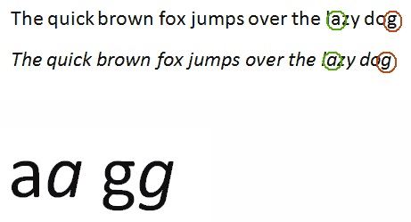
Anyway. Typing a draft of an email. I highlighted a phrase to italicize it and noticed something interesting:
Notice anything? I mean, aside from the italic-ness. Look again:
Mr. High and Mighty Calibri thinks it’s okay to change the lowercase g and lowercase a from double-story to single-story (actual terms) when italicizing.
Oh silly little arrogant fartface font. I knew there was a reason I didn’t like you, apart from your attempted overthrow of the Times New Roman dynasty upon the arrival of Word 2007 and all its tab-happy obnoxiousness.
Screw you! Times New Roman forever!


