A Visual Explanation of Analysis of Variance (ANOVA)
HOKAY GUYZ. We’re doing ANOVA in two of the lab sessions I’m running. I like explaining ANOVA because it’s something that might seem complicated/difficult if you look at all the equations involved but is actually a pretty intuitive procedure. Back when I taught my class at the U of I, I always preferred to explain it visually first and then look at the math, just because it really is something that’s easier to understand with a visual (like a lot of things in statistics, really).
So that’s what I’m going to do in today’s blog!
The first confusing thing about ANOVA is its name: analysis of variance. The reason this is confusing is because ANOVA is actually a test to determine if a set of three or more means are significantly different from one another. For example, suppose you have three different species of iris* and you want to determine if there is a significant difference in the mean petal lengths for these three species.
“But then why isn’t it called “analysis of means?” you ask.
Because ANOME is a weird acronym
Because—get this—we actually analyze variances to determine if there are differences in means!
BUT HOW?
Keep reading. It’s pretty cool.
Let’s look at our iris example. The three species are versicolor, virginica, and setosa. Here I’ve plotted 50 petal lengths for each species (150 flowers total). The mean for each group is marked with a vertical black line. Just looking at this plot, would you suspect there is a significant difference amongst the means (meaning at least two of the means are statistically significantly different)? It looks like the mean petal lengths of virginica and versicolor are similar, but setosa’s kind of hanging out there on its own. So maybe there’s a difference.

Well, ANOVA will let us test it for sure!
Like the name implies, ANOVA involves looking at the variance of a sample. What’s special about ANOVA, though, is the way it looks at the variance of a sample. Specifically, it breaks it down into two sources: “within-groups” variance and “between-groups” variance. I’ll keep using our iris sample to demonstrate these.
Within-groups variance is just as it sounds—it’s the variation of the values within each of the groups in the sample. Here, our groups are the three species, and our within-groups variance is a measure of how much the petal length varies within each species sample. I’ve taken the original plot and changed it so that the within-groups variance is represented here:

You can think of the sum of the lengths of these colored lines as your total within-groups variance for our sample.**
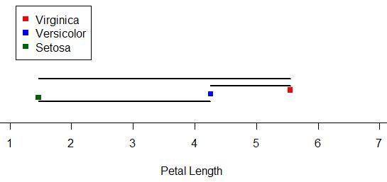
What about between-groups variance? Well, it’s pretty much just what it sounds like as well. It’s essentially the variance between the means of the groups in the sample. Here I’ve marked the three species means and drawn black line segments between the different means. You can think of the sum of the lengths of these black lines as your total between-groups variance for the sample:
ALRIGHTY, so those are our two sources of variance. Looking at those two, which do you think we’d be more interested in if we were looking for differences amongst the means? Answer: between-groups variance! We’re less concerned about the variance around the individual means and more concerned with the variance between the means. The larger our between-groups variance is, the more evidence we have to support the claim that our means are different.
However, we still have to take into account the within-groups variance. Even though we don’t really care about it, it is a source of variance as well, so we need to deal with it. So how do we do that? We actually look at a ratio: a ratio of our between-groups variance to our within-groups variance.
In the context of ANOVA, this ratio is our F-statistic.*** The larger the F-statistic is, the more the between-groups variance—the variance we’re interested in—contributes to the overall variance of the sample. The smaller the F-statistic, the less the between-groups variance contributes to the overall variance of the sample.
It makes sense, then, that the larger the F-statistic, the more evidence we have to suggest that the means of the groups in the sample are different.

Above are the length-based loose representations of our between- and within-groups variances for our iris data. Notice that our between-groups variance is longer (and thus larger). Is is larger enough for there to be a statistically significant difference amongst the means? Well, since this demo can only go so far, we’d have to do an actual ANOVA to answer that.
(I’m going to do an actual ANOVA.)
Haha, well, our F = 1180, which is REALLY huge. For those of you who know what p-values are, the p-value is like 0.0000000000000001 or something. Really tiny. Which means that yes, there is a statistically significant difference in the means of petal length by species in this sample.
Brief summary: we use variance to analyze the similarity of sample means (in order to make inferences about the populatoin means) by dividing variance into two source: within-groups variance and between-groups variance. Taking a ratio of these two sources, the larger the ratio is, the more evidence there is to suggest that the variation between groups is great–which in turn suggests the means are different.
Anyway. Hopefully this gave a little bit more insight to the process, at least, even if it wasn’t a perfectly accurate description of how the variances are exactly calculated. I still think visualizing it like this is easier to understand than just looking at the formulae.
*Actual data originally from Sir Ronald Fisher.
**That’s not exactly how it works, but close enough for this demo.
***I won’t go much into this here, either, just so I don’t have to explain the F distribution and all that jazz. Just think of the F-statistic as a basic ratio of variances for now.
TWSB: Happy birthday, Sir Ronald Fisher!
Happy birthday to one of the greatest statisticians ever: Sir Ronald Fisher!
Fisher (1890 – 1962) was an English statistician/biologist/geneticist who did a few cool things…you know…like CREATING FREAKING ANALYSIS OF VARIANCE.
Yes, that’s right kids. Fisher’s the guy that came up with ANOVA. In fact, he’s known as the father of modern statistics. Apart from ANOVA, he’s also responsible for coining the term “null hypothesis”, the F-distribution (F for “Fisher!”), and maximum likelihood.
Seriously. This guy was like a bundle of statistical genius. What would it be like to be the dude who popularized maximum likelihood? “Oh hey guys, I’ve got this idea for parameter estimation in a statistical model. All you do is select the values of the parameters in the model such that the likelihood function is maximized. No big deal or anything, it just maximizes the probability of the observed data under the distribution.”
I dealt with ML quite a bit for my thesis and I’m still kinda shaky with it.
I would love to get into the heads of these incredibly smart individuals who come up with this stuff. Very, very cool.
Good lord…
I think Sir Ronald Fisher is the statistics equivalent to Leibniz in my mind. Check it:
…this paper laid the foundation for what came to be known as biometrical genetics, and introduced the very important methodology of the analysis of variance, which was a considerable advance over the correlation methods used previously.
The freaking ANOVA, people.
In addition to “analysis of variance”, Fisher invented the technique of maximum likelihood and originated the concepts of sufficiency, ancillarity, Fisher’s linear discriminator and Fisher information. His 1924 article “On a distribution yielding the error functions of several well known statistics” presented Karl Pearson’s chi-squared and Student’s t in the same framework as the Gaussian distribution, and his own “analysis of variance” distribution Z (more commonly used today in the form of the F distribution). These contributions easily made him a major figure in 20th century statistics.
Do you know what the Z distribution is? It’s used for setting confidence intervals around correlation estimates. Since a correlation is bound by -1 and 1, any sampling distribution with a mean correlation other than zero has a skewed distribution, and thus requires unsymmetrical confidence intervals to be set. Fisher’s Z distribution is a non-linear transformation of correlations that FORCES THEM INTO A NORMAL DISTRIBUTION in which you can set symmetrical confidence intervals, and then you can TRANSFORM THOSE LIMITS BACK and get confidence intervals in the original sampling distribution of correlations.
Seriously, that’s pretty freaking amazing. This guy rocked. Go search him in Wikipedia and see the massive list of “see also” pages.

