Graphin’ It
I think my favorite topic we covered in ASHA this past winter semester was the “good visualizations, bad visualizations” topic, in which I showed the students some examples of some really good visualizations of data/information as well as some really bad ones.
Visualization of information is, in my opinion, overlooked in introductory (and advanced) statistics courses. It’s important to not only understand the analyses and the data behind the analyses, but it’s just as important to be able to convey the meanings and interpretations of the data in ways that make said meanings/interpretations easy to understand. This can be done very effectively and efficiently with a good visualization.
And it can be done very misleadingly with a poor visualization.
I think I’m going to incorporate a little unit (maybe a lab or two?) focusing on the importance of good visualization next time I teach a higher-level stats course. Even if I just give similar examples to the ones I gave in ASHA (as well as, of course, general guidelines for different types of common visualizations), I can at least get students thinking about the visual presentation of information and how important it can be.
Anyway.
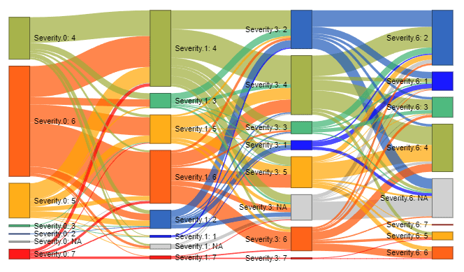
The Dreaded Sankey Diagram
When they are used unnecessarily, I hate Sankey diagrams.
And because I’m a member of r/dataisbeautiful, I see them used ALL THE TIME
They are, in my opinion, a really distracting way to present information in a lot of cases because they’re just so bulky. Usually the “thread” of interest ends up being so small it’s like…why did we need all this other information?
I get that they’re supposed to show some sort of flow, but like with all other graphs, ya gotta do it right, bro. It’s so easy to make them way too cluttered.
(Source)
Or way too…weird.

(Source)
We can do better, yo.

