TWSB: Analyzing Old Faithful with Faithful Old Regression
Alright y’all, sit your butts down…it’s time for some REGRESSION!
If you’ve ever gone to Yellowstone National Park, you likely stopped to watch Old Faithful shoot off its rather regular jet of water. In case you’ve never seen this display, have a video taken of an eruption in 2007:
(Side note: you can hear people frantically winding their disposable cameras throughout the video. Retro.)
What does Old Faithful have to do with regression, you ask?
Well, while the geyser is neither the largest nor the most regular in Yellowstone, it’s the biggest regular geyser. Its size, combined with the relative predictability of its eruptions, makes it a good geyser for tourists to check out, as park rangers are able to estimate when the eruptions might occur and thus inform people about them. And that’s where regression comes into play: by analyzing the relationship between the length of an Old Faithful eruption and the waiting time between eruptions, a regression equation can be created that can allow for someone armed with the length of the last eruption to predict the amount of waiting time until the next one. Let’s see how it’s done!*
Part 1: What is Regression?
(This is TOTALLY not comprehensive; it’s just a very brief description of what regression is. There are a lot of assumptions that must be met and a lot of little details that I left out, but I just wanted to give a short overview for anyone who’s like, “I know a little bit about what regression is, but I need a bit of a refresher.”)
Regression is a statistical technique used to describe the relationship between two variables that are thought to be linearly related. It’s a little like correlation in the sense that it can be used to determine the strength of the linear relationship between the variables (think of the relationship between height and weight; in general, the taller someone is, the more they’re likely to weigh, and this relationship is pretty linear). However, unlike correlation, regression requires that the person interested in the data designate one variable as the independent variable and one as the dependent variable. That is, one variable (the independent variable) causes change in the other variable (the dependent variable, “dependent” because its value is at least in part dependent on the changes of the independent variable). In the height/weight example, we can say that height is the independent variable and weight the dependent variable, as it makes intuitive sense to say that height affects weight (and it doesn’t really make sense to say that weight affects height).
What regression then allows us to do with these two variables is this: say we have 30 people for which we’ve measured both their heights and weights. We can use this information to construct an equation of a line—the regression line—that best describes the linear relationship between height and weight for these 30 people. We can then use this equation for inference. For example, say you wanted to estimate the weight for a person who was 6 feet tall. By plugging in the value of six feet into your regression equation, you can calculate the likely associated weight estimate.
In short, regression lets us do this: if we have two variables that we suspect have a linear relationship and we have some data available for those two variables, we can use the data to construct the equation of a line that best describes the linear relationship between the variables. We can then use the line to infer or estimate the value of the dependent variable based on any given value of the independent variable.
Part 2: Regression and Old Faithful
We can apply regression to Old Faithful in a useful way. Say you’re a park ranger at Yellowstone and you want to be able to tell tourists when they should start gathering around Old Faithful to watch it spout its water. You know that there’s a relationship between how long each eruption is and the subsequent waiting time until the next eruption. (For the sake of this example, let’s say you also know that this relationship is linear…which it is in real life.) So you want to create a regression equation that will let you predict waiting time from eruption time.
You get your hands on some data**—recorded eruption lengths (to the nearest .1 minute) and the subsequent waiting time (to the nearest minute) and you use this to build your regression equation! Let’s pretend you know how to do this in Excel or SPSS or R or something like that. The regression equation you get is as follows:
WaitingTime = 33.97 + 10.36*EruptionTime
What does this regression equation tell us? The main thing it tells us is that based on this data set, for every minute increase in the length of the eruption (EruptionTime), the waiting time (WaitingTime) until the next eruption increases by 10.36 minutes.
It also, of course, gives us a tool for predicting the waiting time for the next eruption following an eruption of any given length. For example, say the first eruption you observe on a Wednesday morning lasts for 2.9 minutes. Now that you’ve got your regression equation, you can set EruptionTime = 2.9 and solve the equation for the WaitingTime. In this case,
WaitingTime = 33.97 + 10.36*2.9 = 33.97 + 30.04 = 64.01
That means that you estimate the waiting time until the next eruption to be a little bit more than an hour. This is information you can use to help you do your job—telling tourists when the next eruption is likely.
Of course, no regression equation (and thus no prediction based off a regression equation) is perfect—I’ve read that people who try to predict eruptions based on regression equations are usually within a 10-minute margin, plus or minus—but it’s definitely a useful tool in my opinion. Plus it’s stats, so y’know…it’s cool automatically.
END!
*I actually have no idea if Yellowstone officials actually have used regression to determine when to tell crowds to gather at the geyser; I can’t remember how it’s all even set up at the Old Faithful location, seeing as how I was like six years old when I saw it and Nate and I were thwarted in our efforts to see it a few weeks ago. But hey, any excuse to talk about stats, right?
**There are a decent number of Old Faithful datasets out there; I chose this one because it was easy to find and decently precise with regards to recording the durations.
Multicollinearity revisited
So as none of you probably remember, I did a blog in April (March?) on the perils of dealing with data that had multicollinearity issues. I used a lot of Venn diagrams and a lot of exclamation points.
Today I shall rehash my explanation using the magical wonders that are vectors instead of Venn diagrams. Why?
1. Because vectors are more demonstrably appropriate to use, particularly for multiple regression,
2. I just learned how to do it, and
3. BECAUSE STATISTICS RULE!
So we’re going to do as before and use the same dataset, found here, of the 2010 Olympic male figure skating judging. And I’m going to be lazy and just copy/paste what I’d written before for the explanation: the dataset contains vectors of the skaters’ names, the country they’re from, the total Technical score (which is made up of the scores the skaters earned on jumps), the total Component score, and the five subscales of the Component score (Skating Skills, Transitions, Performance/Execution, Choreography, and Interpretation).
And now we’ll proceed in a bit more organized fashion than last time, because I’m not freaking out as much and am instead hoping my plots look readable.
So, let’s start at the beginning.
Regression (multiple regression in this case) is taking a set of variables and using them to predict the behavior of another variable outside the sample in which the variables were gathered. For example, let’s say I collected data on 30 people—their age, education level, and yearly earnings. What if I wanted to examine the effects of two of these variables (let’s say the first two) on the third variable (yearly earnings) That is, what weighted combination of the variables age and education level best predict an individual’s yearly earnings?
Let’s call the two variables we’re using as predictors X1 and X2 (age and education level, respectively). These are, appropriately named, predictor variables. Let’s call the variable we’re predicting (yearly earnings) Y, or the criterion variable.
Now we can see a more geometric interpretation of regression.

Suppose the predictor variables (represented as vectors) span a space called the “predictor space.” The criterion variable (also a vector) does not sit in the hyper plane spanned by the predictor variables, but instead it exists at an angle to the space (I tried to represent that in the drawing).
How do we predict Y when it’s not even in the hyper plane? Easy. We orthogonally project it into the space, producing a vector Y ̂ that lies alongside the two predictor variable vectors. The projection is orthogonal because we want to make the angle between Y and Y ̂ the smallest in order to minimize errors.

So here is the plane containing X1, X2, and Y ̂, the projection of Y into the predictor space. From here, we can further decompose Y ̂ into portions of the X vectors’ lengths. The b1 and b2 values let you know the relative “weight” of impact that X1 and X2 have on the criterion variable. Let’s say that b1 = .285. That means that for every unit change in X1, it is predicted that Y would change by .285 units. The longer the length of the b, the more influence its corresponding predictor variable has on the criterion variable.
So what is multicollinearity, anyway?
Multicollinearity is a big problem in regression, as my vehement Venn diagrams showed last time. Multicollinearity is essentially linear dependence of one form or another, which is something that can easily be explained using vectors.
Exact linear dependence occurs when one predictor vector is a multiple of another, or if a predictor vector is formed out of a linear combination of several other predictor vectors. This isn’t necessarily too bad; the multiple or linearly combined vector doesn’t add much to the analysis, and you can still orthogonally project Y into the predictor space.
Near linear dependence, on the other hand, is like statistical Armageddon. This is when you’ve got two predictor vectors that are very close to one another in the predictor space (highly correlated). This is easiest to see in a two-predictor scenario.

As you can see, the vectors form an “unstable” plane, as they are both highly correlated and there are no other variables to help “balance” things out. Which is bad, come projection time. In order to find b1, I have to be able to “draw” it parallel to the other predictor vector, which, as you can see, is pretty difficult to do. I have to the same thing to find b2. It gets even worse if you, for example, were to have a change in the Y variable. Even the slightest change would strongly influence the b values, since when you change Y you obviously chance its projection Y ̂ too, which forces you to meticulously re-draw the parallel b’s on the plane.
SKATING DATA TIME!
Technically this’ll be an exact linear dependence example (NOT the stats Armageddon of near linear dependence), but what’re you gonna do?
So bad things happen when predictor variables are highly correlated, correct? Here’s the correlation matrix for the five subscales:


I don’t care who you are, correlations above .90 are high. Look at the correlation between Skating Skills and Choreography, holy freaking crap.
So let’s see what happens in regression land when we screw with such highly correlated predictor variables.


If you’re unfamiliar with R and/or regression, I’m predicting the total Composite score from the five subscales. The numbers under the “Estimate” column are the b’s for the intercept and each subscale (SS, T, P, C, and I). But the most interesting part of this regression is under the “Pr(>|t|)” column. These are the p-values which essentially tell you whether or not a predictor significantly* accounts for some proportion of variation in the criterion variable. The generally accepted cutoff point is any value p < .05 (with anything less than .05 meaning that yes, the predictor variable accounts for a significant proportion of variance in the criterion).
As you can see by the values in that last column, not a single one of the predictor variables is considered to be significant. Which is odd, when you think about it initially—after all, we’re predicting the total Composite score, which is composed of these individual predictor variables—why wouldn’t any of them be significant in terms of the amount of variance they account for in the Composite? Well, because the Composite score is the five subscales added together, it’s a direct linear combination of the predictor variables. Because all of the predictor variables appear to account for an equal amount of variance—and because the variance in the Composite score involves a lot of “overlapping” variance from each of the predictors, none of them are deemed statistically significant.
Cool, huh?
*Don’t even get me started on this—this significance is “statistical significance” rather than practical significance, and if you’re interested as to why .05 is traditionally used as the cutoff, I suggest you read this.
Today’s song: Top of the World by The Carpenters
Multicollinearity: The Silent Killer
Warning: this whole blog is like a stats orgy for me, but if you’re not into that, feel free to skip.
OKAY, so…last week for my Measurement homework, we were told to analyze data taken from the VANCOUVER 2010 OLYMPIC MALE FIGURE SKATING JUDGING!!!! Yeah, I was super happy.
Anyway, so since the only thing we really looked at was reliability between the judges and the components, I decided to screw around with it more this afternoon. Very quickly, my little fun turned into an exercise of how multicollinearity can destroy an analysis.
First, a brief explanation of the data (which can be found RIGHT HERE). The dataset contains vectors of the skaters’ names, the country they’re from, the total Technical score (which is made up of the scores the skaters earned on jumps), the total Component score, and the five subscales of the Component score (Skating Skills, Transitions, Performance/Execution, Choreography, and Interpretation).
So the first thing I did was find out the correlations between the five subscales. The way the data were initially presented gave the subscale scores broken up by the nine judges (so 45 columns), but since the reliability of the judges was so high, I felt it appropriate to collapse the judges’ ratings into the average judge scores for each subscale. So here’s the correlation matrix:
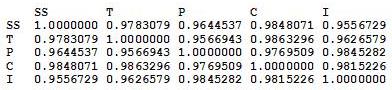
From this, it’s pretty apparent how related these subscales are.
AND NOW THE REGRESSION!

Here I’m predicting the total Composite score from the five subscales. Intuitively, these subscale coefficients should all be significant, right? Since the Composite score is, you know, entirely dependent on all of them.
Well, if we try this out, we get no significance at the .05 level FOR ALL SUBSCALES.
That’s right, the very variables that CREATE the Composite score don’t explain ANY significant amount of variance in it!
But why, you ask? (And I know you’re asking it!)
MULTICOLLINEARITY!
Regression coefficients are numbers that explain the change in the dependent variable for every unit change in the corresponding independent variable. For example, if the regression coefficient for Skating Skills was 3.52, then we would expect that for every unit change in Skating Skills, the Composite score would increase 3.52 units. Well, how are regression coefficients interpreted? As the amount of change in the dependent variable that can be explained by a single independent variable while holding the other variables constant.
That last part is the most important, and requires a picture.
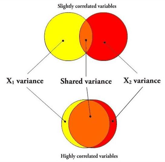
In the first case, if I’m going to predict a variable using X1, the variance that overlaps with X2 (the orange part) will be partialled out when creating the regression coefficient, since X2 is being held constant. However, since the variables aren’t very correlated, there is still a lot of “influence” (the yellow area, independent of X2) that X1 can have on the predictor variable when X2 is held constant.
However, in the second case, the overlapping orange part is huge, leaving only a small sliver of yellow. In other words, when two predictor variables are highly correlated, partialling the second variable (X2) out in order to create the unique predictive power of the first variable (X1) practically removes the entirety of X1, leaving very little influence left over, so even if X1 were highly predictive of the dependent variable, it most likely would not have a significant regression coefficient.
Here’s a picture using the five subscales as the independent variables.
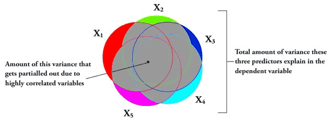
The entire gray area is the amount of the explained variance that gets “covered up” due to the variables all being highly correlated. The colored components are the amount of each independent variable that actually gets to be examined per each regression coefficient. This lack of variance exhibited by each of these little slivers basically causes the independent variables to look insignificant in the amount of variance they explain in the dependent variable.
Another good test for multicollinearity issues is the tolerance. The multiple R2 (in this case, .9926) is the amount of variance in the Composite score that all these variables together predict. Tolerance is 1 – R2, and is 0.0074 in this case. Any tolerance lower than 0.20 is usually an indicator of multicollinearity.
So yeah. How cool is that?
When I do the regression for each subscale predicting the Component score individually, they’re all highly significant (p < 0.001).
MULTICOLLINEARITY DESTROYS REGRESSION ANALYSES!
Yeah.
This made me really happy.
And yes, this was, in my opinion, and excellent use of the afternoon.
Today’s song: Red Alert by Basement Jaxx

