Connect Again: Colorado Rockies
The Rockies have a new City Connect uniform! Check it:
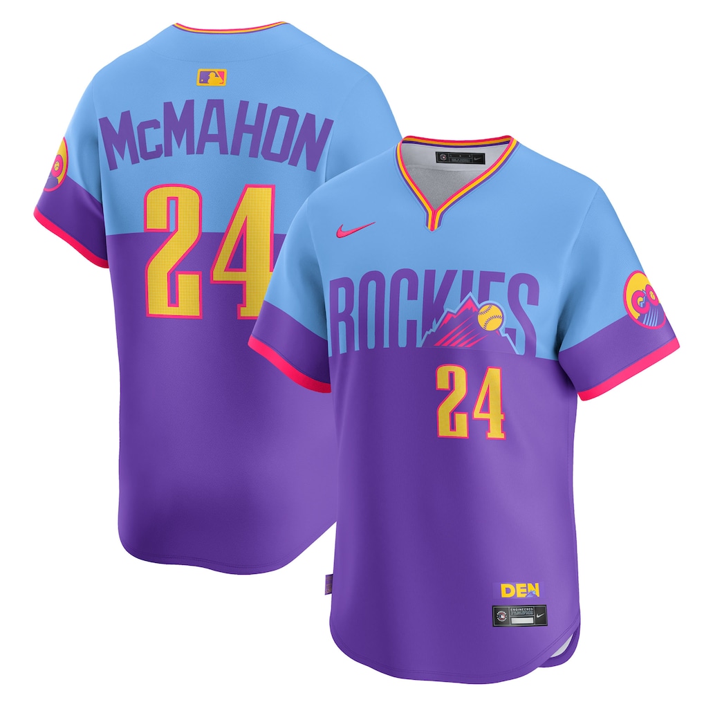
Apparently people don’t like this one, but I dig it. It’s definitely better than their “we just took the state license plate and put it on a shirt” City Connect from a few years ago. They’re very 80s.
I think this would go in the “S” tier with the Padres and the Rays.
YOU get a new jersey! And YOU get a new jersey! And YOU and YOU and YOU and…
Alright you NERD BASKETS, all of this year’s City Connect uniforms are out,* so let’s update the thingy.

I’m not going to repeat all my rankings from the previous post I did, but let’s just mention the new ones (which I’ve outlined in red in the above pic).
Tampa Bay Rays

I freaking love these, yo. There’s a skateboarding ray on them, what more can you want? The only reason these don’t beat out the Padres is because 1) those Padres colors are fire, and 2) the number on the back of the jersey is really hard to see from far away. If the outline were thicker and/or in lime green, they’d be perfect.
New York Mets
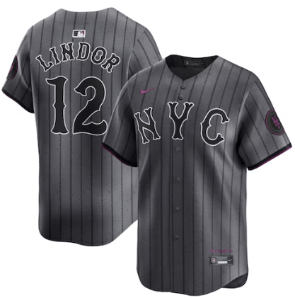
I think this is a really good jersey. I like the purple touches and all the little meanings behind the smaller details that you maybe can’t see from the picture. Also, I’m, y’know, a little biased.
Cleveland Guardians

Eh. They’re not bad. I like the font and that funky texturing.
Detroit Tigers

Why are they blue?
This looks like something a middle-aged dad would wear to go bowling. I guess it does kind of look like the wearer got run over, so…yeah. MOTOR CITY
Philadelphia Phillies
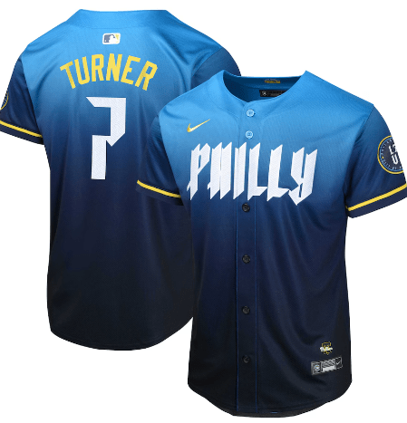
The two things I absolutely never think of when I think of the city of Philadelphia are 1) the color blue, and 2) a serial killer font. That 7 looks like a pipe wrench. I know they put the Liberty Bell on the hat, but come on. A gold/copper jersey with a big-ass black lightning-shaped crack going down the front of it would be so much more iconic.
St. Louis Cardinals
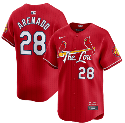
LOL “The Lou.” Apparently it’s a thing, and it’s like the only thing different about this City Connect Jersey compared to their usual ones. Do they have to put those damn birds on everything? Are they like glued to the bat? Put the birds on “The Lou” or, better yet, do what that Photoshop-wielding guy on Twitter did and put a giant toilet on the front and perch the birds on that.
(They’re still better than those god-awful Marlins jerseys, though.)
The end.
*Except for the Dodger’s second iteration, but I have a feeling it will be just as boring as the first one**
**IT LOOKS LIKE THEY ROLLED IN FUNFETTI CAKE. WHAT IN THE SHIT, DODGERS
In This Blog: Claudia Ranks the City Connect Uniforms
Why? Because I’m bored and I have opinions.
Let’s go from best to worst.
#1: San Diego Padres
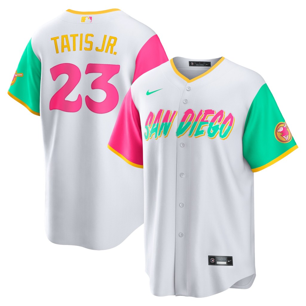
These are SO colorful and SO unique. The whole point of this project with Nike was to create uniforms that reflect cultural aspects of each team’s home city, right? This does a great job of highlighting the colors of the coastal community of San Diego and (apparently) Tijuana as well. Sunsets, surfing, skating. I love this uniform.
#2: Houston Astros
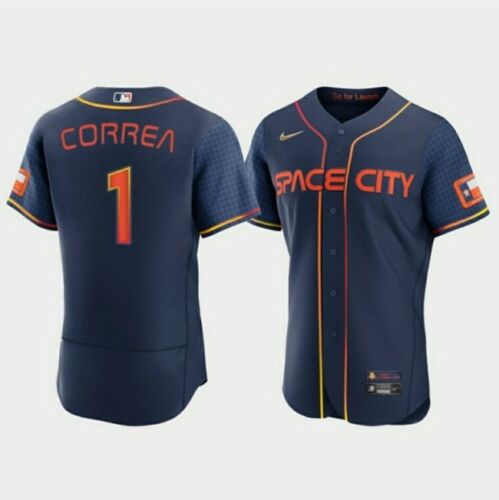
The Astros can go suck it, but I like this jersey design. I love the gradient in the striping (Houston seems to like gradients in their uniforms) and the “futuristic” font. The accompanying hats are cool, too.

#3: Seattle Mariners

I dig these. They’re old school, especially with that font choice and blue/yellow combo. I like the shadowing behind the letters/numbers and the “PNW” on the sleeve. That’s very PNW, haha. The accompanying hat has a trident on it, too, which is another throwback. This is a very history-aware jersey and I’m here for it.
#4: Colorado Rockies
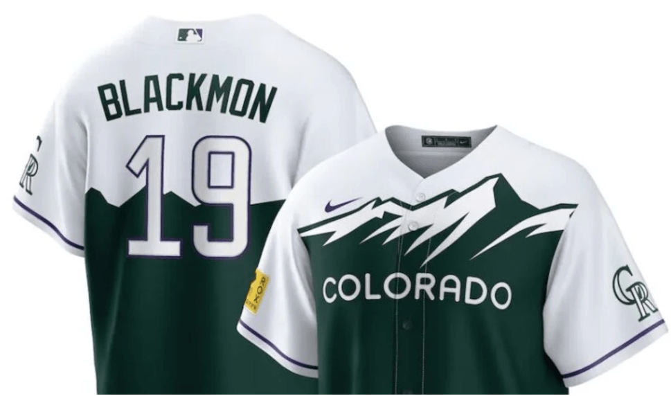
I like how they just put the license plate design on a jersey, haha. I wish this was purple because I love the Rockies’ purple, but I guess green fits better for the design. The hat’s a little off, though. But very Colorado.
#5: Washington Nationals

This seems to be, by a wide margin, everyone’s favorite City Connect design. I like it; it’s unique. But it’s not my favorite. It’s a little washed out (or should I say…WSH’d out? HAHAHAHAHA) and kind of…blah? I think if the “WSH” or the cherry blossom cluster on the front had had a thicker, darker outline to it, it would look better.
#6: Boston Red Sox
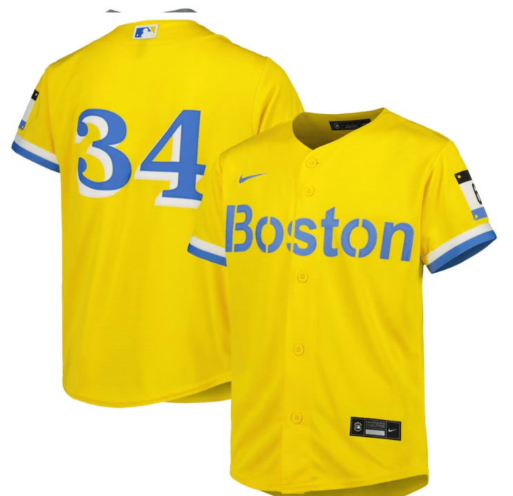
The lack of red is…well, weird. But again, the whole point of these was to represent some connection to the city’s culture. The Boston Marathon, perhaps the most famous race in the world, have blue and yellow at the finish line. There’s also a patch in the shape of a marathon bib with “617” on it to represent Boston’s area code. It’s different than what’s expected, and I like that.
#7: Pittsburgh Pirates
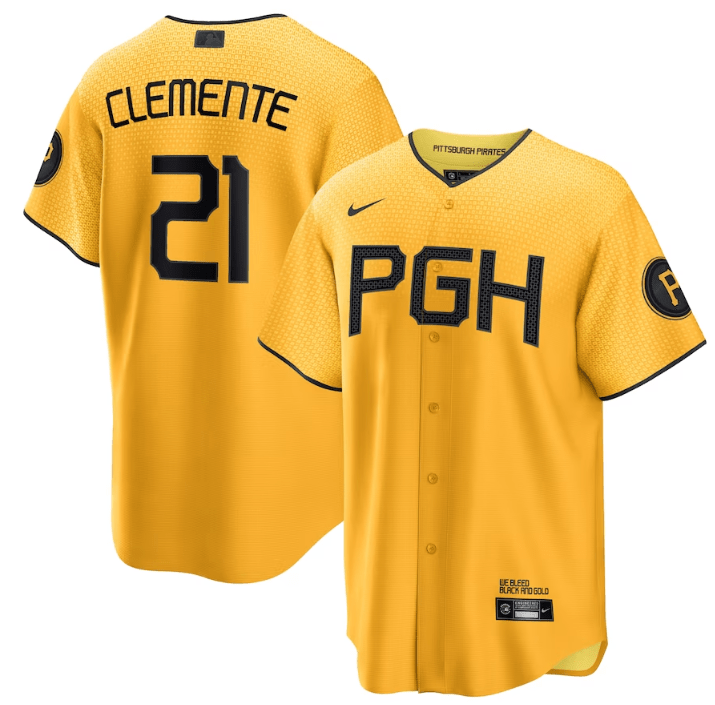
I love the yellow and I love the pattern on the jersey. There’s even a pattern on the black lettering. I just wish these patterns were easier to see! Like, up close they’re pretty prominent, but the further away you are from it, the harder it is to see those subtle details. Maybe that’s the point, but I’d like it if they were a bit more obvious.
#8: Milwaukee Brewers

I like the “Brew Crew” and I love how their logo is prominent on the sleeve. They’ve got one of the cooler logos. I guess powder blue and yellow are on the People’s Flag of Milwaukee (didn’t know that was a thing) and the blue also is supposed to pay tribute to the blue skies of summer in the city. Looks a little too safe, though.
#9: Los Angeles Angels

These are okay. I like the font of the “Angels” on the front and like the cream color. You get a beach vibe from it, which is what they were going for. Works well with LA and keeps the classic colors, too.
#10: Baltimore Orioles
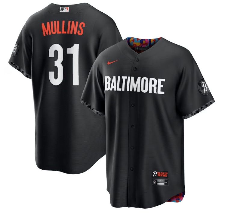
Oh, Baltimore. Why did you hide that beautiful color pattern (representing the neighborhoods of the city) on the inside? I mean, I guess they had a reason: to show on the outside how Baltimore is typically thought of versus, on the inside, the vibrant nature of the culture that actually exists there. Still, though, seeing even a hint of that color on the outside would be awesome. It does look like players often role up the cuffs of the sleeves to show off that color, though, so I guess. I think they should have incorporated Maryland’s flag somehow, too.
#11: Arizona Diamondbacks

I don’t know how I feel about the color itself, but I like the snake as the “S” and I like that it’s in Spanish. They’ve got the Arizona flag on the sleeve, too, which is a pretty flag. Honestly, they can’t do worse than this atrocity.
#12: Chicago White Sox
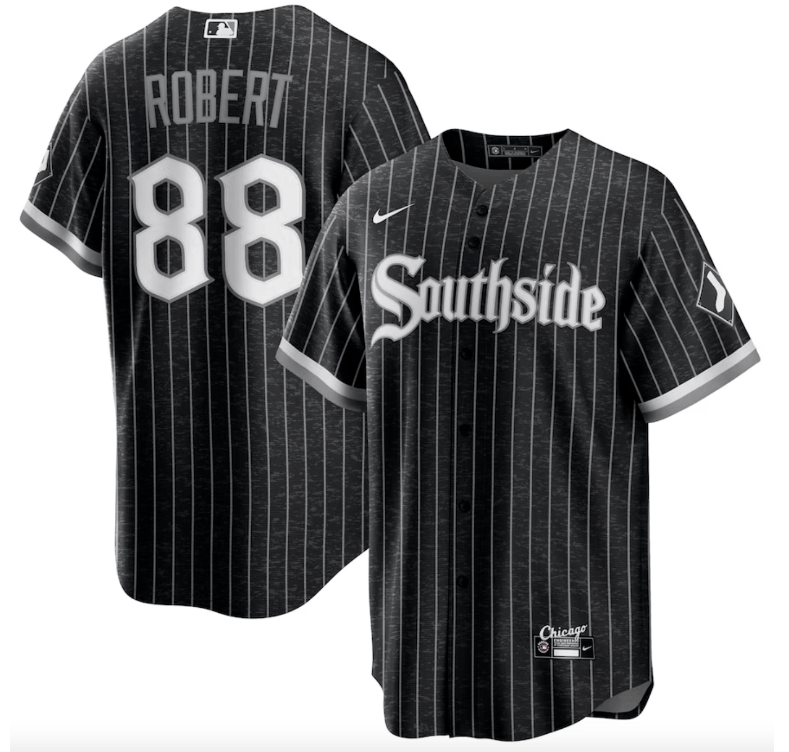
I feel bad for the White Sox because they’re basically stuck with black and white for everything, but I think they did the best they could. I think the pinstripes are unexpected and I like the font.
#13: Atlanta Braves

This is so…meh. Maybe because it looks like a uniform they already have. And that blue is just a little too light or washed out or something. At least the “A” is capitalized.
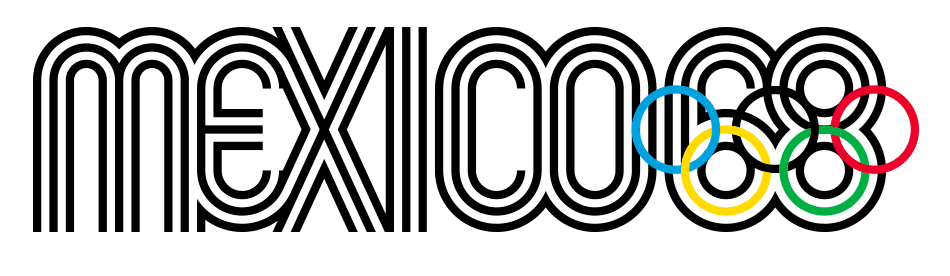
#14: Kansas City Royals
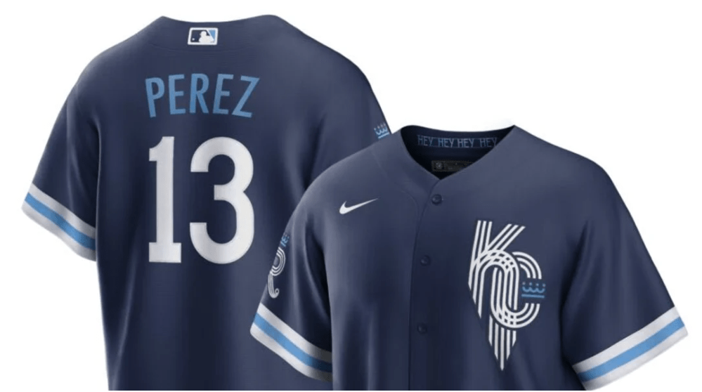
Another meh. It’s too safe. I get that they were trying to be cool with that funky “KC” on the front, but it just reminds me of the design vomit that was the Mexico ’68 Olympic logo. Too many freaking lines (Edit: JESUS CHRIST WAS THIS REALLY A THING?)
#15: Cincinnati Reds

It’s so hard to read! It’s so dark! I like the stripes on the sleeve cuffs, but other than that, blegh.
#16: Chicago Cubs
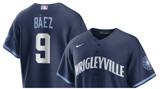
Another meh. It’s just so…plain. I don’t even have anything else to say.
#17: Los Angeles Dodgers

Oh my god, they’re BORING! Why are they so BORING?
#18: Texas Rangers

This is just a weird-ass uniform. I get no “Texas Rangers” vibe from this at all. I don’t like that dark blue and that red together. I don’t like the fonts. It’s like a really bad collage.
#19: San Francisco Giants

Oh. Oh no. It’s pretty bad when the most prominent feature of your uniform is a really bad fade to represent fog. And that creamsicle orange is yuck. Like a lot of these lower-tier uniforms, it’s too safe. But also not safe enough? I don’t even know.
#20: Miami Marlins
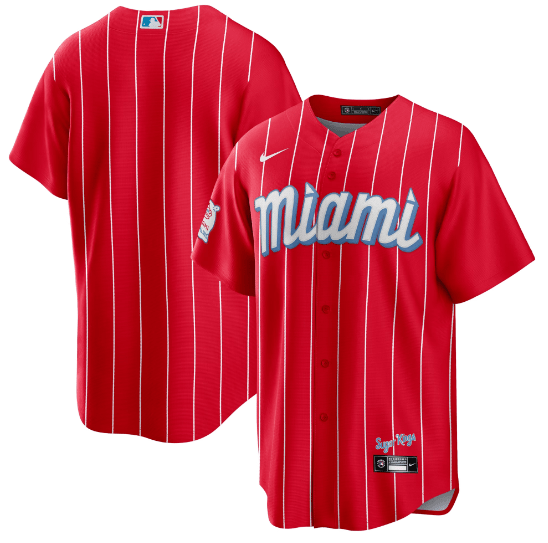
Remember that fantastically gaudy and ostentatious home run sculpture that the Marlins used to have? Remember when the sculpture got moved out of the park because Jeter hates fun? This is the uniform equivalent of that. If you think of Miami, you think of neon, beaches, palm trees, and warm nights. You think of colors and of fun. You don’t think of a puke-inducing color combination of blood red and powder blue with out-of-place pinstripes. This uniform actually almost makes me physically sick. It’s the Smurf Turf of uniforms.
In conclusion:

Thank you for coming to my Ted Talk.
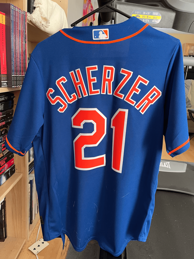
Presents of Mind
Yo!
So we opened presents today because why the hell not? My family knows exactly what I like, haha. Observe:
A magnet from my mom. I’ve got it stuck to my treadmill where I can see it from my chair.

A FREAKING SCHERZER JERSEY from Nate. I’ve dubbed it my “Scherzey” and will wear it on opening day next season (it’s already covered in Pepper hair, haha).
I also got a cat calendar as always. WOO!

