Because Reddit giveth (weird map posts) and Reddit taketh away (free time).
Note: I’m just copy/pasting these from that map, so some of them are a little tilty.
Colorado

I like the “C”.
South Carolina

This is a logo! Got the tree in there that’s on the flag, got the “SC” for “South Carolina” bolded in “discover,” got cool lettering…nice.
Mississippi

Love the curly S set!
New York

I was unaware that this thing was actually New York’s tourism logo. It’s a classic.
Alaska

This has the perfect amount of simplicity to it.
Missouri

Pretty. I like it.
Ohio

Good color scheme.
Hawaii
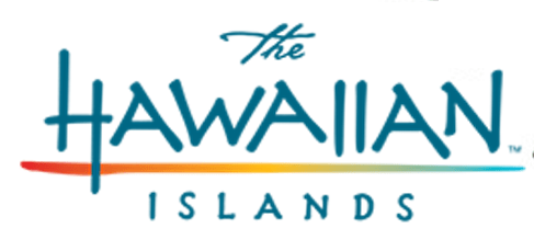
I like the rainbow.
Nevada
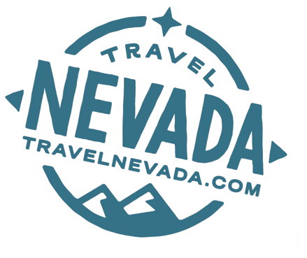
Looks like a compass. I approve.
Idaho

My bias is showing.
Indiana

I like the colors.
Arkansas
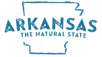
Not bad.
New Jersey

Simple, but I like it.
Louisiana
(This one kind of got eaten by the edge of the state, sorry)

I like the font.
Wisconsin

Just travel the website, that’s good enough.
Connecticut

This looks like a presidential campaign logo.
Utah

This looks like a sports team logo.
Maryland
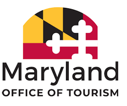
They’ve got to put their weird flag on everything, huh?
Vermont
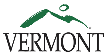
I think this is the logo that best matches how I would imagine a particular state’s logo to look. This is very “Vermont.”
Texas

Let’s not.
Georgia

I see what you did there with the peach-colored lettering.
Michigan

The upper peninsula is where Dirty Michigan is.
Washington
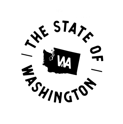
Poor Washington. They have to mention the “state” part on EVERYTHING so they don’t get confused with DC.
Florida

I dig the pink.
Rhode Island
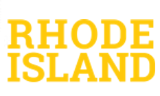
I like yellow, but that would be pretty hard to see on any sort of printed thing.
Wyoming

Look, they managed to fit Wyoming’s entire population on this logo!
Pennsylvania

Lively, but not the kind of vibe that screams “Pennsylvania” to me.
Oklahoma

This looks like it’s trying to be a logo for the Olympic games.
Nebraska
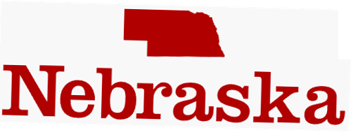
At least it’s red and not black like 70% of these things.
Massachusetts

Too corporate.
New Hampshire
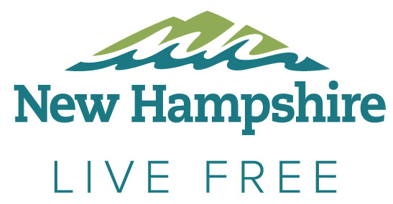
Where’s the rest of the quote, New Hampshire? Where’s the rest of the quote?????
Delaware

Meh. Too blue.
Alabama

Is the song stuck in your head now? IS IT????
Iowa

If you zoom in far enough into those blue brackets, it says “please stop confusing us with Idaho.”
California
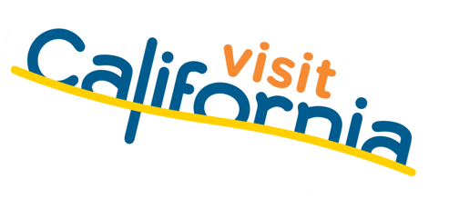
OH GOD IT’S DROWNING
New Mexico
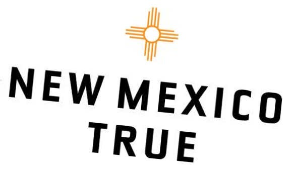
I like their little symbol thingy.
Arizona

Let’s ignore the desert parts!
Illinois

I hate the all-lowercase thing. I HATE it. Capitalize your goddamn state, dawgs!
Tennessee

That’s…that’s a lot of words for a tiny logo.
Virginia

Weird slogan, but okay.
South Dakota

A fancy font for a non-fancy state.
North Dakota

Or forgotten. Either one.
Oregon

Travel Oregon…because that’s better than living there!
Minnesota

Those lowercase e’s thrown in with all the capital letters make me want to diiiiiiiiiie.
North Carolina

Bro.
Kentucky

Sponsored by Dymo.
Maine

At least put a lobster on there, c’mon.
Montana

It’s only slightly more interesting than this logo!
Kansas

It’s a state!
West Virginia

Did a five-year-old write this in diarrhea? What in the actual hell.
What is my life?

