When they are used unnecessarily, I hate Sankey diagrams.
And because I’m a member of r/dataisbeautiful, I see them used ALL THE TIME
They are, in my opinion, a really distracting way to present information in a lot of cases because they’re just so bulky. Usually the “thread” of interest ends up being so small it’s like…why did we need all this other information?
I get that they’re supposed to show some sort of flow, but like with all other graphs, ya gotta do it right, bro. It’s so easy to make them way too cluttered.
(Source)
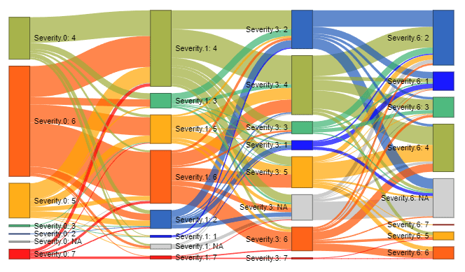
Or way too…weird.

(Source)
We can do better, yo.

